Blog

  • High-Converting Coming Soon Pages Guide

    High-Converting Coming Soon Pages Guide

    So, you’ve got a great idea for a website or a new product, but it’s not quite ready for the world. What do you do with your domain in the meantime? You put up a “Coming Soon” page.

    But this isn’t just some digital “under construction” sign. A coming soon page is a powerful marketing tool. Think of it as the trailer for your business’s blockbuster movie—it offers a tantalizing sneak peek that gets people hyped for the main event. It’s your first chance to build anticipation, capture leads, and kick off your marketing well before you officially launch.

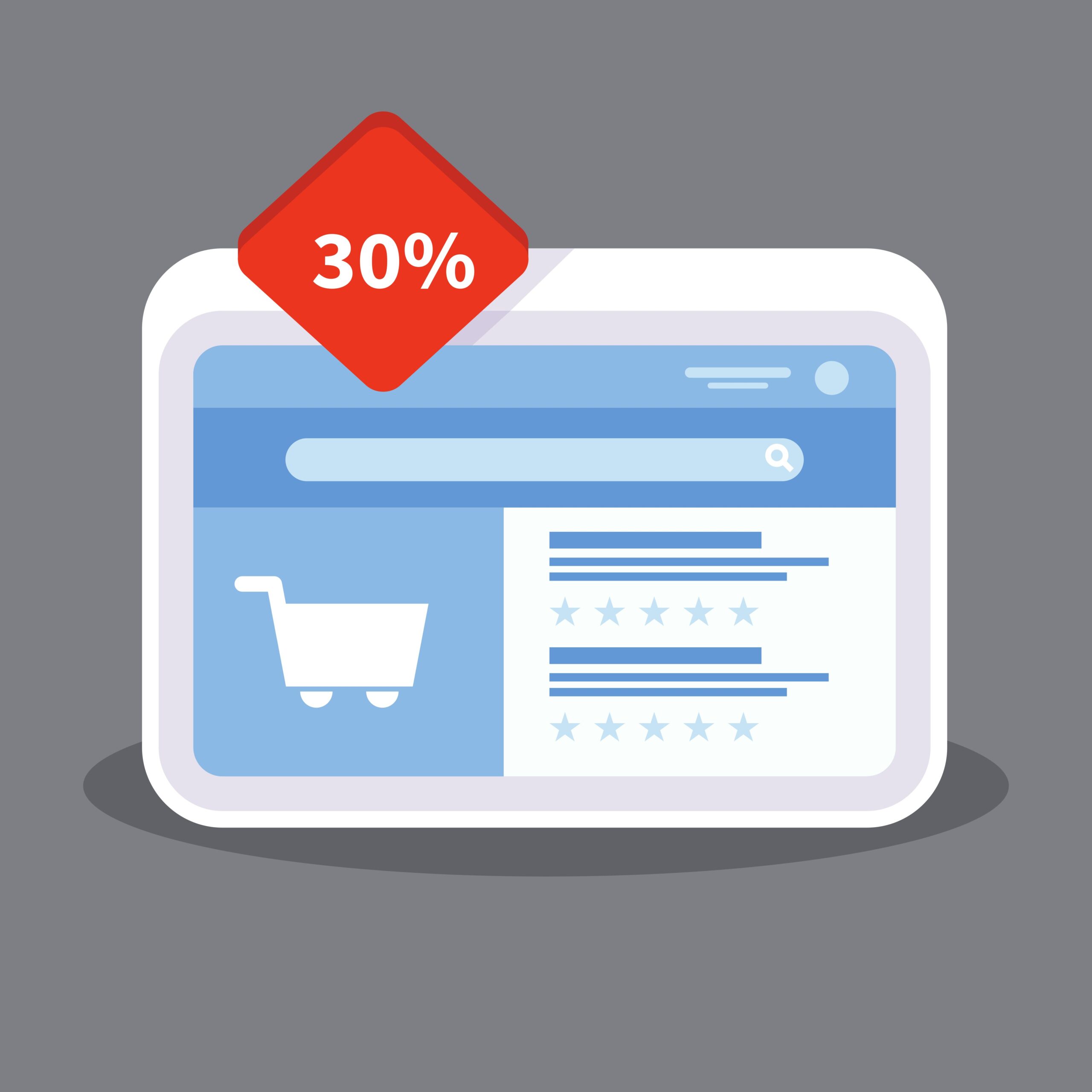
    What Is a Coming Soon Page and Why It Matters

    A laptop displaying a coming soon page with a lead capture form, symbolizing pre-launch marketing.

    Launching to the sound of crickets is a nightmare for any entrepreneur. A coming soon page helps you avoid that entirely. It turns the quiet, heads-down development phase into an active pre-launch campaign. Instead of greeting early-bird visitors with a blank screen or a confusing error message, you welcome them with a clear message and a compelling reason to come back.

    This single page serves as your brand’s opening act. It lets you test the waters and validate your idea by seeing how many people sign up for updates. More importantly, it opens a direct line of communication with your very first potential customers. You’re not just building a website in a vacuum; you’re building an audience right alongside it.

    The Strategic Value of Launching Early

    Many people fall into the trap of thinking that marketing only starts after the product is perfect and ready to ship. That’s a huge mistake. A well-designed coming soon page lets you get a major head start and build momentum from day one.

    The perks go way beyond just a simple announcement:

    • Generate Buzz and Anticipation: You can create genuine excitement and curiosity. Simple elements like a countdown timer or a sneak peek of a key feature make people feel like they’re in on a secret, building up to an exclusive event.
    • Capture High-Quality Leads: This is its most critical job. By collecting email addresses from people who are genuinely interested, you’re building a pre-launch list. This list becomes your single most valuable asset on launch day—a built-in audience ready and waiting for your announcement.
    • Validate Your Business Idea: Before you sink a ton of time and money into development, you can get a real sense of market interest. If people are signing up in droves, that’s a fantastic sign you’re onto something good.
    • Kickstart Your SEO Efforts: Believe it or not, this simple page can help your search engine ranking. Google and other search engines can start crawling and indexing your domain, connecting it with your target keywords. That means you won’t be starting from absolute zero when the full site goes live.

    A coming soon page is your first handshake with the market. It’s an opportunity to make a strong first impression, gather valuable feedback, and build a community before your doors even officially open.

    The growing recognition of these pre-launch tools is easy to see in the market for landing page builders. The global market for these platforms was valued at USD 657.99 million in 2024 and is expected to rocket to USD 3.87 billion by 2037, growing at a compound annual rate of over 14.6%. This trend highlights just how crucial it has become for businesses to engage with their audiences early and effectively. You can discover more insights about the landing page builder market from recent research.

    The Anatomy of a High-Converting Coming Soon Page

    A blueprint diagram showing the key components of a high-converting coming soon page, such as a headline, lead capture form, and countdown timer.

    A killer coming soon page is more than just a digital signpost. It’s a finely-tuned engine where every single part—from the headline to the sign-up button—works in concert to do one thing: turn a curious visitor into an eager subscriber.

    If you get these core components right, you won’t just be collecting emails. You’ll be building a powerful launchpad for whatever comes next. Let’s break down the must-have elements that separate a forgettable placeholder from a lead-generating machine.

    Key Elements of a High-Conversion Coming Soon Page

    To truly understand what makes a coming soon page work, it helps to see each piece’s specific job. The table below outlines the essential building blocks, their strategic purpose, and a pro tip for getting each one right.

    Element Purpose Best Practice
    Headline Grab attention instantly and communicate the core benefit. Focus on the outcome. Answer the visitor’s question: “What’s in it for me?”
    Benefit-Driven Copy Build desire and explain why someone should care about your launch. Use bullet points to highlight what the user gets, not just what your product does.
    Lead Capture Form Convert interest into a tangible lead (an email address). Keep it simple. Ask only for an email to minimize friction and boost sign-ups.
    Call-to-Action (CTA) Drive the desired action—signing up for your list. Use strong, action-oriented text like “Get Early Access” in a high-contrast button.
    Urgency Element Motivate immediate action by creating a sense of scarcity. A countdown timer is a classic for a reason. It visually shows that time is running out.
    Social Proof/Sharing Build trust and leverage word-of-mouth marketing. Add social sharing buttons and consider offering a small incentive for referrals.

    Each of these elements plays a vital role in the page’s overall success. When they work together seamlessly, the result is a page that doesn’t just inform, it persuades.

    Crafting a Magnetic Headline and Value Proposition

    You’ve got about three seconds. That’s all the time your headline has to hook a visitor before they click away. Vague promises like “Something Big is Coming” just don’t cut it anymore.

    Your headline needs to deliver a powerful value proposition—a clear, concise promise of the value you’re offering. It should instantly answer the visitor’s silent question: “Why should I care?”

    A new project management tool, for instance, could skip the fluff and go straight for the pain point with a headline like, “Stop Juggling Tasks. Start Dominating Your Day.” It’s direct, benefit-focused, and speaks to a real problem.

    Writing Concise and Benefit-Driven Copy

    Once the headline has their attention, your body copy has to reel them in. This is not the place for an essay. Keep your sentences short, punchy, and laser-focused on the benefits.

    A feature is what your product does; a benefit is what the user gets. Your copy should always emphasize the latter. For example, instead of saying “AI-powered scheduling,” say “Effortlessly find the perfect meeting time without the back-and-forth emails.”

    This simple shift from talking about yourself to talking about your customer’s success makes your offer infinitely more compelling. Strong copy builds anticipation and makes signing up feel like the obvious next step in a smooth user experience.

    Designing a Frictionless Lead Capture Form

    Think of your lead capture form as the heart of the entire page. Every other element is designed to guide people right to this spot. The secret to a form that people actually fill out? Make it dead simple.

    The goal is to remove every possible bit of friction. All you really need is an email address. Every extra field you add—name, company, phone number—is another reason for someone to hesitate and leave. If you need more info, you can always ask for it later. For a deep dive, check out this guide to build a high-converting lead capture form.

    The Power Trio: Urgency, Action, and Trust

    Beyond the basics, a few key psychological triggers can dramatically lift your conversion rates. These elements work together to build trust and create a sense of immediacy that pushes people to act now.

    Here’s the trio that makes it all click:

    • A Compelling Call-to-Action (CTA): Your CTA button has to be unmissable. Use urgent, action-packed text like “Get Early Access” or “Notify Me at Launch”—not a boring “Submit.” The button itself should pop with a color that contrasts with the rest of the page.
    • Countdown Timers: There’s nothing quite like a ticking clock to create a sense of urgency. A countdown timer visually reinforces that the launch is a time-sensitive event, tapping into our natural fear of missing out (FOMO) and encouraging sign-ups on the spot.
    • Social Proof and Sharing: Let your first visitors become your first marketers. By including social sharing buttons, you make it easy for them to spread the word. You can even sweeten the deal by offering a small bonus or discount to anyone who refers a friend.
    • Contact Information: Even something as simple as an email address or a link to a social profile can make a huge difference. It shows there are real humans behind the project, which is critical for building that initial layer of trust.

    Building Your Pre-Launch SEO Foundation

    An illustration of a magnifying glass examining a website under construction, symbolizing the process of building pre-launch SEO.

    Most people see a coming soon page as just a temporary placeholder. That’s a huge mistake. It’s actually one of the most powerful, and frankly, underused SEO tools you have at your disposal.

    Think of it like laying the foundation for a skyscraper long before the first wall goes up. By putting up an optimized page early, you’re basically sending an invitation to Google and other search engines to start learning about your brand, what you do, and who you do it for.

    This early indexing gives your domain time to mature and build a bit of authority. It’s a massive head start that your competitors probably aren’t taking. Instead of launching to crickets, you get to debut with some real search visibility and momentum already behind you.

    Optimizing Your Page for Search Engines

    Of course, just having a page isn’t enough. It needs to be properly optimized to tell search engines what it’s all about. This all starts with good old-fashioned keyword research—finding out what terms and phrases your future customers are actually typing into Google.

    Once you know your primary keywords, you need to weave them into the page. The goal isn’t to cram them in everywhere, but to use them naturally so they signal what your site will eventually offer.

    Here are the absolute must-haves for your page:

    • Craft an SEO-Friendly Title Tag: This is the headline that shows up in browser tabs and on the Google search results page. It should cleanly state your brand and what you do, like “Acme Project Manager | The Future of Team Collaboration.”
    • Write a Compelling Meta Description: This is the little blurb under your title in the search results. It’s your 160-character sales pitch to get someone to click, so make it enticing and include your main keywords.
    • Use SEO-Focused On-Page Copy: The main headline and body text on your page need to clearly explain your value proposition. Use the language your audience uses; this helps both real people and search engine bots understand what’s coming.

    Nailing your audience’s language is everything. Even a little bit of research into your ideal customer can uncover the exact phrases they use to describe their pain points, which is gold for on-page SEO. You can learn more about grouping these customers in our guide on target audience segmentation.

    Setting Up Analytics from Day One

    Launching a website without analytics is like flying a plane blind. Before your coming soon page ever sees the light of day, you have to get your tracking tools in place. This isn’t optional—it provides crucial data from the very first visitor.

    Setting up analytics early transforms your pre-launch phase from a waiting game into an active research period. Every visitor provides a data point that can help you refine your messaging, understand your audience, and validate your market.

    There are two tools you absolutely need to install right away:

    1. Google Analytics: This is the classic for a reason. It tracks what people do on your page—how they found you, where they’re from, and how long they stick around. This is invaluable for getting a first look at your audience.
    2. Google Search Console: Think of this as your website’s health report from Google’s point of view. It shows you which keywords are bringing people to your page, flags any technical glitches, and confirms that Google is actually indexing your page correctly.

    The Impact of Early SEO Efforts

    The payoff for this pre-launch work is real and measurable. Studies have shown that websites with optimized coming soon pages saw an average organic traffic bump of 20-30% in the months leading up to their official launch compared to sites that just appeared overnight.

    This early effort helps establish your site’s authority and relevance before you even have a full product ready. Find out more by reading the full research about pre-launch page impact. When you treat your coming soon page as the first chapter of your SEO story, you ensure your grand opening is met by an audience that’s already waiting.

    Coming Soon Page Examples and Proven Templates

    A collage of different coming soon pages, showcasing minimalist, viral, and product-focused designs.

    It’s one thing to talk about the theory behind a great coming soon page, but seeing it done right is where the lightbulbs really go off. The best pages are masters of persuasion, using clever design and sharp copy to turn a simple placeholder into a full-blown marketing event.

    By breaking down what works for others, you can cherry-pick proven strategies for your own pre-launch campaign. Let’s dive into a few examples from different corners of the market to see how they pull it off.

    SaaS Product Launch Example

    Picture a new project management tool about to hit the market. Its coming soon page doesn’t just mumble, “we’re new.” It shouts from the rooftops with a headline that nails a universal pain point: “Stop Drowning in Tasks. Reclaim Your Day.”

    The rest of the copy is razor-sharp and minimal. It uses a few bullet points to highlight the benefits, not just the features:

    • Automate your repetitive tasks in seconds.
    • See your team’s entire workflow at a glance.
    • Integrate with the tools you already love.

    The call-to-action is a big, can’t-miss button that promises, “Get 50% Off at Launch.” This page works because it sells a solution—less stress, more control—and gives people a concrete reason to sign up right now.

    E-commerce Store Pre-Launch Example

    Now, imagine a new sustainable fashion brand. They want to build a community, not just a customer list, before the first product ever drops. Their page features a stunning photo of their signature piece, but the real star is the story. The headline is aspirational: “Wear Your Values. Look Amazing Doing It.”

    They’ve added a countdown timer ticking down to the grand opening, which immediately injects a dose of urgency. And instead of a generic “enter your email” field, the form invites visitors to “Join the Movement” for exclusive early access and a peek behind the scenes. This approach makes subscribers feel like insiders, not just names on a list.

    The most effective coming soon pages don’t just announce a product; they invite visitors into a story. They make signing up feel like the first step in an exciting journey, transforming passive interest into active anticipation.

    Three Proven Templates to Get You Started

    Feeling inspired? The good news is you don’t have to reinvent the wheel. Here are three conversion-focused templates you can adapt for your project, each built for a specific goal.

    Template 1: The Minimalist Lead Magnet

    This one is all about getting straight to the point. It’s perfect for SaaS products, professional services, or anyone with a powerful, clear-cut value proposition.

    • Headline: State the primary benefit in ten words or less. Think: “The Easiest Way to Create Professional Invoices.”
    • Subheading: Briefly explain who it’s for and what problem it crushes.
    • Lead Capture: A single email field tied to an irresistible offer. The CTA should promise a clear reward, like “Get a Free Guide to Better Invoicing” or “Claim Your Early Adopter Discount.”
    • Design: Keep it clean. A single background image or color with plenty of white space puts all the focus on the headline and the form.

    Template 2: The Viral Hype Builder

    If your main goal is to get people talking and maximize your reach, this is your playbook. The entire strategy is built around incentivizing social sharing and referrals.

    • Headline: Spark curiosity and a sense of exclusivity. For example: “The Secret Is Almost Out. Be the First to Know.”
    • Value Proposition: Briefly explain the product, then immediately introduce the referral program.
    • Referral System: Use a tool that gives every subscriber their own unique sharing link. Offer tiered rewards, like “Refer 3 friends for early access” or “Refer 10 friends for a free product on launch day.”
    • Visuals: A slick teaser video or a few dynamic images will help build that must-have excitement.

    Template 3: The Product Showcase

    This template is a natural fit for physical products, e-commerce brands, or any launch where the visuals do the heavy lifting. It gives a juicy sneak peek without giving away the whole farm.

    • Headline: Announce the product with confidence: “Introducing the All-New HydroFlask Pro.”
    • Visuals: A high-quality gallery of product shots or even a 360-degree view. You can get clever by using tasteful blurs or shadows to hide certain details and build suspense.
    • Key Features: List out 3-5 of the most compelling features, always framing them in terms of benefits for the customer.
    • Countdown Timer: A big, bold timer counting down to the exact launch date and time.
    • Call-to-Action: Make the CTA direct and time-sensitive. Something like “Notify Me at Launch” works perfectly.

    By picking the right approach for your goals, you can build a coming soon page that not only looks professional but also works around the clock to build your audience before you even open for business.

    How to Build and Launch Your Coming Soon Page

    Alright, with the strategy and design nailed down, it’s time to get your hands dirty and actually build this thing. The best part? You absolutely do not need to be a coding wizard to create a professional-looking page that gets results. There are fantastic tools out there for every skill level and platform.

    We’ll walk through the most common ways to get this done, from simple plugins to using the built-in features of your e-commerce platform. The goal is to get you from a blank slate to a live, lead-capturing page as painlessly as possible. Let’s find the right approach for you.

    Using WordPress Plugins for Easy Setup

    For the millions of us running sites on WordPress, plugins are by far the fastest and easiest route. These tools are designed to do all the heavy lifting for you, offering pre-made templates and drag-and-drop editors that require zero technical chops.

    They handle the backend stuff, making sure your main site stays hidden while displaying a polished coming soon page to visitors. Many even come loaded with the essentials, like countdown timers, social media links, and hooks for your email marketing service.

    A couple of top-notch options to look at are:

    • SeedProd: This one is a huge player in the space for a reason. SeedProd has a visual builder that makes customizing your page a breeze, plus a massive library of templates to start from. It connects directly with major email platforms like Mailchimp and Constant Contact.
    • Elementor Maintenance Mode: If you’re already building your site with the Elementor page builder, you’re in luck. Its built-in Maintenance Mode is a killer feature that lets you design your coming soon page using the same interface you already know and love.

    Customizing E-commerce Password Pages

    Platforms like Shopify and BigCommerce were built with product launches in mind. By default, your new, unpublished store is guarded by a “password page”—which is really just a built-in coming soon page. It’s functional right out of the box, but a few tweaks can turn it into a marketing machine.

    Most themes let you easily edit this page to:

    • Add your logo and brand colors.
    • Swap out the background image.
    • Rewrite the text to build some real excitement.
    • Crucially, include a newsletter signup form so you can start gathering emails from day one.

    Don’t sleep on this feature. Customizing your store’s password page is one of the simplest, most effective ways to build an audience before you’ve even made your first sale. You’re turning a dead end into a genuine lead-generation opportunity without spending an extra dime.

    Building a Custom-Coded Page

    For anyone who wants total creative freedom or has very specific needs, nothing beats a custom-coded HTML/CSS page. This path is perfect for developers or businesses with a dev team who want to create a truly unique pre-launch experience.

    When you build from scratch, you can do anything—complex animations, one-of-a-kind layouts, or custom integrations that a page builder just can’t handle. Just keep in mind that this route requires real-deal knowledge of web development and how to get a page hosted and live on the internet.

    Enhancing Your Page and Driving Action

    Once your page is up and running, a few extra touches can really crank up its effectiveness. For example, a notification bar is a fantastic way to flash a special offer or an important update without cluttering up your clean design. You could add a bar that shouts, “Sign up now and get an exclusive 20% discount on launch day!” This keeps your core message simple while layering on a powerful incentive. Tools like LoudBar are designed specifically to make these messages pop and boost conversions with eye-catching effects.

    No matter which method you go with, remember that this page is just one piece of a bigger puzzle. To get the best results, slot your coming soon page into a comprehensive product launch checklist template. This ensures all your pre-launch activities are working together, setting you up for a smooth and powerful launch day.

    Got Questions About Coming Soon Pages? We’ve Got Answers.

    So you’re gearing up for a launch. Big things are on the horizon, but you’ve got questions. A coming soon page might seem simple on the surface, but a lot of strategy goes into making it work. Getting the details right can be the difference between a launch that fizzles out and one that starts with a bang.

    Let’s clear up some of the most common questions people have when building a coming soon page. My goal here is to give you straightforward, practical answers so you can move forward with confidence and sidestep those common pitfalls.

    How Long Should a Coming Soon Page Be Live Before Launch?

    Ah, the timing question. This is all about finding that sweet spot. You need enough time to build genuine momentum, but not so much that the excitement dies down before you even open the doors.

    For most projects, the ideal window is 30 to 90 days. This gives you enough runway to build a solid email list and get people talking, but it’s not so long that you risk audience fatigue. Go much shorter, and you won’t have time to gain traction. Go much longer, and your launch can start to feel like it’s perpetually “coming soon,” which is a real buzzkill.

    You’ll want to fine-tune this timeline based on your specific situation:

    • Launching a simple product or a new feature? A focused 30-day campaign is usually plenty of time to get your existing audience hyped and capture new leads.
    • Starting a whole new company in a crowded market? Give yourself more room to breathe. A longer, 90-day pre-launch can be a game-changer, giving you time to build an audience from scratch, run ad campaigns, and start getting noticed by search engines.

    The bottom line? You want to create a wave of anticipation that crests right on launch day, not months before.

    What Should I Do with the Email List I Collect?

    Your pre-launch email list is pure gold—so treat it that way. One of the biggest mistakes I see founders make is letting that list go cold. These people are your hottest leads. They literally raised their hands and said, “Yes, I want to hear from you!”

    Don’t just sit on that list until you’re ready to launch. Start the conversation now. Nurture these subscribers to keep them invested and excited.

    Think of your pre-launch subscribers as your founding members. They’re your first believers. Keeping them in the loop makes them feel like insiders, transforming them from passive followers into genuine advocates for your brand.

    Here are a few simple ways to keep them engaged:

    1. Send occasional updates: Share a peek behind the curtain. Show them sneak peeks of the product or talk about key milestones you’ve hit during development.
    2. Ask for their opinion: Send out a quick survey asking about their biggest pain points related to your niche. This not only provides you with invaluable feedback but also makes them feel like part of the process.
    3. Build a community: Invite them to a private Discord server or Facebook group. It’s a great way for them to connect with you and each other.

    Then, when launch day finally arrives, reward their early faith with something special. An exclusive discount or early access can be a powerful way to turn those first subscribers into your first paying customers.

    Can a Coming Soon Page Hurt My SEO?

    This is a great question. A well-executed coming soon page is a massive asset for your SEO. But a poorly configured one? It can definitely cause problems. To make sure it helps, not hurts, you have to get the technical setup right.

    The single most critical piece is the HTTP status code. Your page absolutely must return a 200 OK status code. This is the signal that tells Google and other search engines, “Hey, this is a real, healthy page—go ahead and index it.” You want to avoid using a 503 Service Unavailable code at all costs. That’s for temporary maintenance, and it tells search engines to come back later, effectively killing your chance to get indexed.

    Beyond the status code, make sure your page isn’t just a pretty picture. It needs:

    • Indexable text: You need a clear headline, a short description of what’s on the way, and some relevant keywords.
    • A proper title tag and meta description: These are SEO 101. They tell search engines what your page is about and give people a reason to click when they see you in the search results.

    Get this right, and you’re building your SEO foundation from day one. Get it wrong, and you’re wasting a golden opportunity.

    Should I Run Paid Ads to My Coming Soon Page?

    Yes, you absolutely should. Driving paid traffic from platforms like Google, Facebook, or LinkedIn to your coming soon page is a brilliant way to supercharge your lead generation and validate your entire idea. It’s a low-risk way to test your core messaging and value proposition before the product is even finished.

    Think about it: by running small, targeted ad campaigns, you can gather priceless data. You can A/B test different headlines, ad copy, and audience segments to see what actually resonates with people. That feedback is incredibly valuable for refining your website copy and overall launch strategy.

    You don’t need a huge budget. Start small, test, and learn. Once you find a message that converts, you can scale up your spending with the confidence that you’re putting money behind something that works.


    Ready to make sure your launch announcements get the attention they deserve? LoudBar helps you create unmissable notification bars with fun, eye-catching effects that cut through the noise. Start building your pre-launch buzz today at https://loudbar.co.

  • A Guide to Landing Pages Conversion

    A Guide to Landing Pages Conversion

    It’s an old saying, but it holds true: you can’t improve what you don’t measure. Before you can boost your landing page conversion rates, you need an honest, clear-eyed look at where you’re starting from. This means establishing your baseline metrics.

    How To Measure Your Current Conversion Performance

    A person analyzing charts and graphs on a computer screen, representing performance measurement for landing pages conversion.

    Before you touch a single headline or button, you have to build a solid foundation of data. I’ve seen so many teams jump straight into A/B testing without understanding their current performance, and it’s a lot like trying to find a destination without a map. Sure, you’re moving, but you have no real direction. The whole point here is to establish a reliable baseline so you can actually track the impact of your changes down the line.

    The first, and most critical, step in this whole optimization journey is implementing robust effective website conversion tracking. This usually means getting tools like Google Analytics set up correctly to monitor user actions, making sure every click, form submission, and purchase is actually being counted. Get this part right, and everything else becomes easier.

    Understanding Industry Benchmarks

    It’s always helpful to know what a “good” conversion rate even looks like. While your own historical data is the ultimate benchmark, industry figures give you some much-needed context. They can quickly tell you if your performance is about average, lagging behind, or genuinely leading the pack.

    Here’s a quick look at some recent data to give you a feel for where the market is.

    Industry Median Conversion Rate Benchmarks

    This table breaks down the median conversion rates across different industries, giving you a reference point to see how your own numbers stack up.

    Category Median Conversion Rate
    All Industries (Overall) 6.6%
    Business-to-Consumer (B2C) 9.87%
    Business-to-Business (B2B) 13.28%

    These figures, which come from a massive analysis of over 41,000 pages, are a solid starting point for setting realistic goals for your own campaigns.

    A quick word of caution: A benchmark is a point of reference, not a hard-and-fast rule. Your main goal should always be continuous improvement against your own baseline, not just chasing an industry average that might not even apply to your unique audience or offer.

    Key Performance Indicators Beyond Conversion Rate

    Focusing only on the final conversion rate can be a bit misleading. To get the full picture, you need to look at several connected Key Performance Indicators (KPIs) that start to reveal the why behind your numbers. A low conversion rate is often just a symptom of a different problem.

    Here are the essential metrics I always recommend tracking for landing pages:

    • Conversion Rate: This is the big one—the percentage of visitors who complete your goal (sign up, buy something, download a file). It’s your primary success metric.
    • Bounce Rate: This is the percentage of people who land on your page and leave without doing anything else. A high bounce rate is a huge red flag that there’s a disconnect between your ad and your page.
    • Time on Page: How long do people actually stick around? Longer times can mean they’re engaged, while super short visits might signal they’re confused or just not interested.
    • Cost Per Acquisition (CPA): How much are you spending to get one customer or lead? This metric is crucial because it ties your marketing spend directly to your results and profitability.
    • Lead Quality: For B2B, this is a biggie. Don’t just track the number of leads. You need to know how many of them turn into sales-qualified leads to understand your true ROI.

    Setting Up Your Performance Dashboard

    Once you know which KPIs matter, pull them all together into a performance dashboard. Whether you use Google Analytics 4 (GA4) or another analytics platform, you can create a custom report that puts all your essential metrics in one spot.

    Start by setting up conversion goals in GA4 for your main call to action, like a form submission or a “thank you” page view. This lets the platform automatically calculate your conversion rate. I also highly recommend creating custom segments to analyze traffic from different sources (like organic search vs. paid ads) to see which channels are sending you the best visitors.

    This dashboard will become your single source of truth for every optimization effort you make. For a deeper dive into improving these numbers, you can check out our other articles on conversion rates.

    Fine-Tuning the User Experience and Page Speed

    A person using a tablet to interact with a visually clean and fast-loading landing page, symbolizing an excellent user experience.

    You can write the most brilliant copy in the world and have an offer that’s an absolute no-brainer, but none of it matters if your landing page is slow, clunky, or just plain confusing. If a visitor lands on your page and it’s a pain to use, they’re gone. Simple as that.

    Think of it this way: every moment of confusion, every extra second of load time—it’s all friction. And friction is the mortal enemy of a high conversion rate. When someone clicks your ad, they’re expecting a quick, clear answer to their problem. A slow, frustrating page breaks that promise right out of the gate. That’s why tweaking your UX and page speed isn’t just a job for your developer; it’s a core part of your conversion strategy.

    Speed Is Not a Feature; It’s a Requirement

    We live in an era of instant gratification, and your landing page is no exception. We’ve all been there—clicking a link, staring at a blank screen, and getting more impatient with every passing millisecond. Most people won’t wait. They’ll just hit the back button and find a competitor whose site actually works.

    The numbers here are staggering. Research consistently shows that pages loading in just one second can achieve conversion rates up to five times higher than those that take a sluggish 10 seconds to appear. Even a seemingly small jump from a five-second load time to one second can triple your conversions. The message is clear: speed sells.

    Here are a few things you can do right now to speed things up:

    • Shrink your images. This is the low-hanging fruit. Huge, unoptimized images are almost always the biggest culprit behind slow pages. Use a tool like TinyPNG to compress them without losing visual quality.
    • Audit your scripts. Every little script you add for analytics, heatmaps, or chat widgets adds to the load time. Take a hard look at what you’re running and cut anything that isn’t absolutely essential for this specific page.
    • Use browser caching. Caching tells a visitor’s browser to save static elements—like your logo, fonts, and stylesheets—so the page loads almost instantly on their next visit.

    Build for Thumbs, Not Cursors

    It’s no secret that mobile traffic dominates the web, yet so many landing pages still feel like they were built exclusively for a giant desktop monitor. This is a huge, costly mistake. A design that looks beautiful on your screen can quickly become a user’s nightmare on a phone, with text so small you have to squint and buttons that are impossible to tap accurately.

    Your goal isn’t just a “mobile-friendly” page; it’s a mobile-first experience. This means the most important stuff—your headline, your core promise, and your call-to-action—should be front and center without any need for pinching, zooming, or scrolling.

    My Two Cents: Don’t just trust your browser’s mobile simulator. Test your page on real devices. Grab an iPhone, find an Android phone, and see how it actually feels to use. You’ll be shocked at the little usability headaches you uncover that the emulators completely miss.

    One Page, One Goal: Remove the Escape Routes

    A great landing page has one job and one job only: to get the visitor to take that one specific action. One of the most common mistakes I see is giving people too many choices. Pages cluttered with full navigation menus, links to social media profiles, and links to other “special offers” are conversion killers.

    Every single one of those extra links is an escape hatch. It’s a shiny object pulling your visitor’s attention away from the one thing you want them to do.

    A truly optimized landing page should have no main navigation. The only clickable elements should guide the user toward the conversion goal. This “one page, one purpose” philosophy keeps them focused and moving down the path you’ve laid out for them, which dramatically increases the odds they’ll actually get to the end.

    If you want to dive deeper into getting these on-page elements just right, check out our other articles on user experience. By eliminating distractions and making your page blazing fast, you create a smooth, frictionless journey from their first click to your next conversion.

    Writing Copy That Converts

    A person writing at a desk with lightbulbs overhead, symbolizing the creation of high-converting copy for landing pages.

    While a fast, beautiful page sets the stage, your words do the heavy lifting. The copy is what ultimately convinces someone to take action, turning their passive interest into a decisive click. I’ve seen bad copy sink perfectly designed pages, while great copy can make even a simple design incredibly effective.

    Think of your copy as your best salesperson. It needs to grab attention instantly, build rapport, handle objections, and clearly ask for the sale. Every single word has to earn its spot on the page, guiding the visitor one step closer to your goal. This isn’t about being clever or using fancy language; it’s about using the right language to connect with your audience’s real needs.

    Your Headline Must Do One Job Perfectly

    The headline is your first—and often, your only—chance to make an impression. It’s a harsh reality, but about 8 out of 10 people will read your headline, while only 2 out of 10 will bother with the rest. Its one and only job is to hook them and convince them the rest of the page is worth their time.

    A high-converting headline isn’t just clever; it’s crystal clear. It has to instantly communicate the biggest benefit of what you’re offering. Ditch the vague promises and get straight to the tangible outcomes.

    Let’s walk through a real-world scenario. Say you’re offering project management software for small teams.

    • Weak Headline: The Future of Team Collaboration (This is just fluff. It says nothing.)
    • Strong Headline: Stop Juggling Tabs and Finish Projects On Time (This is specific, hits on a known pain point, and promises a clear benefit.)

    The second headline works because it enters the conversation already happening in the prospect’s head. It pinpoints a common frustration—”juggling tabs”—and immediately presents a desirable solution.

    Crafting Body Copy That Resonates

    Once the headline gets them to stick around, your body copy has to deliver on that initial promise. This is where you connect your solution directly to the visitor’s problems. The biggest mistake I see brands make is talking endlessly about themselves and their product’s features. Here’s a tough truth: your visitors don’t care about your features. They care about what those features can do for them.

    Always write from the customer’s perspective. Frame every feature as a direct benefit that solves a problem or helps them achieve a goal. Instead of saying, “Our software has a real-time analytics dashboard,” try, “See exactly which tasks are falling behind in real-time so nothing gets missed.”

    To make your copy more compelling and just plain easier to read, keep these tips in your back pocket:

    • Use short paragraphs. Break your text into small, digestible chunks of one to three sentences. This creates white space and makes the page feel less intimidating to scan.
    • Speak their language. Drop the industry jargon and corporate-speak. Write as if you were explaining your solution to a friend over coffee. It builds trust and makes your message stick.
    • Focus on the “what’s in it for me?” For every single point you make, ask yourself why the reader should care. The answer is the benefit you need to highlight.

    The Irresistible Call to Action

    Your Call to Action (CTA) is the final, crucial step. It’s the moment of truth. A weak, uninspired CTA can bring your entire conversion funnel to a screeching halt. The goal is to make the action feel both urgent and valuable.

    Believe it or not, the text on your button matters far more than its color. Generic words like “Submit” or “Click Here” create hesitation because they don’t tell the user what they get in return. Instead, use action-oriented, benefit-driven language.

    Here’s a simple side-by-side:

    Weak CTA Strong CTA
    Submit Get My Free Guide
    Sign Up Start My 14-Day Trial
    Download Download the Checklist Now

    Notice how the strong examples complete the sentence “I want to…” from the user’s point of view. They are specific and reinforce the value they’re about to receive.

    Finally, don’t forget the microcopy right around your form and CTA. This is the small, reassuring text that eases anxiety. Simple phrases like “We’ll never share your email” or “No credit card required” can do wonders for building confidence and nudging that conversion rate upward.

    Earning Their Trust with Social Proof

    Let’s be honest. Even with a brilliant offer and a beautiful landing page, most first-time visitors are skeptical. They’ve been burned before. Before they even think about giving you an email address, let alone a credit card number, you have to prove you’re the real deal.

    This is where social proof comes in. It’s a simple psychological concept: people trust other people. When a potential customer sees that others just like them have already had a great experience with you, their defenses come down. Think of it like walking past a restaurant with a line out the door—you instantly assume the food must be worth the wait.

    Authentic Testimonials Are Your Secret Weapon

    The most common and effective form of social proof is a customer testimonial. But its power is directly tied to how authentic it feels. A vague, overly polished quote can scream “fake” and backfire completely.

    The best testimonials tell a story and focus on a tangible result. They don’t just say your product is “great,” they show how it solved a real-world problem. Whenever you can, pair the quote with a real name, title, and a headshot. It makes the person and their story feel so much more real.

    • What to avoid: “We love this software. It’s awesome!”
    • What to aim for: “We were wasting 10 hours a week on manual data entry. Now, it’s completely automated. That’s a full workday we get back every single week.” – Jane Doe, Operations Manager, Acme Corp.

    See the difference? The second one has a clear “before and after” and a specific, valuable outcome. That’s what resonates with new visitors who are hoping for a similar result.

    More Than Just a Good Quote

    While testimonials are a great start, don’t stop there. Different people are persuaded by different things. Some connect with a personal story, while others are more impressed by cold, hard data or a stamp of approval from a brand they recognize.

    Try sprinkling a few of these throughout your landing page:

    • Case Studies: A full case study can be a lot to read, but you can pull out the most powerful stat. A simple line like “Helped one client increase their conversion rate by 45%” can be incredibly compelling.
    • User Reviews & Ratings: Got great reviews on G2, Capterra, or Trustpilot? Star ratings are an immediate visual cue for quality. Flaunt them.
    • Customer Logos: If you’ve worked with well-known companies, their logos can do the talking for you. It’s a form of borrowed credibility that says, “If these big players trust us, you can, too.”
    • Press Mentions: Being featured in a respected publication is a powerful endorsement. Adding logos from places you’ve been mentioned builds instant authority.

    The trick is to be strategic about placement. A powerful testimonial right next to your call-to-action button can be the final nudge someone needs. Similarly, a few security badges near a payment form can quiet those last-minute jitters.

    Don’t Forget Security and Trust Badges

    Never, ever underestimate the calming effect of a small, recognizable icon, especially when you’re asking for sensitive information. These little badges are mental shortcuts that reassure visitors their data is safe and your business is legitimate.

    Where you put them matters.

    Type of Badge Best Placement What It Says
    Payment Logos Near checkout or payment fields. “We accept these trusted payment methods.”
    Security Seals Near any form asking for personal info. “Your connection is secure and your data is safe.”
    Industry Awards In an “As Seen On” section or page footer. “We’re recognized by our peers as a leader.”

    By layering these different types of social proof, you build a powerful case for trust. You stop telling visitors how great your solution is and start showing them that plenty of other people already agree. That validation is often the final piece of the puzzle that turns a hesitant browser into your next happy customer.

    Running A/B Tests That Actually Work

    A split-screen view showing two different versions of a landing page, 'A' and 'B', illustrating the concept of A/B testing.

    You can tweak your copy, obsess over page speed, and load up on testimonials, but eventually, the easy wins dry up. This is where the real, needle-moving work starts. To get past that plateau and keep boosting your landing pages conversion rates, you have to stop guessing and start making data-driven decisions.

    This is exactly what A/B testing (or split testing) is for. It’s a beautifully simple idea: you create two versions of your page—the original “control” and a new “variation”—show them to different groups of visitors, and see which one performs better. It’s the ultimate way to let your audience vote with their clicks, taking ego and guesswork completely out of the equation.

    Forming a Strong Hypothesis

    A great test never kicks off with a random thought like, “I wonder if a green button would work better.” That’s just throwing spaghetti at the wall. Every meaningful test starts with a solid, testable hypothesis that’s rooted in something you’ve observed about your users. Honestly, this is the most critical part of the whole process, and it’s where most people go wrong.

    Your hypothesis should be built on an observation, proposing a specific change you believe will lead to a measurable outcome. The best clues are hiding in the data you’re already collecting.

    • Analytics Data: Seeing a massive drop-off right at your contact form? Your hypothesis might be: “By cutting the number of form fields from seven to three, we’ll reduce user friction and see more submissions because people are getting overwhelmed.”
    • User Feedback: Are your support chats constantly answering the same question about your pricing? You could form this hypothesis: “By adding a small FAQ section right under the pricing table, we can clear up common doubts and increase sign-ups because we’re proactively addressing user uncertainty.”

    See the structure? “By changing X to Y, we will achieve Z because of B.” This simple formula forces you to justify why you think a change will work, which leads to much smarter experiments.

    What to Test for the Biggest Impact

    When you’re just starting, it’s so tempting to test tiny things like button colors or font styles. And while those can make a difference, they rarely deliver game-changing results. If you want to see a significant lift in your landing pages conversion metrics, you have to think bigger.

    Focus your energy on the elements with the most potential impact first. I always recommend starting with these heavy hitters:

    1. Your Headline and Value Proposition: This is the first thing people read. A completely different headline that targets a new pain point can have a massive effect on whether they stay or bounce.
    2. Your Call to Action (CTA): Go beyond just the color and test the actual words. “Get My Free Template” feels very different from “Download Now,” and that difference can dramatically change your click-through rates.
    3. Page Layout and Flow: Sometimes the entire structure is the problem. Try testing a radically different layout. What happens if you move your social proof above the fold? Or pit a single-column design against your current two-column setup?
    4. The Offer Itself: This is a more advanced tactic, but it can produce the biggest wins. Could a free trial outperform a demo? Is a 20% discount more compelling than a free e-book? Testing the core offer gets to the heart of what your audience truly wants.

    A classic rookie mistake is testing too many things at once. If you change the headline, the main image, and the CTA all in one variation, you’ll have no idea which change was responsible for the win (or loss). Always test one variable at a time.

    Tools and Statistical Significance

    To actually run these tests, you’ll need a bit of help from technology. Platforms like Google Optimize (which is now part of Google Analytics 4), VWO, or Optimizely are designed for this. They handle the technical part of splitting your traffic and tracking the results so you can focus on the strategy.

    Finally, be patient. You can’t declare a winner after just a few hours. You have to let your test run long enough to reach statistical significance—a fancy term for making sure your results aren’t just a fluke. Most tools will calculate this for you, and you’re generally looking for a 95% confidence level. This gives you the confidence that when you implement the winning version, it will actually perform better for all your future visitors.

    Using Notification Bars to Boost Conversions

    Once you’ve tightened up the core elements of your page, you can layer on dynamic tools to grab attention and nudge visitors toward action. One of the most effective—and subtle—ways to do this is with a notification bar. Think of it as a smart, timely message that boosts your landing page’s conversion rate without getting in the user’s way.

    A great tool for this is LoudBar. It lets you add an eye-catching, non-intrusive banner that can reinforce your main offer or flash a special deal. But here’s the key: instead of just sitting there, these bars pop up based on what a visitor is doing, making the message feel incredibly personal and timely.

    Setting Up Your First Bar

    Getting one up and running is surprisingly simple. First, you’ll pick a style that matches your brand’s vibe. You can go for something clean and classic or choose a more animated look. The idea is to catch the eye without clashing with the rest of your page design.

    The real magic, though, is in the triggers. Imagine setting up a bar that only appears when a visitor shows exit intent—that classic moment they move their cursor to leave the page. This is your golden opportunity to hit them with a last-chance offer, maybe a 10% discount code, to stop them from bouncing.

    Here’s a quick look at how a LoudBar notification appears on a live site.

    See how it sits cleanly at the top? It delivers a punchy message without blocking the content your visitor came to see.

    Practical Triggers for Higher Conversions

    The difference between a notification bar that works and one that gets ignored comes down to two things: timing and relevance. A generic message blasted to every single visitor is just digital noise.

    A well-timed notification acts as a helpful nudge, not an annoying interruption. By aligning your message with user behavior, you can significantly increase the chances of a visitor taking your desired action.

    Let’s look at a couple of real-world scenarios:

    • Time-on-Page Trigger: A visitor has been lingering on your pricing page for more than 30 seconds. They’re clearly thinking it over. This is the perfect moment to trigger a bar offering a free consultation or linking to a detailed case study that seals the deal.
    • New Visitor Welcome: For someone visiting your site for the very first time, why not roll out the red carpet? Show them a bar with a special introductory offer to make a great first impression and encourage that all-important first conversion.

    For each trigger, you’ll want to customize the message and call-to-action. Once it’s live, the final step is to watch the numbers. Tracking click-through rates on your bars tells you exactly how they’re impacting your overall landing page conversion goals, so you can keep tweaking your approach.

    For more hands-on ideas, check out our in-depth guides on notification bar customization.

    Your Top Landing Page Conversion Questions, Answered

    When you dive into landing page optimization, a few common questions always seem to pop up. Let’s tackle them head-on.

    Lots of marketers feel stuck on where to even begin. With so many variables—headlines, images, copy, CTAs—it’s easy to get analysis paralysis. If you’re looking for the single change that will give you the most bang for your buck, start with your headline. A powerful, benefit-driven headline is almost always the highest-impact element you can test.

    Another big one is page length. Long-form or short-form? The honest answer is: it depends. There’s no magic number. It all comes down to the complexity of what you’re offering and how much your audience already knows. A simple free checklist needs way less convincing than a complex, high-ticket B2B software.

    My rule of thumb is this: your landing page should be as long as it needs to be to answer every question and squash every objection, but not a single word longer.

    How Many Form Fields Is Too Many?

    Ah, the eternal debate over form fields. Everyone knows that fewer fields generally mean higher landing pages conversion rates. But just slashing fields isn’t always the smart move for the business.

    Sometimes, asking for more information—like company size or job title—can weed out unqualified leads. Sure, your overall conversion rate might dip, but the quality of the leads you do get could skyrocket.

    It’s all about finding that sweet spot between quantity and quality. Before you decide, think about:

    • Your Goal: Are you playing a volume game, trying to get as many leads as possible? Or are you hunting for a smaller list of highly-qualified prospects?
    • The Value Exchange: People will part with more information for a high-value offer, like a one-on-one demo, than they will for a basic newsletter signup. Make sure the “ask” matches the “get.”

    If you’re looking for more practical strategies to solve these kinds of challenges, this guide on 8 Landing Page Optimization Tips for Conversions in 2025 is a great next step. At the end of the day, the only way to find what truly works is to test, test, and test again with your own audience.


    Ready to make your most important messages impossible to ignore? LoudBar helps you create attention-grabbing notification bars that boost clicks and conversions. Start turning fleeting attention into action today. Get started with LoudBar for free!

  • 7 High-Converting Contact Form Examples for 2025

    7 High-Converting Contact Form Examples for 2025

    Your website’s contact form is more than just a few fields and a submit button; it’s the final, crucial handshake between a potential customer and your business. It’s the digital equivalent of an open door, inviting questions, inquiries, and sales. Yet, this critical conversion point is often treated as an afterthought, leading to abandoned submissions and lost revenue. A confusing layout, too many fields, or a lack of trust signals can stop a high-intent visitor dead in their tracks.

    This article moves beyond generic advice to provide a strategic breakdown of high-performing contact form examples. We will deconstruct what makes a form truly effective, analyzing the psychology behind its design, the precision of its microcopy, and the seamlessness of its user experience. We aren’t just showing you pretty designs; we are dissecting the conversion-focused thinking that powers them.

    Inside, you’ll find a curated list of powerful examples and platforms, complete with screenshots and direct links. For each example, we will analyze:

    • Strategic Design: Why the layout and field choices work.
    • Conversion Tactics: The specific elements that encourage completion.
    • Actionable Takeaways: Replicable ideas you can implement immediately.

    While a well-designed contact form is vital for capturing leads, sometimes customers require instant assistance. Exploring immediate communication channels like the best live chat software can prevent lead loss when a user has an urgent question. However, for structured inquiries and detailed requests, the contact form remains indispensable. Let’s dive into the examples that get it right.

    1. Jotform

    While many resources offer static images of great contact forms, Jotform provides a massive, interactive gallery of fully functional and clonable contact form examples. Instead of just showing you a design, it gives you a working template you can immediately customize and embed on your site, making it an excellent starting point for businesses that need to deploy a form quickly.

    The platform is built around a powerful, no-code, drag-and-drop editor. This means you can select a template that closely matches your needs and then tailor it by adding or removing fields, changing colors, and connecting it to your existing tools without writing a single line of code.

    Strategic Analysis: Why Jotform Stands Out

    Jotform’s primary advantage is its focus on speed to implementation. For marketing agencies managing multiple clients or startups needing a quick lead capture solution, the ability to go from template to a live, embedded form in minutes is invaluable.

    The platform’s strength lies in its extensive integration ecosystem. With over 130 native integrations, you can automatically send submission data to your CRM (like HubSpot or Salesforce), notify your team on Slack, or add new subscribers to your Mailchimp list. This automates workflows that would otherwise require manual data entry or complex API connections.

    Key Features & Offerings

    Feature Description
    Template Gallery Hundreds of pre-built, responsive contact form templates.
    No-Code Editor Drag-and-drop interface for easy customization.
    Integrations 130+ native connections to CRMs, payment gateways, and marketing tools.
    Security & Compliance Options for CAPTCHA, GDPR, and HIPAA compliance (on paid plans).
    Embed Options Easily embed forms on any website with a simple code snippet.

    Practical Takeaways & Pricing

    • Pros: Extremely fast to publish a functional form, a wide range of integrations for automation, and robust compliance features for regulated industries.
    • Cons: The free plan is limited to 5 forms and 100 monthly submissions. Removing Jotform branding and accessing higher quotas requires a paid subscription.
    • Pricing: Jotform offers a free starter plan. Paid plans start at $34/month (billed annually) for increased limits and features. They also provide discounts for nonprofit organizations and educational institutions.

    Actionable Tip: Use Jotform’s template gallery not just for ready-made solutions but also as a source of inspiration. Filter by industry to see common field patterns and microcopy used by others in your niche, then adapt those ideas for your own custom-built forms.

    Jotform is the ideal tool for anyone who wants to move beyond design mockups and implement a high-performing contact form with advanced features like conditional logic, payment processing, and automated data routing.

    Website: Jotform Contact Form Templates

    2. Typeform

    Where many form builders focus on traditional, top-down field layouts, Typeform offers a library of conversational, multi-step contact form examples designed for a more human-like interaction. Instead of presenting users with a long list of fields, Typeform engages them one question at a time, creating a dialogue that can significantly boost completion rates and improve the user experience.

    The platform is known for its elegant design and fluid interface. Its templates provide a strong foundation for creating on-brand experiences, allowing for extensive customization of colors, fonts, and background media. This focus on aesthetic and interactive design makes it a favorite among marketing and growth teams aiming to capture leads without sacrificing brand identity.

    Strategic Analysis: Why Typeform Stands Out

    Typeform’s core advantage is its ability to transform data collection into a conversational experience. This one-question-at-a-time approach reduces the cognitive load on the user, making the form feel less like a chore and more like a guided conversation. For businesses focused on customer experience, this is a powerful way to make a strong first impression.

    The platform excels at using conditional logic, or “Logic Jumps,” to create dynamic paths for users. This means you can ask more relevant questions based on previous answers, personalizing the journey and ensuring you only collect necessary information. For example, a user selecting “Sales Inquiry” can be routed to a different set of questions than someone selecting “Customer Support,” streamlining data segmentation from the point of capture.

    Key Features & Offerings

    Feature Description
    Conversational Interface One-question-at-a-time format designed to increase engagement.
    Logic Jumps Create custom paths and show relevant questions based on user answers.
    Template Library A wide range of stylish, mobile-first templates for various use cases.
    Brand Customization Extensive options for fonts, colors, and background images/videos.
    300+ Integrations Connect seamlessly with tools like HubSpot, Slack, Zapier, and Salesforce.

    Practical Takeaways & Pricing

    • Pros: Exceptional user experience that often leads to higher completion rates. Strong brand customization and easy embedding options. Great for creating interactive and personalized forms.
    • Cons: Pricing is based on response volume, which can become costly for high-traffic sites. Removing Typeform branding and accessing advanced features requires higher-tier plans.
    • Pricing: Typeform offers a limited free plan. Paid plans begin at $25/month (billed annually) for more responses, logic jumps, and features.

    Actionable Tip: Use Typeform’s Logic Jumps to pre-qualify leads directly within your contact form. Ask a qualifying question early on (e.g., “What is your monthly budget?”) and route high-value prospects to a calendar booking link while sending others to a general inbox. Learn more about how this can improve website engagement on blog.loudbar.co.

    Typeform is the ideal choice for businesses that prioritize user experience and want to create beautiful, interactive contact forms that feel more like a conversation and less like a static document.

    Website: Typeform Contact Form Templates

    3. Webflow

    For designers and teams who prioritize pixel-perfect control and seamless integration into their website’s design system, Webflow offers a unique approach. Instead of a separate form builder, it provides native form components and a vast library of “cloneable” contact form examples created by its community. This allows you to copy fully styled, production-ready form sections directly into your project.

    Webflow

    Webflow is a visual web development platform that lets you build professional websites without code. Its form element is a native component, meaning you have complete visual control over its layout, styling, and interactions using the same tools you use to build the rest of your site. This ensures your contact form perfectly matches your brand’s aesthetic.

    Strategic Analysis: Why Webflow Stands Out

    Webflow’s key advantage is its design-first integration. Unlike third-party tools that are embedded via code snippets, Webflow forms are built directly into the site structure. This eliminates issues with clashing styles or slow-loading scripts and gives designers unparalleled control over every element, from input field padding to custom success and error state animations.

    The power of its cloneable library cannot be overstated. Designers can find inspiration and functional components for nearly any use case, copy them into their project with a click, and then customize them. This model is perfect for agencies and freelancers who need to deliver unique, high-quality designs quickly without starting from scratch. Webflow’s approach to form creation is a great case study in improving user experience by integrating essential tools natively.

    Key Features & Offerings

    Feature Description
    Native Form Builder Build forms directly within the Webflow Designer for full styling control.
    Cloneable Library Access hundreds of free, community-built forms and sections to copy/paste.
    Custom Interactions Animate success/error messages, field focus states, and submission buttons.
    Built-in Submissions Manage form submissions directly in the Webflow dashboard or forward to email.
    Logic & Integrations Connect to tools like Zapier and Make to route data to CRMs and other apps.

    Practical Takeaways & Pricing

    • Pros: Complete design freedom to match brand identity, a rich library of free cloneable assets, and seamless integration with the host website.
    • Cons: Has a steeper learning curve than simple drag-and-drop builders. Form submission quotas are tied to site hosting plans, which can be limiting on lower tiers.
    • Pricing: You can build and use cloneables for free. To publish a site and accept form submissions on a custom domain, you need a paid Site Plan, starting at $14/month (billed annually).

    Actionable Tip: Use Webflow’s “Made in Webflow” showcase and filter by “cloneable” to find advanced contact form examples with complex layouts and interactions. Clone one that fits your needs to deconstruct how it was built and learn new styling techniques you can apply to your own projects.

    Webflow is the ideal solution for designers, agencies, and businesses that refuse to compromise on design and want their contact form to be a seamless, branded extension of their website experience.

    Website: Webflow Contact Form Showcase

    4. TemplateMonster

    While other resources focus on standalone forms, TemplateMonster offers a marketplace approach where you can find contact form examples integrated within complete website themes. This is ideal for businesses that need not just a form, but a fully designed, cohesive website that includes a polished contact page from day one. Instead of building from scratch, you can preview and purchase a professional theme with a built-in contact section.

    The platform functions as a vast digital store for website templates across various technologies like WordPress, HTML, and Elementor. You can filter thousands of designs to find one that aligns with your brand, see live demos of the contact pages, and purchase the entire package for immediate use. This approach is perfect for launching a new site or overhauling an existing one with minimal design work.

    Strategic Analysis: Why TemplateMonster Stands Out

    TemplateMonster’s unique advantage is its focus on holistic design integration. For entrepreneurs or agencies launching a new website, this model saves significant time by providing a professional, ready-to-deploy contact page that perfectly matches the rest of the site’s aesthetic. You are not just getting a form; you are getting the entire user journey context.

    The platform’s strength lies in its sheer volume and variety. With thousands of templates from countless vendors, you can find niche-specific designs that already incorporate relevant fields and layouts for your industry. For example, a restaurant theme will likely have a contact form with a reservation field, while a consulting theme might include an appointment scheduler.

    Key Features & Offerings

    Feature Description
    Integrated Designs Contact forms are part of complete website themes for a cohesive look.
    Vast Marketplace Thousands of templates for WordPress, HTML, Shopify, and more.
    Live Demos Preview a template’s contact page and overall functionality before buying.
    Vendor Ratings Customer reviews and ratings help you choose reliable template authors.
    One-Time Purchase Buy a theme with a lifetime license, avoiding recurring subscription fees.

    Practical Takeaways & Pricing

    • Pros: One purchase provides an entire website design, including a professional contact form. A wide price range and frequent sales make it accessible for various budgets.
    • Cons: Quality and post-purchase support can vary significantly between different template vendors. You are responsible for your own hosting and configuring the form’s backend processing (e.g., email scripts or plugins).
    • Pricing: Template prices vary widely, from as low as $5 for simple HTML templates to over $100 for feature-rich WordPress themes. Purchases are typically a one-time fee.

    Actionable Tip: Use TemplateMonster’s live demos as an advanced research tool. Analyze how different high-selling themes structure their contact pages, what fields they include for specific industries, and what microcopy they use to encourage submissions. This provides real-world design intelligence you can apply to your project, even if you don’t purchase the theme.

    TemplateMonster is the go-to solution for anyone who needs to see contact forms in the context of a full-site design, offering an efficient path to a professional and consistent online presence.

    Website: TemplateMonster Contact Form Themes

    5. CodeCanyon (Envato Market)

    For developers or businesses that prefer to own their tools, CodeCanyon offers a different approach to contact forms. It’s a massive marketplace for downloadable scripts and plugins, providing the raw code for self-hosted contact form examples instead of a subscription-based service. This is ideal for those who want complete control over their data, functionality, and hosting environment without being tied to a third-party platform.

    CodeCanyon (Envato Market)

    Unlike SaaS builders, you purchase a script or WordPress plugin once and can deploy it on your own server. The offerings range from simple PHP AJAX forms to complex, multi-step form builders with conditional logic and payment integrations. This model empowers users to customize the code directly, ensuring maximum flexibility for unique project requirements.

    Strategic Analysis: Why CodeCanyon Stands Out

    CodeCanyon’s key advantage is ownership and control. In an era where data privacy is paramount, hosting your own form logic means submission data never has to pass through a third-party service. This can be a critical requirement for organizations in regulated industries or for companies with strict internal data governance policies.

    The platform’s strength lies in its diversity. You can find highly specialized scripts tailored for specific needs, such as forms with advanced file uploaders, integrated cost calculators, or unique spam prevention techniques. This one-time purchase model is also highly cost-effective for agencies and developers who can reuse a licensed script across multiple projects (depending on the license terms), avoiding recurring monthly fees.

    Key Features & Offerings

    Feature Description
    Downloadable Scripts Purchase and download PHP, JavaScript, and AJAX-powered form scripts.
    WordPress Plugins A large selection of form builder plugins for the WordPress ecosystem.
    One-Time Licensing Pay once for the script and receive future updates, often for a limited time.
    Full Code Access Users get the source code, allowing for deep customization and integration.
    Community & Reviews Each product has ratings, comments, and author support to help gauge quality.

    Practical Takeaways & Pricing

    • Pros: Complete control over data and hosting, cost-effective one-time purchase model, and a wide variety of niche and powerful solutions.
    • Cons: Quality and support vary significantly between authors. You are responsible for installation, server configuration, security, and maintenance.
    • Pricing: Scripts are sold with a one-time license fee, typically ranging from $7 to $49. Extended support is often available for an additional fee.

    Actionable Tip: Before purchasing, meticulously check an item’s “Last Update” date, version compatibility (e.g., PHP version), buyer ratings, and the author’s comment response history. This due diligence is crucial for avoiding abandoned or poorly supported scripts that could become a security risk.

    CodeCanyon is the go-to resource for tech-savvy users, developers, and agencies who prioritize customization, data privacy, and long-term cost savings over the convenience of a managed, all-in-one platform.

    Website: CodeCanyon Contact Form Scripts

    6. Visme

    While many form builders focus purely on data collection, Visme positions its contact forms as an integrated part of a larger visual design ecosystem. Known for its presentation and infographic tools, Visme offers a library of polished, design-forward contact form examples that prioritize brand consistency and visual appeal. It’s an ideal choice for marketers who want their forms to look like a seamless, professionally designed extension of their website or landing page.

    Instead of a utilitarian form builder, Visme provides stylized templates that can include animated elements and interactive components. The platform allows users to create a form within a broader design project, such as a sales proposal or an interactive infographic, and then embed it anywhere online.

    Visme

    Strategic Analysis: Why Visme Stands Out

    Visme’s core advantage is its focus on visual cohesion and branding. For companies where design is paramount, a generic-looking embedded form can disrupt the user experience. Visme solves this by treating the contact form as a design asset, allowing for deep customization of fonts, colors, backgrounds, and layouts to perfectly match a brand’s aesthetic.

    The platform’s strength is further amplified by its built-in analytics. When you embed a Visme form, you can track views, completions, and average completion time directly within the Visme dashboard. This provides immediate, accessible data for optimizing form performance without needing to configure complex third-party analytics tools, making it perfect for marketing campaigns where quick feedback is essential.

    Key Features & Offerings

    Feature Description
    Stylized Templates A curated gallery of visually-focused templates with interactive and animated options.
    Design Integration Forms are part of a unified design suite, working alongside presentations, charts, and graphics.
    Embed Options Generate a simple embed code to publish forms on any website, landing page, or project.
    In-Platform Analytics Track form views, submissions, and completion rates directly within the Visme dashboard.
    Brand Kit Apply your company’s official fonts, colors, and logos to forms for perfect brand alignment.

    Practical Takeaways & Pricing

    • Pros: Exceptional visual customization for creating beautiful, on-brand forms. Integrated analytics provide easy-to-understand performance metrics. Part of a comprehensive design toolkit.
    • Cons: Fewer advanced automation and integration options compared to dedicated form builders like Jotform. Submission limits and features are tied to subscription tiers.
    • Pricing: Visme offers a free Basic plan with limited templates and a cap on projects. Paid plans start at $12.25/month (billed annually) for more features, storage, and premium assets.

    Actionable Tip: Leverage Visme’s analytics to A/B test your form designs. Create two visually distinct versions of your contact form for the same landing page, run them for a set period, and use Visme’s built-in data to see which design achieves a higher completion rate.

    Visme is the best fit for marketing teams and designers who need their contact forms to be as visually compelling as the rest of their brand assets and want straightforward analytics to measure engagement.

    Website: Visme Form & Survey Templates

    7. Instapage

    Instapage is a premium landing page platform that treats the contact form not as a standalone component, but as an integral part of a high-performance conversion funnel. It provides hundreds of professionally designed, mobile-responsive page templates where the contact form is strategically placed and optimized for users arriving from paid ad campaigns.

    The platform is engineered for marketers who need to maximize their return on ad spend. Its powerful drag-and-drop builder allows for precise customization of every element on the page, including multi-step forms that break down information requests into smaller, less intimidating steps. This approach is proven to reduce friction and increase submission rates.

    Strategic Analysis: Why Instapage Stands Out

    Instapage’s core advantage is its relentless focus on conversion rate optimization (CRO) for paid traffic. Unlike general-purpose form builders, every feature is designed to turn clicks into leads. Its server-side A/B testing capabilities let you experiment with different form layouts, field labels, or button copy to scientifically determine what works best for your audience.

    The platform’s strength is amplified by its enterprise-grade performance features, like its proprietary Thor Render Engine for lightning-fast page loads. For marketers running campaigns where every second counts, this speed can significantly reduce bounce rates and improve lead quality. Heatmaps and collaboration tools further empower teams to analyze user behavior and iterate on their contact form examples with data-driven insights.

    Key Features & Offerings

    Feature Description
    Landing Page Templates Over 500 conversion-focused layouts with integrated forms.
    Multi-Step Forms Break down long forms into digestible steps to reduce user friction.
    A/B Testing Server-side split testing to optimize form performance and layout.
    Performance Engine Fast-loading pages with AMP support to maximize ad spend effectiveness.
    Team Collaboration Real-time visual feedback and heatmaps to analyze user interactions on higher-tier plans.

    Practical Takeaways & Pricing

    • Pros: Elite performance and optimization tools specifically for paid campaigns, reusable Global Blocks to scale form deployment across multiple pages, and robust analytics.
    • Cons: Premium pricing makes it less suitable for businesses not actively running paid traffic. It’s more of a landing page platform than a simple form builder.
    • Pricing: Instapage’s pricing is geared toward professional teams. The “Build” plan starts at $199/month (billed annually), with custom pricing for advanced “Convert” plans.

    Actionable Tip: Use Instapage’s multi-step form feature to ask for sensitive information like a phone number or budget in the second or third step. Once a user completes the first step (e.g., name and email), they are more psychologically committed to finishing the process, a principle known as the “foot-in-the-door” technique. For a deeper dive into CRO, you can learn more about how to boost conversions.

    Instapage is the ideal solution for performance marketers and agencies who need to build, test, and scale high-converting contact funnels tied directly to their advertising efforts.

    Website: Instapage Contact Us Page Templates

    Contact Form Examples — 7-Tool Comparison

    Solution Implementation complexity (🔄) Resource requirements (⚡) Expected outcomes   (⭐ / 📊) Ideal use cases (💡) Key advantages
    Jotform Low 🔄 — no-code drag & drop; fast publish Low ⚡ — minimal dev; paid tiers for higher quotas ⭐⭐⭐⭐ — production-ready forms; strong automation 📊 💡 Quick embeddable forms with integrations; enterprises/nonprofits Fast to launch; wide integrations; compliance options
    Typeform Medium 🔄🔄 — logic flows & multi-step setup Medium ⚡ — subscription scales with responses ⭐⭐⭐⭐ — high completion UX; conversational flows 📊 💡 Marketing/growth teams wanting engaging forms Excellent UX; brand customization; conditional logic
    Webflow Medium-High 🔄🔄🔄 — visual builder learning curve Medium ⚡⚡ — designer time; hosting costs when publishing ⭐⭐⭐ — designer-controlled, production-ready layouts 📊 💡 Designers building branded sites with inline forms Visual control; cloneable sections; strong docs
    TemplateMonster Low-Medium 🔄🔄 — purchase + theme setup Medium-High ⚡ — hosting & form processing self-managed ⭐⭐⭐ — full-site themes with contact pages; quality varies 📊 💡 Buy complete themes that include polished contact layouts Large selection; instant downloads; price variety
    CodeCanyon (Envato) High 🔄🔄🔄 — dev installation & customization High ⚡ — developer effort for hosting/security ⭐⭐⭐⭐ — full control/ownership; flexible backend 📊 💡 Developers wanting self-hosted, privacy-focused forms Own the code; one-time licenses; wide script variety
    Visme Low-Medium 🔄🔄 — design-focused editor Low ⚡⚡ — easy styling; quotas on free plan ⭐⭐⭐ — visually polished forms; basic analytics 📊 💡 Brand-forward forms integrated with design assets Strong visual customization; built-in metrics
    Instapage Medium-High 🔄🔄🔄 — campaign & testing setup High ⚡⚡⚡ — premium pricing; team collaboration costs ⭐⭐⭐⭐⭐ — optimized for conversions; A/B and speed-first 📊 💡 Paid-traffic landing pages and conversion experiments Enterprise optimization; fast rendering; testing tools

    From Examples to Execution: Build Your Conversion Engine

    We’ve explored a wide range of powerful contact form examples, from the conversational flows of Typeform to the highly customizable builds from Webflow and the ready-to-deploy templates on TemplateMonster. Across every successful example, a few core principles emerge, transforming a simple web form from a passive data collector into a proactive conversion engine.

    The most effective forms are not just a series of questions; they are the start of a meaningful conversation with your audience. They demonstrate that you respect the user’s time, understand their intent, and are genuinely committed to helping them. This is achieved by meticulously aligning every element with the user’s goal, whether they’re requesting a demo, seeking support, or providing feedback.

    The key is to move beyond thinking of a contact form as a mere utility. Instead, view it as a critical touchpoint in the customer journey. It’s an opportunity to build trust, reinforce your brand’s personality, and make a stellar first impression. The difference between a form that gets ignored and one that generates a steady stream of qualified leads lies in the strategic details we’ve analyzed.

    Your Final Checklist for a High-Converting Form

    As you begin to implement these ideas, keep this consolidated checklist handy. These are the non-negotiable principles that underpinned all the best contact form examples we reviewed.

    1. Ruthless Simplicity is Key: Every single field creates friction. Before adding a field, ask yourself: “Is this information absolutely essential for the very next step of the conversation?” If not, remove it. You can always gather more details later.
    2. Make the Call-to-Action Unmistakable: Your CTA button should be a beacon. Use a contrasting color, action-oriented language (e.g., “Get My Free Quote” instead of “Submit”), and ensure it’s the most prominent element on the form.
    3. Surround the Form with Trust: Users are hesitant to share personal information. Mitigate this by adding trust signals directly beside your form. This includes privacy policy links, security badges (like SSL), customer testimonials, or a simple sentence explaining what you’ll do with their data.
    4. Prioritize the Mobile Experience: Assume over half of your users will find your form on a mobile device. Test it rigorously. Are the fields large enough to tap? Does the keyboard pop up correctly? Is there any horizontal scrolling required? A poor mobile experience is a guaranteed conversion killer.
    5. Provide Instant, Clear Feedback: Use inline validation to tell users immediately if there’s an error in a field, rather than waiting until they hit submit. Clear success messages after submission are equally important, letting the user know their entry was received and what to expect next.

    Choosing the Right Tool for the Job

    The tools we’ve covered, from Jotform to Instapage, each offer unique strengths. Your choice should depend on your technical resources, design needs, and integration requirements.

    • For Speed and Simplicity: Tools like Typeform and Jotform are excellent for creating beautiful, functional forms in minutes without any code.
    • For Total Design Control: Webflow is the champion if you need to build a form that is perfectly integrated into a custom website design.
    • For Pre-Built Solutions: Marketplaces like TemplateMonster and CodeCanyon provide a massive library of templates if you’re looking for a quick, affordable, and often feature-rich starting point.

    Ultimately, building the perfect form is an ongoing process of testing, learning, and refining. These contact form examples provide the blueprint, but your unique audience will dictate the final design. Pay attention to your analytics, gather user feedback, and never stop optimizing. The insights you gather from other high-performing designs, even outside your direct industry, can be incredibly valuable. If you want to expand your inspiration, you can explore various examples to see how different layouts and strategies are used across the web.


    Ready to capture your visitors’ attention before they even reach your contact page? Add an unmissable call to action with a top notification bar from LoudBar. It’s the perfect way to guide users to your newly optimized forms and promotions. Create your free, eye-catching notification bar in seconds with LoudBar.

  • 12 High-Converting Lead Magnet Template Resources for 2025

    12 High-Converting Lead Magnet Template Resources for 2025

    Generating high-quality leads is a foundational goal for nearly every business, from e-commerce brands to SaaS companies. Yet, the process of creating a compelling lead magnet from scratch can be a significant bottleneck. It demands design skills, content strategy, and a clear understanding of what converts. A well-designed lead magnet template solves this problem by providing a professional, structured starting point, allowing you to focus on the value of your content rather than the complexities of layout and design. This guide eliminates the guesswork by curating the best platforms and marketplaces for high-converting templates.

    This resource list is designed for immediate action. We dive into twelve of the best sources for lead magnet templates, including everything from PDF checklists and e-books to interactive quizzes and email course outlines. For those needing a deeper dive into the strategy behind these assets, our guide on Lead Magnets Explained From Concept To Conversion offers a comprehensive overview. Each entry in our list provides a clear breakdown of its unique strengths, ideal use cases, and potential limitations, so you can quickly identify the perfect fit for your specific marketing goals and budget.

    Whether you’re a marketing agency managing multiple clients, a startup founder needing a quick on-site CTA, or a content creator looking to grow your email list, the right template can dramatically accelerate your list-building efforts. We’ve included direct links and screenshots for each platform, ensuring you can find and implement the ideal resource efficiently. Let’s explore the templates that will help you turn website visitors into loyal subscribers.

    1. Canva

    Canva is an indispensable design platform for marketers and business owners who need to create visually appealing lead magnets without a graphic design background. Its strength lies in its vast library of professionally designed templates that can be quickly customized for various formats, including ebooks, checklists, worksheets, and infographics. This makes it an ideal starting point for anyone looking for a high-quality lead magnet template.

    Canva

    The user experience is built around a simple drag-and-drop editor, allowing for rapid customization. For brands, the “Brand Kit” feature (available on the Pro plan) is a significant time-saver, letting you apply your brand’s specific colors, fonts, and logos to any template with a single click. This ensures brand consistency across all your marketing materials, from a simple checklist to a comprehensive multi-page guide.

    Key Features & Implementation Tips

    Canva stands out by democratizing design, making it accessible for SaaS teams, e-commerce brands, and content creators alike.

    • Massive Template Library: Search for specific terms like “checklist template” or “ebook” to find dozens of relevant starting points.
    • Easy Exporting: You can download your finished design as a print-ready PDF, a standard PDF for web use, or even share it as a direct link.
    • Rich Media Integration: The platform includes a massive library of stock photos, icons, charts, and graphics, many of which are available on the free plan.

    Practical Tip: To create a cohesive lead magnet template, start by setting up your Brand Kit. Then, create a master template for one lead magnet type (e.g., a one-page checklist) and duplicate it for future offers to maintain a consistent look and feel.

    Pricing and Access

    • Canva Free: Offers robust functionality with thousands of free templates and design elements.
    • Canva Pro: Starts at $119.99/year for one person. It unlocks premium templates, the Brand Kit, Magic Resize, and a larger library of stock assets. This is highly recommended for serious marketing efforts.

    Website: https://www.canva.com/templates/

    2. Etsy

    Etsy serves as a massive marketplace not just for physical goods, but for digital products, making it a goldmine for unique and niche-specific lead magnet templates. Independent creators offer thousands of pre-made designs, often sold as editable Canva files, covering everything from detailed workbooks to simple one-page checklists. This is an excellent solution for businesses wanting a more distinct aesthetic than what standard platforms provide.

    The platform’s value lies in its sheer variety and affordability. You can find a professional, multi-page lead magnet template for a fraction of the cost of a custom design. The instant digital download model means you can purchase a template and begin customizing it within minutes. Seller ratings and customer reviews are crucial here, providing social proof to help you gauge the quality and ease of use before buying.

    Key Features & Implementation Tips

    Etsy is perfect for finding a creative spark or a ready-to-go solution that aligns with a specific industry, from wellness coaching to real estate.

    • Huge Variety of Styles: Search for terms like “boho ebook template” or “minimalist checklist” to find designs that perfectly match your brand’s visual identity.
    • Instant Digital Downloads: Once purchased, you typically receive a PDF with a direct link to the editable template in Canva.
    • Seller Ratings and Reviews: Always check feedback from previous buyers to ensure the template is high-quality and the seller is reputable.

    Practical Tip: Before purchasing, carefully read the item description. Some sellers use Canva Pro elements in their designs. If you only have a free Canva account, these elements will appear with a watermark, requiring you to either upgrade or replace them.

    Pricing and Access

    • Varies by Seller: Prices can range from just a few dollars for a simple one-page template to $30+ for comprehensive lead magnet bundles. Most are one-time purchases.

    Website: https://www.etsy.com/search?q=lead+magnet+template

    3. Creative Market

    Creative Market is a curated design marketplace where independent creators sell premium digital assets. For businesses seeking a truly polished and professional aesthetic, it offers an exceptional selection of high-quality lead magnet template packs, often designed for easy editing in Canva or Adobe InDesign. These templates move beyond basic layouts, providing cohesive, multi-page designs for ebooks, workbooks, and webinars that are ready for a high-end brand.

    Creative Market

    Unlike platforms with user-generated freebies, every item on Creative Market is reviewed for quality, ensuring you get a professional-grade product. The detailed previews allow you to see every page of a template before purchasing, and you often get direct support from the creator. This makes it a go-to resource for brands that want to save significant design time while still achieving a custom, high-end look.

    Key Features & Implementation Tips

    Creative Market excels at providing ready-made, brand-in-a-box solutions that require minimal tweaking to look fantastic.

    • Multi-Page Ebook & Workbook Templates: Find comprehensive template packs that include everything from cover pages to chapter layouts and call-to-action pages.
    • Commercial Licensing Options: Most templates come with a commercial license, allowing you to use them for business purposes, but always check the specific terms for each product.
    • Detailed Previews and Creator Support: You can view all included pages and often contact the designer directly for questions, providing an extra layer of confidence.

    Practical Tip: Use the search filters to narrow down options by application (e.g., “Canva,” “InDesign”) and format (“US Letter,” “A4”) to find the perfect lead magnet template for your needs. Pay close attention to the included file types and required fonts.

    Pricing and Access

    • Per-Item Pricing: Templates are sold individually, with prices set by the creator. Prices typically range from $15 to $70+ for comprehensive lead magnet kits.
    • No Subscription: You pay only for the specific assets you need, with no recurring fees. Licenses vary, so review the terms before purchase.

    Website: https://creativemarket.com

    4. Envato Elements

    For creators and marketers who require a continuous stream of diverse design assets, Envato Elements offers an exceptional value proposition. Instead of purchasing templates individually, you gain unlimited access to a massive library of high-quality files for a single subscription fee. This is ideal for agencies or businesses that frequently produce lead magnets like ebooks, detailed whitepapers, and multi-page guides and need a professional lead magnet template in formats like InDesign, Photoshop, or Illustrator.

    Envato Elements

    The platform’s key differentiator is its all-inclusive model, which covers everything from graphics and stock video to presentation templates and fonts. This allows for a high degree of creative freedom, as you can mix and match different assets to create a truly unique and polished final product. The commercial license included with the subscription simplifies the legal side, ensuring your creations are ready for business use.

    Key Features & Implementation Tips

    Envato Elements is best suited for those comfortable with professional design software who need a high volume of quality assets without per-item costs.

    • Unlimited Downloads: A single subscription provides limitless access to millions of creative assets, including thousands of lead magnet templates.
    • Professional File Formats: Templates are typically available in Adobe InDesign (INDD), Photoshop (PSD), and Illustrator (AI) files, offering maximum editability.
    • Comprehensive Licensing: The simple commercial license covers most business use cases, so you don’t have to worry about tracking individual licenses. For those looking for even more assets related to Envato Elements, you might find valuable resources among additional Envato Elements products.

    Practical Tip: Use keywords like “ebook template InDesign” or “brochure template” to narrow your search. Once you find a designer whose style you like, check their portfolio for other templates to create a consistent brand aesthetic across different marketing materials.

    Pricing and Access

    • Individual Plan: Starts at $16.50/month. This provides one user with unlimited downloads of the entire library.
    • Teams Plan: Priced per member, starting at $10.75/month per member for a team of 5. It offers team-specific features and easy license management.

    Website: https://elements.envato.com

    5. Design Bundles

    Design Bundles is a design marketplace that serves as a treasure trove for marketers looking for pre-packaged, niche-specific lead magnet bundles. Unlike platforms where you build from scratch, its strength lies in offering complete, multi-page Canva and Adobe templates for ebooks, workbooks, and planners, sold by independent creators. This makes it an excellent resource for finding a fully realized lead magnet template you can purchase once and customize.

    Design Bundles

    The platform is ideal for users who want to bypass the initial design phase entirely. You can find bundles tailored to specific industries like wellness, coaching, or real estate, often including covers, chapter pages, and worksheets. Because these are sold with commercial licenses, you can adapt them for your business needs without recurring fees, offering a cost-effective alternative to subscription services.

    Key Features & Implementation Tips

    Design Bundles provides a different approach by focusing on curated, ready-to-edit packages that cater to specific business needs.

    • Niche-Specific Bundles: Search for terms like “coaching workbook Canva” or “real estate ebook” to find comprehensive packages often containing 20+ pages.
    • Commercial Licenses: Most templates are sold with a commercial use license, allowing you to use them for your business’s lead generation efforts. Always check the specific license terms.
    • One-Off Purchases: You buy what you need without a subscription. This is perfect for single campaigns or for building a library of templates over time.

    Practical Tip: Always review seller ratings and read the full item description. Descriptions typically list the exact number of pages, file formats (Canva, InDesign, etc.), and whether stock images are included. This ensures the lead magnet template you purchase meets your technical and content requirements.

    Pricing and Access

    • Per-Product Pricing: Prices vary significantly depending on the seller and the complexity of the bundle, ranging from a few dollars to $50+.
    • Plus Membership: A subscription option that provides credits for downloads and access to exclusive products, which can be cost-effective for frequent buyers.

    Website: https://designbundles.net

    6. Template.net

    Template.net is a massive resource library for those who prefer creating marketing assets within familiar office software over dedicated design platforms. Its unique value is providing lead magnet files in formats like Google Docs and Microsoft Word, alongside traditional PSD and Illustrator files. This makes it an excellent choice for teams that are more comfortable editing text and layouts in a word processor than a design canvas, allowing for the quick creation of a functional lead magnet template.

    The platform is geared toward practicality and speed for non-designers. You can find ready-to-edit layouts for ebooks, worksheets, and reports that can be customized and then exported directly to PDF for delivery. While the visual variety may not compete with design-centric sites, its strength is its accessibility for anyone who can use Google Docs, eliminating the learning curve associated with graphic design tools.

    Key Features & Implementation Tips

    Template.net serves users who prioritize content and structure over complex visual design, offering a straightforward path from template to finished PDF.

    • Multiple File Formats: Templates are available for Google Docs, Word, Apple Pages, PSD, and Illustrator, offering unparalleled flexibility for different workflows.
    • Broad Business Focus: Beyond marketing, the site includes templates for planning, reports, and other business documents, which can be repurposed as lead magnets.
    • Online Editor: For quick edits without downloading software, some templates can be customized directly on the website before being exported.

    Practical Tip: Use the Google Docs or Word version of a lead magnet template for collaborative content creation. Your writing team can finalize the copy directly in the document before a manager gives it a final review and exports it as a PDF, streamlining the entire production process.

    Pricing and Access

    • Free Templates: A selection of templates is available for free with attribution.
    • Pro Plan: Starts at $8.25/month (billed annually). This provides unlimited access to their entire library of pro templates, designs, and documents.

    Website: https://www.template.net

    7. Gumroad

    Gumroad is a popular marketplace for creators to sell digital products directly to consumers, making it a hidden gem for finding unique and specialized lead magnet templates. Unlike massive platforms, Gumroad hosts independent designers who often sell comprehensive template packs, which might include variations for ebooks, checklists, and social media graphics, all designed to work together cohesively. This direct-from-creator model means you can discover a lead magnet template with a distinct style you won’t find elsewhere.

    Gumroad

    The platform’s strength lies in its niche offerings and the added value provided by sellers. Many listings include not just the templates (often editable in Canva or Adobe software) but also video tutorials, usage guides, or direct support from the designer. This can be incredibly helpful for marketers who want to understand the strategic thinking behind the design and how to best adapt it for their own campaigns.

    Key Features & Implementation Tips

    Gumroad excels by offering direct access to unique, creator-driven template bundles that often cater to specific industries or aesthetics.

    • Niche-Specific Template Packs: Search for terms like “SaaS lead magnet” or “ecommerce checklist template” to uncover packs tailored to your industry.
    • Direct Creator Support: Many sellers offer support or include detailed instructions, providing more value than a simple template download.
    • Instant Delivery: Once purchased, digital files are delivered immediately to your inbox, allowing you to start customizing right away.

    Practical Tip: Before purchasing, carefully read the product description to check for software compatibility (e.g., Canva, Figma, Adobe InDesign) and licensing terms. Look at seller ratings and reviews to gauge the quality and support you can expect.

    Pricing and Access

    • Varies by Seller: Prices are set by individual creators. Templates can range from a few dollars for a simple checklist to $50+ for a comprehensive bundle with multiple assets and video tutorials. There is no subscription fee to browse or buy.

    Website: https://gumroad.com

    8. Beacon

    Beacon is a specialized platform built from the ground up to create, publish, and manage lead magnets. Unlike general design tools, its entire workflow is optimized for lead generation, offering a suite of templates for ebooks, checklists, and resource guides that are designed to convert. This focus makes it an excellent choice for marketers who want an all-in-one solution for their lead magnet template needs.

    Beacon

    The platform’s standout feature is its ability to automatically convert existing blog posts into professionally designed lead magnets, saving countless hours of content repurposing. The user interface is clean, with a simple drag-and-drop editor that makes customization straightforward, even for those with no design experience. It also includes tools for creating opt-in forms and dedicated resource library pages to host your downloadable content.

    Key Features & Implementation Tips

    Beacon streamlines the entire process from content creation to lead capture, making it a powerful tool for content marketers.

    • Blog Post Recycling: Instantly turn any URL into a formatted ebook or checklist, preserving images and text structure.
    • Smart PDFs: Create lead magnets that include embedded call-to-action buttons and opt-in forms directly within the PDF.
    • Template Library: Access a collection of professionally designed templates for various formats, all fully customizable.

    Practical Tip: Use Beacon’s blog post recycling feature to identify your top-performing articles and quickly turn them into content upgrades. This is a highly effective way to offer relevant value based on a user’s interests. For deeper insights on matching your lead magnets to specific user groups, learn more about target audience segmentation.

    Pricing and Access

    • Free Forever: Create one lead magnet with Beacon branding.
    • Professional: Starts at $49/month. Includes unlimited lead magnets, custom domains, and no Beacon branding.

    Website: https://beacon.by

    9. Visme

    Visme is a powerful visual content platform that excels at creating interactive and animated lead magnets. While it offers standard formats like ebooks and checklists, its unique strength is in producing engaging, web-viewable content that goes beyond a static PDF. This makes it an excellent choice for brands wanting a more dynamic lead magnet template that captures attention.

    Visme

    The platform is designed for creating presentations, infographics, and reports, but these capabilities translate perfectly to lead magnets. You can embed videos, add animations, or create interactive flipbooks that provide a richer user experience directly in the browser. This approach is particularly effective for SaaS companies demonstrating features or e-commerce brands showcasing product lookbooks. The focus on interactive elements can significantly improve the perceived value and overall user experience of your lead magnet.

    Key Features & Implementation Tips

    Visme stands out by enabling marketers to build lead magnets that feel more like micro-websites than simple documents.

    • Interactive Outputs: Export your creations as HTML5 to embed them directly on a landing page or share them via a link. This allows for animations, clickable pop-ups, and embedded media.
    • Data Visualization Tools: Easily add professional charts, graphs, and maps to your lead magnets to present data in a compelling way.
    • Variety of Formats: Beyond PDFs, you can export your designs as high-resolution images (JPG/PNG) or even as animated GIFs and videos.

    Practical Tip: Use the “Flipbook” effect on your multi-page ebook template. This creates a realistic page-turning animation that is far more engaging than scrolling through a standard PDF, making your content feel more premium.

    Pricing and Access

    • Basic: The free plan offers limited templates, storage, and includes Visme branding on all projects.
    • Starter: Starts at $29/month (billed monthly) and removes branding, adds more templates, and unlocks PDF/JPG/PNG downloads.
    • Pro: Starts at $59/month (billed monthly) and includes full download options (including HTML5), brand kit features, and advanced analytics.

    Website: https://www.visme.co/templates

    10. Mailchimp (Landing Page Templates)

    While known primarily for email marketing, Mailchimp offers a powerful, integrated solution for deploying lead magnets through its free landing page builder. This is perfect for marketers who want a seamless system where a user signs up on a dedicated page and is immediately added to an email workflow to receive their requested resource. Instead of just a design tool, Mailchimp provides the complete capture-and-deliver mechanism.

    Mailchimp (Landing Page Templates)

    The platform’s strength is its direct integration with email automation. You can use a pre-built lead magnet template for your landing page, connect it to a specific audience, and automatically tag new subscribers based on which resource they downloaded. This functionality is crucial for segmenting your audience and sending targeted follow-up campaigns, turning a simple download into a long-term customer journey. The drag-and-drop editor is straightforward, making it quick to publish mobile-responsive opt-in pages.

    Key Features & Implementation Tips

    Mailchimp is ideal for those who need an all-in-one system for lead capture and nurturing without relying on third-party integrations.

    • Integrated Automation: Automatically trigger an email with your lead magnet attached the moment someone subscribes via your landing page.
    • Audience Tagging: Use tags to segment users who download specific lead magnets, allowing for highly relevant future marketing messages.
    • Simple Analytics: Track views and new contacts directly within your Mailchimp dashboard to measure the page’s effectiveness.

    Practical Tip: Create a dedicated “Welcome” automation for each lead magnet landing page. This allows you to deliver the promised PDF or link in the first email and then follow up with a series of related content to nurture the new lead. This is a proven strategy to boost conversions over time.

    Pricing and Access

    • Free Plan: Includes up to 500 contacts and allows you to publish landing pages, though Mailchimp branding will be present.
    • Paid Plans: Start at $13/month (Essentials) and remove branding, offer more advanced automation features, and provide larger contact and send limits.

    Website: https://mailchimp.com/help/types-landing-page-templates/

    11. Venngage

    Venngage is a powerful online design tool that specializes in data visualization and marketing-focused documents, making it a strong choice for creating professional ebooks and white papers. Its platform is particularly suited for non-designers who need to incorporate charts, graphs, and data into their content. Venngage provides a focused selection of templates designed specifically for lead generation, ensuring your final product is both informative and effective at capturing leads.

    Venngage

    The editor is intuitive and built around the needs of business communicators. Unlike more general design tools, Venngage’s templates are often structured around specific business use cases like marketing reports, project plans, and comprehensive guides. This focus makes it simpler to find a lead magnet template that aligns with B2B or data-driven content strategies, without getting lost in overly artistic options.

    Key Features & Implementation Tips

    Venngage excels at turning complex information into visually engaging and easy-to-digest lead magnets.

    • Marketing-Focused Templates: The library is curated for business needs, offering layouts for ebooks, white papers, and reports in standard US Letter/A4 sizes.
    • Built-in Charts & Graphs: Easily add and customize various charts by inputting your data directly, a standout feature for creating data-rich content.
    • AI-Assisted Editing: Use AI tools to help generate or refine text directly within your design, streamlining the content creation process.

    Practical Tip: Leverage the built-in chart tools to create a unique data-driven lead magnet. Compile industry statistics or proprietary data into a “State of the Industry” report or a data-backed white paper to offer exclusive value that competitors can’t easily replicate.

    Pricing and Access

    • Free Plan: Offers limited access to templates and features, with Venngage branding on exports.
    • Premium Plan: Starts at $19/month per user. Unlocks premium templates, high-quality exports (PNG HD, PDF), and more design elements.
    • Business Plan: Starts at $49/month per user. Adds brand kit functionality, team collaboration features, and multi-page PDF exporting.

    Website: https://venngage.com/templates/ebooks

    12. Ivory Mix

    Ivory Mix is a specialized template shop and membership site designed for small business owners and content creators who rely heavily on Canva. It provides cohesive, ready-to-use lead magnet template bundles that include not just the core asset like an ebook or worksheet, but also promotional graphics. This bundled approach makes it a strong choice for marketers looking for an all-in-one solution to launch a new opt-in offer quickly.

    Ivory Mix

    The platform’s strength lies in its focus on practical, marketer-friendly layouts. Each template is built in Canva and comes with clear instructions, making the customization process straightforward even for beginners. While the catalog is smaller than massive marketplaces, the quality and thoughtful design of each lead magnet template ensure you can produce a professional-looking resource without needing design expertise.

    Key Features & Implementation Tips

    Ivory Mix excels by providing complete, aesthetically pleasing packages tailored for non-designers who need to move fast.

    • Cohesive Bundles: Templates often include multi-page ebooks, workbooks, checklists, and corresponding social media graphics to promote them.
    • Canva-Centric: All templates are fully editable in Canva, leveraging its user-friendly drag-and-drop interface for easy customization.
    • Mix-and-Match Pages: The templates are designed with versatile page layouts (sized for US Letter), allowing you to easily add, remove, or reorder pages to create a custom document.

    Practical Tip: When using an Ivory Mix bundle, start by customizing the “master” pages like the cover, introduction, and call-to-action page. Once these core elements reflect your brand, you can quickly assemble various lead magnets by duplicating and arranging the pre-designed content pages.

    Pricing and Access

    • Individual Templates: Bundles can be purchased a la carte, typically ranging from $27 to $67.
    • Ivory Mix Membership: Provides access to the entire library of templates, photos, and training resources for a recurring fee, offering better value for prolific content creators.

    Website: https://ivorymix.com/product/lead-magnet-template-bundle/

    Top 12 Lead Magnet Template Providers — Comparison

    Tool Core features UX / Quality Price & Value Target audience Unique selling point
    Canva Massive editable template library, drag‑and‑drop, export PDF/web ★★★★★ 🏆 💰 Free → Pro (brand kit, assets) 👥 Non‑designers & marketers ✨ Huge template ecosystem, Brand Kit
    Etsy Marketplace of instant digital template downloads, niche styles ★★★★☆ 💰 Low‑cost one‑offs 👥 Small businesses & niche buyers ✨ Unique, seller‑driven styles
    Creative Market Curated premium templates, commercial licensing, previews ★★★★★ 🏆 💰 Pay‑per‑item (higher avg price) 👥 Brands & designers ✨ Professional, brand‑ready packs
    Envato Elements Unlimited downloads subscription, multi‑format assets ★★★★☆ 💰 Subscription — great value for volume 👥 Agencies & frequent creators ✨ Unlimited downloads + commercial license
    Design Bundles Niche Canva packs and design bundles, frequent promos ★★★★☆ 💰 Affordable one‑offs, frequent deals 👥 Small businesses & marketers ✨ Clear pack contents, bargains
    Template.net Templates in Docs/Word/PSD/AI, online editing option ★★★☆☆ 💰 Some free + paid plans 👥 Office users & non‑designers ✨ Office‑format templates (Docs/Word)
    Gumroad Direct‑from‑creator template packs, instant delivery & updates ★★★★☆ 💰 Pay‑per‑item, often affordable 👥 Niche creators & buyers ✨ Direct seller support, unique packs
    Beacon Lead‑magnet builder, blog→lead conversion, opt‑in forms ★★★★★ 🏆 💰 Free tier → paid for advanced features 👥 Marketers & bloggers ✨ Purpose‑built lead‑gen workflows
    Visme Editable templates + interactive/animated outputs, flipbooks ★★★★☆ 💰 Freemium; paid for exports/advanced 👥 Visual marketers, web‑view lead magnets ✨ Interactive/HTML5 & animated outputs
    Mailchimp (Landing Pages) Lead‑gen landing pages, signup forms, automations ★★★★☆ 💰 Free start; paid for advanced automations 👥 Email marketers & small businesses ✨ Integrated delivery + automations
    Venngage Ebook/checklist templates, AI editing, charts & embeds ★★★★☆ 💰 Freemium → premium plans 👥 Marketers & data‑driven creators ✨ AI‑assist + built‑in charts
    Ivory Mix Canva‑ready lead magnet bundles, marketer tutorials ★★★★☆ 💰 Affordable bundles, membership option 👥 Small‑business marketers ✨ Marketer‑focused Canva packs & guides

    How to Deploy and Promote Your New Lead Magnet for Maximum Impact

    You’ve explored the landscape of high-converting lead magnet templates, from the design-forward options on Canva and Visme to the niche-specific treasures on Etsy and Ivory Mix. We’ve dissected everything from PDF checklists and swipe files to quiz templates and one-pagers, equipping you with the foundational assets to build a powerful lead generation engine. But possessing a professionally designed lead magnet template is only the first step. The real art lies in its strategic deployment and promotion, which ultimately determines whether it becomes a growth catalyst or simply a well-designed file sitting on your hard drive.

    The core takeaway is that value and visibility are a powerful combination. A lead magnet succeeds when it solves a specific, urgent problem for your target audience, and it thrives when it’s placed in their direct line of sight at the precise moment of need. Your choice of template and platform, as discussed, sets the stage for perceived value. Your deployment strategy brings that value to life.

    Key Takeaways and Actionable Next Steps

    To transform your newfound resources into tangible results, focus on these critical actions. This is where you move from planning to execution, ensuring your lead magnet template fulfills its ultimate purpose: converting visitors into leads.

    • Audit Your Audience’s Pain Points: Before customizing any template, revisit your ideal customer profile. What is their single most pressing challenge that your lead magnet can solve quickly? The best lead magnets offer an immediate win, not a comprehensive encyclopedia. A DTC brand might find a “10-Point Product Photography Checklist” far more effective than a generic “Guide to E-commerce.”
    • Match the Template to the Funnel Stage: A top-of-funnel visitor browsing blog posts will respond better to a low-commitment checklist or swipe file. A visitor on your pricing page, however, might be more inclined to download a detailed case study or ROI calculator. Align the lead magnet’s depth and format with the user’s intent at each stage of their journey.
    • Prioritize Strategic Placement: Don’t just bury your lead magnet on a dedicated landing page. Think contextually.
      • Blog Posts: Embed relevant CTAs within the content and use an exit-intent popup offering a related resource.
      • Homepage: A non-intrusive notification bar or a “hello bar” can capture attention without disrupting the user experience.
      • Product/Service Pages: Use slide-in CTAs that offer a buying guide or comparison sheet.
    • Craft Irresistible CTAs: Your call to action is the gateway to your lead magnet. Instead of a generic “Download Now,” use benefit-driven language. For example, change “Download Your Ebook” to “Get Your Free 5-Minute Website SEO Audit Checklist.” Highlight the speed and the specific outcome.

    Choosing Your Path Forward

    Selecting the right tool or platform from our list depends entirely on your team’s resources and goals.

    • For maximum creative control and brand alignment, platforms like Canva and Visme are unparalleled. They are ideal for in-house marketing teams that want to produce a high volume of unique, visually consistent assets.
    • For speed and variety, marketplaces such as Etsy, Creative Market, and Envato Elements provide a wealth of professionally designed, ready-to-go templates. These are perfect for startups, solo entrepreneurs, and agencies needing to launch campaigns quickly for multiple clients.
    • For an all-in-one solution that combines creation, hosting, and delivery, specialized tools like Beacon are a game-changer. This is the best route for teams who want to streamline their entire lead magnet workflow and minimize technical hurdles.

    Ultimately, the most effective strategy is to start small, deploy your chosen lead magnet template in one or two high-traffic locations, and meticulously track its performance. Measure your conversion rates, analyze the quality of leads generated, and don’t be afraid to iterate. The insights you gain from your first launch will be invaluable for optimizing future lead generation campaigns. Your journey from a simple template to a robust lead-generating machine begins now.


    Now that you have the perfect lead magnet, it’s time to put it in front of every visitor. LoudBar lets you deploy stunning, non-intrusive notification bars in seconds to promote your new checklist, guide, or quiz. Drive more downloads and capture more leads directly from your highest-traffic pages by visiting LoudBar.

  • 10 Powerful Examples of Social Proof That Convert in 2025

    10 Powerful Examples of Social Proof That Convert in 2025

    What if the most powerful voice in your marketing isn’t yours? It belongs to your customers, users, and biggest fans. This is the core of social proof, the psychological phenomenon where people assume the actions of others reflect the correct behavior in a given situation. It’s the reason we instinctively check reviews before buying a product, choose the restaurant with a crowd outside, and trust authentic user testimonials far more than polished ad copy. When potential customers are uncertain, they look to others for guidance, making social proof a critical element for building trust and overcoming hesitation.

    This guide moves beyond simple definitions. We will dissect 10 potent examples of social proof that you can implement immediately to boost conversions and establish credibility. For each type, you will find a strategic breakdown, not just a surface-level description. We’ll explore the “why” behind their effectiveness and provide actionable tactics you can use on your website, landing pages, and marketing campaigns.

    You’ll learn how to transform the collective wisdom of your existing customers into your most valuable conversion asset. From leveraging customer reviews and user-generated content to showcasing real-time activity and expert endorsements, this article is a practical playbook. Get ready to learn how to ethically harness the power of the crowd, build unbreakable trust with your audience, and drive measurable, sustainable growth for your business.

    1. Customer Testimonials

    Customer testimonials are direct statements from satisfied clients, sharing their positive experiences with a product, service, or brand. They function as powerful, authentic endorsements that build credibility by showing prospective buyers that real people have achieved real results. This form of social proof is foundational because it directly addresses a key question for new customers: “Will this work for me?”

    Customer Testimonials

    By featuring quotes from happy customers, you leverage peer influence to overcome skepticism and shorten the consideration phase of the buyer’s journey. Seeing others like them succeed provides the confidence boost a potential customer needs to make a purchase decision.

    Strategic Breakdown

    • Authenticity is Key: Testimonials must feel genuine. Including a customer’s full name, company, title, and a high-quality photo dramatically increases their believability and impact.
    • Specificity Sells: Vague praise like “great service” is less effective than a specific outcome. A testimonial that says, “We increased our lead conversion by 30% in the first quarter,” provides a tangible result that others can aspire to.
    • Address Pain Points: The best testimonials directly address common objections or pain points. If customers worry about a complex onboarding process, a testimonial highlighting its ease and speed becomes a powerful sales tool.

    Actionable Takeaways

    To effectively gather and use customer testimonials, focus on timing and targeting. The ideal moment to request a testimonial is immediately following a positive customer interaction, such as a successful support ticket resolution or a positive survey response.

    Pro Tip: Don’t just ask for a “testimonial.” Instead, ask specific, guiding questions like, “What was the biggest challenge you faced before using our product?” or “What specific result have you seen that you’re most proud of?” This encourages detailed, story-driven responses.

    Vary the format to keep things engaging. While text quotes are standard, video testimonials often have a higher conversion rate due to their personal and dynamic nature. This approach is one of the most effective types of social proof because it humanizes your brand and provides relatable stories that resonate with your target audience. Discover how to enhance these interactions by learning more about customer testimonial strategies.

    2. User Reviews and Ratings

    User reviews and ratings are a cornerstone of modern consumer decision-making, combining quantitative (star ratings) and qualitative (written feedback) insights from a broad customer base. This type of social proof aggregates collective opinion, providing an at-a-glance measure of a product’s quality, reliability, and value. It directly answers the question, “What do most people think about this?”

    User Reviews and Ratings

    Unlike individual testimonials, reviews offer a powerful, scaled perspective that builds trust through volume and transparency. Platforms like Amazon and Google have conditioned consumers to look for star ratings as an immediate quality signal, making their inclusion essential for e-commerce stores, local businesses, and SaaS companies alike.

    Strategic Breakdown

    • Volume Creates Validity: A high number of reviews, even if not all are perfect, lends more credibility than a handful of five-star ratings. It shows that the product has a substantial user base and that the feedback is representative.
    • Negative Reviews Build Trust: A mix of positive and negative feedback appears more authentic and helps customers make informed decisions. Responding professionally to negative reviews demonstrates excellent customer service and transparency.
    • Aggregate Data is Powerful: The overall star rating is a powerful cognitive shortcut. A product with a 4.7-star rating from 1,500 reviews is often perceived as a safer bet than one with a 5.0-star rating from just 10 reviews.

    Actionable Takeaways

    Integrate a system for actively soliciting reviews from customers post-purchase. Timing is critical; send an automated email or notification a week or two after the product has been delivered, giving the customer enough time to form an opinion.

    Pro Tip: Make leaving a review as frictionless as possible. Directly link customers to the review form and keep it simple. Ask one or two guiding questions like, “What was the best part of your experience?” to inspire more detailed feedback.

    Showcase your best reviews prominently on product pages, homepages, and even in marketing emails. Use schema markup to display star ratings directly in search engine results (rich snippets), which can significantly improve click-through rates. These aggregate opinions are one of the most scalable examples of social proof, providing a constant stream of user-generated validation.

    3. Celebrity and Influencer Endorsements

    Celebrity and influencer endorsements are a form of social proof where well-known public figures or social media creators promote a product or service to their followers. This strategy leverages the pre-established trust, credibility, and reach of the influencer, transferring their authority and appeal directly to your brand. It taps into the aspirational desires of an audience, suggesting that by using the product, they can emulate the lifestyle of someone they admire.

    Celebrity and Influencer Endorsements

    From Michael Jordan’s iconic partnership with Nike to a TikTok creator unboxing a new gadget, these endorsements function as a powerful shortcut to building brand awareness and credibility. This approach is highly effective because it instantly places your product in front of a targeted, engaged audience that already trusts the source, making it one of the most visible examples of social proof in modern marketing.

    Strategic Breakdown

    • Audience Alignment is Crucial: The endorsement’s success hinges on the alignment between the influencer’s audience and your target customer. A mismatch can feel inauthentic and lead to poor results, no matter how large the follower count.
    • Engagement Over Reach: A smaller, highly engaged following is often more valuable than a massive, passive one. Micro-influencers frequently have a more dedicated community that trusts their recommendations implicitly, leading to higher conversion rates.
    • Authenticity Builds Trust: Modern consumers are savvy and can easily spot a disingenuous cash-grab. Endorsements that feel organic and align with the influencer’s personal brand are far more effective than those that seem forced or scripted.

    Actionable Takeaways

    To execute a successful influencer campaign, focus on partnership quality rather than quantity. Start by identifying creators whose content and values genuinely reflect your brand’s mission. For an in-depth look at how influencers generate and leverage social proof across various industries, consider exploring the social proof of influencers and cross-industry lessons.

    Pro Tip: Instead of a one-off post, build long-term relationships with a few key influencers. This allows them to integrate your product more naturally over time, creating a more authentic and continuous endorsement that resonates deeper with their audience.

    Always establish clear campaign guidelines but allow for creative freedom. The influencer knows their audience best. Track performance meticulously using unique discount codes or UTM parameters to measure ROI and identify your most effective partners. This data-driven approach will help you refine your strategy and maximize the impact of your social proof efforts.

    4. User-Generated Content (UGC)

    User-Generated Content (UGC) is any form of content, such as images, videos, reviews, or social media posts, created by consumers rather than brands. It acts as an authentic, peer-driven endorsement, showcasing products in real-world scenarios. This form of social proof is exceptionally powerful because it shifts the marketing message from the brand to the customer, creating a trustworthy and relatable narrative.

    User-Generated Content (UGC)

    By featuring content from actual users, companies like GoPro and Lululemon build vibrant communities and turn their customers into brand advocates. This strategy not only provides a constant stream of marketing material but also demonstrates that a brand is loved and used by a diverse group of real people, which heavily influences purchasing decisions.

    Strategic Breakdown

    • Build Community with Hashtags: Create a unique, branded hashtag (like Starbucks’ #RedCupContest) to encourage customers to share their experiences. This organizes UGC into a browsable and interactive gallery that fosters a sense of community.
    • Incentivize Participation: Encourage submissions by running contests, offering discounts, or featuring the best content on your official channels. Recognition is a powerful motivator that can significantly boost participation.
    • Showcase Real-World Use: Unlike polished ad campaigns, UGC shows products in authentic, everyday situations. An IKEA customer’s home setup photo is often more persuasive to a potential buyer than a studio shot because it feels more attainable and real.

    Actionable Takeaways

    To effectively leverage UGC, make it easy for customers to create and share content. Clearly promote your branded hashtag on your product packaging, website, and social media profiles. Always obtain explicit permission before repurposing a customer’s content for your own marketing channels to respect their ownership and privacy.

    Pro Tip: Integrate UGC directly onto your product pages. Displaying customer photos of a particular item provides visual confirmation of its quality and appearance in a real-world context, directly addressing potential customer hesitation and boosting conversion rates.

    For a comprehensive approach to leveraging authentic peer recommendations, refer to this guide to user generated content marketing to harness its full potential as a social proof mechanism. Effectively using UGC is a key strategy for brands looking to enhance their website engagement.

    5. Case Studies and Success Stories

    Case studies are in-depth success stories that detail how a specific customer achieved tangible results using your product or service. Going beyond a simple quote, they combine storytelling with hard data to provide comprehensive proof of value. This form of social proof is especially powerful in B2B contexts where buyers need to justify significant investments and understand the specific ROI.

    By presenting a detailed narrative from problem to solution to results, you allow potential customers to see themselves in the story. This structured evidence demonstrates not just that your solution works, but exactly how it works in a real-world scenario, making it one of the most compelling examples of social proof for complex buying decisions.

    Strategic Breakdown

    • Structure for Impact: A classic case study follows a “Problem-Solution-Result” framework. Clearly outline the customer’s initial challenge, explain how your product was implemented to solve it, and then showcase the quantifiable results.
    • Quantify Everything: Numbers add immense credibility. Instead of saying a client “improved efficiency,” state that they “reduced project completion time by 40% and saved 15 hours per week.” Measurable outcomes are undeniable.
    • Show, Don’t Just Tell: Incorporate visuals like graphs, charts, and direct quotes from the client. Data visualization makes impressive metrics easier to understand and more memorable, while quotes add a human element to the narrative.

    Actionable Takeaways

    To create powerful case studies, build a systematic process for identifying and documenting customer wins. Monitor customer usage data and support interactions to find clients who are achieving exceptional results or have overcome a significant challenge using your product.

    Pro Tip: Frame your request as a co-marketing opportunity. Highlight the benefits for the customer, such as brand exposure on your website and social channels. Provide them with a structured questionnaire to make it easy to share their story, focusing on specific metrics and before-and-after scenarios.

    Make your case studies accessible by creating multiple formats. Offer a detailed, downloadable PDF for deep-divers, a scannable webpage version with key takeaways highlighted for skimmers, and even a short video summary for visual learners. This multi-format approach ensures your most powerful success stories reach the widest possible audience. Discover how companies like HubSpot leverage case studies to drive enterprise sales.

    6. Expert Endorsements and Certifications

    Expert endorsements and certifications are powerful forms of social proof where a recognized industry authority, organization, or credible figure validates your product’s quality, safety, or effectiveness. This type of validation leverages the “halo effect,” where the trust and respect commanded by an expert or institution are transferred to your brand. It answers a critical customer question: “Does a trusted authority in this field stand behind this?”

    When a financial expert on Bloomberg recommends a fintech app or a product receives a B Corp certification, it signals a high level of quality and trustworthiness. This social proof is especially potent in industries where customers lack the expertise to evaluate products themselves, such as healthcare, finance, or technology.

    Strategic Breakdown

    • Borrowed Credibility: By associating your brand with a reputable name, you instantly borrow their credibility. Displaying an ISO 9001 certification or a “WebMD Doctor Approved” badge acts as a mental shortcut for consumers, assuring them of your commitment to standards.
    • Justification for Premium Pricing: Certifications often require significant investment in processes and quality, justifying a higher price point. Customers are frequently willing to pay more for a product they know meets rigorous, third-party standards.
    • Reduced Perceived Risk: For high-stakes purchases, like medical products or financial services, expert approval significantly reduces a customer’s perceived risk. FDA approval, for instance, is non-negotiable for many health-related purchases.

    Actionable Takeaways

    To leverage expert social proof, start by identifying the most respected authorities and relevant certifications in your niche. Reaching out to industry influencers for a product review or undergoing a formal certification process can be a transformative investment.

    Pro Tip: Don’t just display the badge or logo. Explain what it means and why it matters to the customer. A brief tooltip or a dedicated landing page detailing your B Corp journey or the specifics of an ISO standard can turn a simple logo into a compelling brand story.

    Feature these endorsements prominently across your marketing channels, from your website’s homepage to product packaging. Using the expert’s full name, credentials, and a direct quote adds a layer of authenticity. This is one of the most effective examples of social proof for building foundational trust, especially for new brands trying to establish a foothold in a competitive market. You can explore how to amplify these trust signals using tools that build on-site credibility, which you can learn more about in resources detailing credibility-boosting strategies.

    7. Social Proof Numbers and Statistics

    Social proof numbers and statistics are quantitative metrics that showcase a brand’s popularity, scale, or user satisfaction. Phrases like “trusted by 1 million users” or “over 50,000 5-star reviews” serve as instant, powerful validators, conveying reliability and widespread adoption at a glance. This form of social proof leverages the psychological principle that people are more likely to trust and adopt something that many others are already using and enjoying.

    By presenting hard data, you offer concrete evidence of your value, which is often more persuasive than qualitative claims alone. Large, impressive numbers act as a mental shortcut for potential customers, assuring them that they are making a safe and popular choice. For example, when Slack highlights it is “Trusted by 200,000+ teams,” it immediately establishes itself as an industry standard.

    Strategic Breakdown

    • Scale Conveys Trust: Large numbers imply market leadership and stability. A user seeing that Spotify has “500+ million users” feels confident that the service is reliable, feature-rich, and here to stay.
    • Context is Crucial: Numbers without context can be meaningless. “300 million” is impressive, but Zoom’s “hosts 300 million meetings monthly” gives it a time-bound relevance that demonstrates ongoing, active engagement.
    • Granularity Builds Credibility: Specific, non-rounded numbers can feel more authentic. “1,247,519 happy customers” often seems more believable than a rounded “over 1 million.” Keep statistics updated to maintain their impact.

    Actionable Takeaways

    To use social proof numbers effectively, place them in high-visibility areas like your homepage hero section, pricing page, or checkout process. These statistics should be easy to find and digest, reinforcing the customer’s decision at critical moments.

    Pro Tip: Combine quantitative data with other forms of social proof for maximum effect. For instance, display a “Rated 4.8 stars by 50,000+ customers” statistic directly above a section of detailed customer testimonials. This pairing reinforces the broad approval with specific, personal stories.

    This strategy is one of the most direct examples of social proof because it quickly overcomes a primary customer hesitation: “Are other people using this?” By answering with a clear, impressive number, you build immediate confidence and momentum. Explore how these simple metrics can be powerful tools to boost conversions.

    8. Media Coverage and Press Mentions

    Media coverage and press mentions refer to features in reputable news outlets, publications, or media channels that highlight a brand, product, or service. This form of social proof acts as powerful, third-party validation, lending a level of external credibility and authority that a company cannot generate on its own. When an established publication positively covers a business, it transfers its own reputation and trustworthiness to that brand.

    This “as seen on” effect instantly elevates a brand’s status in the consumer’s mind. A feature in a well-known outlet like Forbes, TechCrunch, or The New York Times signals that the company is a significant and credible player in its industry. It’s a compelling signal that tells potential customers, “This brand is important enough for major media to talk about it.”

    Strategic Breakdown

    • Borrowed Credibility: The primary power of media mentions is borrowed authority. Displaying logos of well-known publications on your website immediately creates a halo effect, associating your brand with their established trust and reach.
    • Reach New Audiences: Media coverage exposes your brand to a large, often untapped, audience that may not have discovered you through traditional marketing channels. It serves as both social proof and a powerful top-of-funnel acquisition tool.
    • Targeted Validation: A feature in a niche industry publication can be more valuable than a mention in a general news outlet. It demonstrates expertise and relevance to a specific, high-intent audience, making it one of the most effective examples of social proof for B2B or specialized B2C markets.

    Actionable Takeaways

    To leverage media coverage, you must be proactive. Start by building relationships with journalists and editors in your industry. Create genuinely newsworthy content, such as original research reports, significant company milestones, or compelling founder stories that publications will want to cover.

    Pro Tip: Don’t just wait for media mentions to happen. Actively pitch your stories to relevant journalists. Create a dedicated press kit on your website with high-resolution logos, company background, and key contact information to make it easy for them to write about you.

    Once you secure coverage, merchandise it everywhere. Feature the publication logos prominently on your homepage, landing pages, and pricing pages. Share links to the articles across your social media channels and in your email newsletters to amplify their impact. This strategy reinforces your authority and provides continuous validation to every visitor.

    9. FOMO (Fear of Missing Out) and Scarcity Indicators

    FOMO and scarcity indicators are psychological triggers that create a sense of urgency by highlighting limited availability or time-sensitive opportunities. This form of social proof taps into our innate desire to avoid missing out on valuable deals, exclusive products, or popular events. It convinces potential customers that if they don’t act now, they might lose their chance forever.

    This tactic works because it signals high demand and implies value. When an item is nearly sold out or a sale is about to end, it suggests that many others have already found it worthwhile, prompting hesitant buyers to make a quick decision rather than risk regret.

    Strategic Breakdown

    • Genuine Scarcity is Paramount: Trust is your most valuable asset. Using fake “only 2 left!” notifications for a digital product or an evergreen item can backfire and permanently damage your brand’s credibility. Always use authentic, real-time data.
    • Clearly Communicate Constraints: The urgency driver must be explicit and easy to understand. A countdown timer for a flash sale or a “low stock” warning on a product page immediately communicates why a customer should act now.
    • Combine with Other Social Proof: Scarcity is more powerful when paired with other indicators. For example, showing “Only 5 tickets left” next to a “150 people bought tickets today” notification creates a compelling narrative of high demand and limited supply.

    Actionable Takeaways

    To effectively implement FOMO, integrate real-time inventory and sales data directly into your user experience. E-commerce platforms like Shopify and WooCommerce have apps and plugins that can automatically display low-stock alerts or countdown timers for promotions.

    Pro Tip: Focus on the positive outcome, not just the loss. Instead of saying “Sale ends soon,” try “Don’t miss your 40% discount! Ends in 2 hours.” This frames the urgency around gaining a benefit, which can be more motivating than simply avoiding a loss.

    Leverage different types of scarcity. Time-based scarcity (e.g., flash sales) is great for driving immediate traffic, while quantity-based scarcity (e.g., limited edition drops) builds long-term hype and exclusivity. These FOMO tactics are potent examples of social proof because they leverage crowd behavior to accelerate the purchase cycle. Learn how to implement these strategies using tools like LoudBar’s live notifications to show real-time purchase activity.

    10. Community and Authority Building

    Community and authority building establishes a brand as a trusted industry leader by consistently providing value, education, and engagement. Instead of direct selling, this long-term strategy focuses on creating a loyal following that views the brand as the go-to source for expertise. This approach builds deep-seated trust, making it one of the most powerful and sustainable examples of social proof.

    By becoming an authority, you shift the dynamic from chasing leads to attracting an engaged audience. When people see a thriving community and a wealth of credible resources associated with your brand, they infer that you are a reliable and expert choice, making their purchasing decision feel safer and more informed.

    Strategic Breakdown

    • Generosity Builds Trust: The core principle is to give away valuable information freely. Brands like HubSpot, with its Inbound Marketing Academy, and Neil Patel, with his extensive SEO blog, built empires by educating their audience first.
    • Community Creates a Moat: A strong community, like the one cultivated by Product Hunt, becomes a powerful, self-perpetuating form of social proof. The activity and engagement within the group signal to outsiders that the brand is a central hub in its industry.
    • Consistency is Credibility: Authority is not built overnight. It requires a consistent output of high-quality content, whether through blogs, videos, or developer documentation like Stripe’s. This sustained effort demonstrates unwavering expertise and commitment.

    Actionable Takeaways

    To build authority, focus on creating and distributing valuable content that solves your audience’s problems. Start by identifying common questions and challenges in your niche and creating comprehensive resources that address them.

    Pro Tip: Don’t just publish content; actively participate where your audience gathers. Engage in relevant social media groups, answer questions on forums like Quora or Reddit, and speak at industry events. Your active presence reinforces your expertise and funnels people back to your brand’s ecosystem.

    This method proves effective because it builds a relationship before ever asking for a sale. By the time a potential customer is ready to buy, your brand is already top of mind as the most knowledgeable and trustworthy option. Explore how to foster these connections by learning more about building brand communities.

    10 Social Proof Examples Compared

    Method Implementation Complexity 🔄 Resource Requirements ⚡ Expected Outcomes 📊 ⭐ Ideal Use Cases 💡 Key Advantages ⭐
    Customer Testimonials Low → Medium — collect/verify quotes 🔄 Low — time to request, occasional video costs ⚡ Boosts credibility & trust; moderate conversion lift 📊 ⭐⭐⭐ Product pages, landing pages, onboarding 💡 Authentic peer endorsement; emotional resonance ⭐
    User Reviews & Ratings Low — platform-enabled but needs moderation 🔄 Medium — review systems, moderation tools ⚡ Quantifiable social proof; strong purchase influence 📊 ⭐⭐⭐⭐ E‑commerce, apps, marketplaces 💡 Easy comparison; SEO benefits; scalable ⭐
    Celebrity & Influencer Endorsements High — negotiations & campaign management 🔄 High — fees, agency coordination, content production ⚡ Rapid awareness and reach; variable conversion 📊 ⭐⭐⭐ Brand launches, consumer campaigns, lifestyle products 💡 Large audiences; media attention; demographic targeting ⭐
    User‑Generated Content (UGC) Medium — ask/curate and moderate submissions 🔄 Low → Medium — incentives, moderation systems ⚡ High engagement and authenticity; social amplification 📊 ⭐⭐⭐⭐ Social campaigns, lifestyle brands, community growth 💡 Cost‑effective authentic content; improves engagement ⭐
    Case Studies & Success Stories High — research, data collection, approvals 🔄 High — analytics, interviews, design/production ⚡ Strong ROI proof; converts high‑value prospects 📊 ⭐⭐⭐⭐ B2B sales, enterprise deals, complex solutions 💡 Detailed measurable evidence; trust for decision‑makers ⭐
    Expert Endorsements & Certifications Medium → High — meet standards, vetting 🔄 Medium → High — certification costs, ongoing compliance ⚡ High credibility in specialized/regulatory contexts 📊 ⭐⭐⭐⭐ Healthcare, finance, regulated industries, B2B 💡 Third‑party authority; reduces perceived risk ⭐
    Social Proof Numbers & Statistics Low — aggregate existing metrics 🔄 Low — analytics and display design ⚡ Instant sense of scale & trust; supports FOMO 📊 ⭐⭐⭐⭐ Homepages, hero banners, investor materials 💡 Clear, memorable proof of popularity; wide applicability ⭐
    Media Coverage & Press Mentions Medium — PR outreach and relationships 🔄 Medium — PR resources or agency fees ⚡ Builds authority and broad visibility; SEO gains 📊 ⭐⭐⭐⭐ Product launches, credibility building, thought leadership 💡 Third‑party validation; hard to replicate ⭐
    FOMO & Scarcity Indicators Low — messaging and UX elements 🔄 Low — UI elements, inventory/time tracking ⚡ Short‑term conversion spikes; urgency-driven sales 📊 ⭐⭐⭐ Flash sales, limited editions, ticketing 💡 Drives immediate action; increases conversion rate ⭐
    Community & Authority Building High — sustained content & engagement 🔄 High — ongoing content, events, community management ⚡ Long‑term trust, loyal advocates, quality leads 📊 ⭐⭐⭐⭐ Thought leadership, SaaS, developer platforms, education 💡 Sustainable credibility; differentiated positioning ⭐

    Putting Social Proof Into Action: Your Next Steps

    We’ve journeyed through a comprehensive collection of examples of social proof, from the direct persuasion of customer testimonials to the subtle influence of real-time user activity. The core lesson is clear: social proof is not a single tactic but a versatile and powerful psychological principle that can be woven into every facet of your customer experience. It’s the digital equivalent of a bustling store, a friend’s trusted recommendation, or a line of eager customers waiting outside a new restaurant.

    The examples we’ve explored, including user-generated content, expert endorsements, and FOMO-inducing notifications, all serve the same fundamental purpose: to build trust and reduce friction in the buyer’s journey. By demonstrating that real people are choosing, using, and benefiting from your offerings, you create a powerful magnetic pull that transforms passive browsers into confident buyers.

    Key Takeaways for Implementing Social Proof

    To make these concepts tangible, let’s distill the most critical takeaways from our exploration. The difference between average and exceptional results lies not in if you use social proof, but how you use it.

    • Authenticity Over Everything: Your audience can spot a fake testimonial or an inflated user count from a mile away. Prioritize genuine, verifiable proof. Let your real customers, with their unique voices and experiences, be your most powerful advocates.
    • Context is King: The most effective social proof is highly relevant. A testimonial from a user in the same industry as a B2B prospect is far more compelling than a generic one. Place your proof where it matters most, next to a call to action, on a pricing page, or within a product description.
    • Diversify Your Portfolio: Don’t rely on a single type of social proof. A strategic blend of different examples of social proof creates a more robust and convincing narrative. Combine quantitative data (e.g., “50,000 users served”) with qualitative stories (e.g., detailed case studies) to appeal to both logical and emotional decision-making.

    Your Actionable Roadmap to Mastery

    Feeling inspired is one thing; taking action is another. Here is a simple, step-by-step plan to begin leveraging social proof effectively today.

    1. Conduct a Social Proof Audit: Start by identifying your existing assets. Do you have positive reviews on third-party sites? Glowing emails from customers? Data on how many people have purchased a specific product? Gather everything in one place.
    2. Identify the Low-Hanging Fruit: What is the easiest type of social proof you can implement immediately? For an e-commerce store, this might be enabling product reviews. For a SaaS company, it could be adding logos of well-known clients to your homepage.
    3. Launch a Collection Campaign: Proactively ask for what you need. Set up an automated email to request a review after a purchase. Reach out to your most successful clients and ask if they’d be willing to participate in a case study. Offer a small incentive for sharing user-generated content.
    4. Integrate and Test: Begin placing your newly acquired social proof on key pages. Don’t just set it and forget it. A/B test different formats, placements, and types of proof. Does a video testimonial outperform a blockquote on your landing page? Does a real-time purchase feed increase conversions on product pages? Let the data guide your strategy.

    Mastering social proof is an ongoing process of listening to your audience and amplifying their voices. By consistently and strategically showcasing the trust you’ve earned, you create a self-perpetuating cycle of growth. New customers are drawn in by the positive experiences of others, and they, in turn, become the next wave of advocates for your brand. This isn’t just a marketing strategy; it’s the foundation of a brand that people not only buy from but truly believe in.


    Ready to bring your website to life with dynamic, real-time social proof? LoudBar makes it effortless to display live purchase notifications, user sign-ups, and other crucial activity with a simple, customizable notification bar. Start turning passive browsing into active engagement by visiting LoudBar and see how easy it is to build trust and urgency.

  • 10 Best Call to Action Examples That Convert in 2025

    10 Best Call to Action Examples That Convert in 2025

    A powerful Call to Action (CTA) is the engine of conversion, turning passive visitors into active customers. But what separates a CTA that gets ignored from one that drives explosive growth? It’s more than just a button; it’s a strategic blend of psychology, compelling copy, and smart design. The difference often lies in a single word or a subtle shift in framing, transforming a simple request into an irresistible invitation.

    This guide moves beyond generic advice to provide a strategic blueprint you can implement immediately. We will dissect 10 of the best call to action examples, breaking down the science behind why they work. You won’t just see a list of buttons; you’ll get a deep dive into the specific tactics that make each one effective, from creating urgency and highlighting value to reversing risk and leveraging social proof.

    For each example, we’ll provide actionable takeaways, A/B test ideas, and practical ways to adapt these high-performing CTAs for different contexts. We will even show you how to supercharge them using attention-grabbing notification bars like LoudBar for your e-commerce, SaaS, or publisher site. These principles are universal and can be applied across various platforms. To see a practical application of these principles on a popular platform, you can explore how to use CTAs in TikTok videos. Get ready to transform your buttons into conversion powerhouses that captivate your audience and deliver measurable results.

    1. Urgency-Driven CTA: “Limited Time Offer” / “Sale Ends Today”

    The urgency-driven call to action is a powerful tool in any marketer’s arsenal, leveraging the psychological principle of Loss Aversion. This CTA works by creating a sense of scarcity, either through limited time or limited quantity, compelling users to act immediately rather than risk missing out. It’s one of the best call to action examples because it directly counters hesitation and procrastination, turning passive browsers into active buyers.

    Urgency-Driven CTA: "Limited Time Offer" / "Sale Ends Today"

    This tactic is famously used by platforms like Booking.com (“Only 2 rooms left at this price!”) and Amazon during its “Lightning Deals.” The message is clear: the opportunity is fleeting, and immediate action is required to secure the benefit.

    Strategic Analysis & Actionable Takeaways

    • Psychological Trigger: The primary driver here is the Fear of Missing Out (FOMO). When a user sees an offer is about to expire or stock is low, the perceived value of that offer increases, creating a powerful incentive to convert.
    • Be Authentic: Your urgency must be real. Using fake scarcity (“Only 2 left!” when you have thousands) can permanently damage brand trust if discovered. Always tie your urgency to genuine constraints like inventory levels or a scheduled promotion end date.
    • Amplify with Visuals: Text alone is effective, but visual aids supercharge the effect. For a practical guide on integrating urgency into your online presence, learn how to easily add a countdown timer to your website to boost urgency. This visual cue constantly reminds users that time is running out.

    How to Implement This with LoudBar

    A notification bar is the perfect place for urgency-driven CTAs as it’s highly visible without being intrusive.

    • Ecommerce: Use a LoudBar to announce a flash sale: Sale Ends Tonight! Get 25% Off All Orders - Shop Now →
    • SaaS: Drive trial-to-paid conversions: Upgrade Now & Save 40% - Your Trial Ends in 3 Days!
    • Publishers: Promote limited-time access to premium content: Last Chance: Get All-Access Pass for $1. Offer Expires Friday.

    By combining clear, time-sensitive copy with a prominent placement, you create a conversion-focused experience. To see how you can tailor these messages for maximum impact, explore different notification bar customization techniques.

    2. Value-Focused CTA: “Get Your Free [Resource]” / “Download Now”

    The value-focused call to action operates on a simple, powerful principle of reciprocity: offer something of genuine value for free, and users will be more willing to give you something in return, typically their email address. This CTA is a cornerstone of lead generation, removing the primary barrier to action, which is cost. By offering a high-value resource like a guide, template, or trial, you establish expertise and build trust from the very first interaction.

    Value-Focused CTA: "Get Your Free [Resource]" / "Download Now"

    This strategy is famously employed by content marketing giants like HubSpot (“Get your free marketing audit”) and design platforms like Canva (“Download free templates”). The exchange is clear and immediate: a user gets a solution to their problem, and the business gets a qualified lead to nurture. It’s one of the best call to action examples for building an audience and a sales funnel simultaneously.

    Strategic Analysis & Actionable Takeaways

    • Psychological Trigger: The core principle is reciprocity. When a brand offers a valuable resource for free, it creates a subtle psychological urge for the recipient to give something back. It also eliminates friction by removing the price consideration, making the decision to click much easier.
    • Be Specific and Tangible: Vague offers like “Get our guide” are weak. Be explicit about the value. Instead, use “Download the 50-Point UX Checklist” or “Get Your Free Content Calendar Template.” Specificity increases the perceived value and relevance of the offer.
    • Demonstrate the Value: Don’t just tell users your resource is valuable; show them. Use preview images, bullet points listing the key takeaways, or snippets of the content. This transparency builds confidence and confirms that the resource is worth the user’s time and contact information.

    How to Implement This with LoudBar

    A notification bar is an excellent tool for promoting lead magnets without disrupting the user’s browsing experience. It keeps the offer top-of-mind.

    • Ecommerce: Offer a valuable guide to build your email list: Free Download: The Ultimate Gift-Giving Guide for 2024 - Get It Now!
    • SaaS: Drive sign-ups with a compelling free trial: Start Your 30-Day Free Trial - No Credit Card Required →
    • Publishers: Grow your subscriber base with exclusive content: Download Our Exclusive 2024 Industry Report - Get Your Free Copy!

    By clearly stating the value and making the action simple, a notification bar can become a powerful lead generation engine. You can find more strategies to boost conversions with compelling offers and fine-tune your approach.

    3. Action-Oriented CTA: “Shop Now” / “Sign Up” / “Learn More”

    The action-oriented call to action is the bedrock of digital marketing. This classic CTA uses direct, command-based verbs that tell users exactly what to do next. Its power lies in its clarity; by eliminating ambiguity, it reduces cognitive load and makes the user’s next step obvious. It’s one of the best call to action examples because it is universally understood and forms the foundation of nearly every conversion funnel.

    Action-Oriented CTA: "Shop Now" / "Sign Up" / "Learn More"

    From Nike’s iconic “Shop Now” to Twitter’s “Sign Up,” these CTAs are effective because they are concise and align perfectly with user intent. They don’t try to be clever; they simply guide the user to the desired outcome, making the journey seamless and efficient.

    Strategic Analysis & Actionable Takeaways

    • Psychological Trigger: This CTA leverages the principle of Clarity & Simplicity. By providing a clear, direct command, you remove friction and uncertainty from the user’s decision-making process. The user knows exactly what will happen when they click the button.
    • Context is Key: An action-oriented CTA is only as strong as the value proposition surrounding it. The copy on your page must first convince the user why they should click. The button text simply seals the deal.
    • Test Your Verbs: Small changes in wording can have a big impact. A/B test different action verbs to see what resonates with your audience. For instance, “Get Started” might feel less committal and more user-centric than “Sign Up.” For more ideas on how to improve your on-site messaging, you can explore strategies for boosting website engagement.

    How to Implement This with LoudBar

    A notification bar is an ideal place to present a clear, direct action, guiding users to the most important pages on your site.

    • Ecommerce: Drive traffic to new collections or product categories: Discover Our New Summer Collection - Shop Now →
    • SaaS: Funnel visitors directly into your product signup flow: Ready to Get Started? Create Your Free Account Today!
    • Publishers: Guide readers to your latest key content or newsletter: Read Our Newest Investigative Report - Learn More

    By pairing a direct verb with a clear benefit in your LoudBar, you create a powerful and frictionless pathway for user conversion.

    4. Benefit-Driven CTA: “See How [Benefit] Works” / “Transform Your [Pain Point]”

    The benefit-driven call to action shifts the focus from the task the user must perform (e.g., “Sign Up,” “Buy Now”) to the value they will receive. This approach answers the user’s fundamental question: “What’s in it for me?” By highlighting the positive outcome or the solution to a pain point, it connects with the user’s goals and desires on a deeper emotional level, making it one of the best call to action examples for solution-oriented products.

    Benefit-Driven CTA: "See How [Benefit] Works" / "Transform Your [Pain Point]"

    This strategy is mastered by brands like Slack (“Make work simpler, more pleasant, and more productive”) and Headspace (“Find Calm in Your Life”). These CTAs don’t just ask for a click; they promise a tangible, desirable transformation, making the decision to convert feel less like a transaction and more like a step toward a better outcome.

    Strategic Analysis & Actionable Takeaways

    • Psychological Trigger: This CTA leverages the principle of Value Proposition. Instead of selling a feature, you’re selling a future state. It connects your product directly to the user’s aspirations, whether that’s increased productivity, reduced stress, or personal growth, which is a far more powerful motivator than a simple command.
    • Be Specific: Vague benefits like “Improve your life” are ineffective. Focus on concrete outcomes. “Learn a language in just 5 minutes a day” (Duolingo) is powerful because it’s specific, measurable, and addresses the common pain point of not having enough time.
    • Research Is Key: To craft a compelling benefit-driven CTA, you must deeply understand your audience’s pain points. Use customer surveys, interviews, and support ticket data to uncover the exact language your customers use to describe their problems and desired solutions.

    How to Implement This with LoudBar

    A notification bar can continuously reinforce your product’s core value proposition, keeping the primary benefit top-of-mind for every visitor.

    • SaaS: Frame your trial offer around a key result: Stop Wasting Time on Admin Tasks. Automate Your Workflow Now →
    • Ecommerce: Focus on the feeling or status the product provides: Unlock a Healthier You - Get Your Starter Kit Today!
    • Publishers: Sell the outcome of your content: Master Digital Marketing in 30 Days. Get Your First Lesson Free.

    By leading with the benefit, your LoudBar CTA becomes an invitation to a better future, dramatically increasing its persuasive power.

    5. Social Proof CTA: “Join 500K+ Users” / “See What Others Are Doing”

    The social proof call to action is a cornerstone of conversion psychology, leveraging the human tendency to conform. When potential customers see that a large number of people are already using and trusting a product, it reduces their perceived risk and creates a powerful sense of validation. This is one of the best call to action examples because it builds instant credibility, suggesting that the choice to sign up or purchase is a safe and popular one.

    This strategy is a staple for high-growth SaaS companies and popular consumer apps. GitHub proudly states, “Join 100+ million developers,” while Notion highlights it is “Trusted by millions of users worldwide.” The message is straightforward: many people have already made this choice, and you should too. It shifts the user’s mindset from “Should I try this?” to “Why haven’t I tried this yet?”

    Strategic Analysis & Actionable Takeaways

    • Psychological Trigger: This CTA relies on the Bandwagon Effect. People are more likely to do something if they see many others doing it. This herd mentality is a cognitive shortcut that simplifies decision-making, making users feel more secure in their choice to convert.
    • Specificity is Key: Vague claims like “Join thousands” are less effective than concrete numbers. “Join 12,487 happy customers” is far more believable and impactful. If your numbers aren’t massive, target a niche. For a marketing tool, “Trusted by 500+ SEO agencies” is more persuasive than a generic global user count.
    • Keep it Current: Social proof is not a set-it-and-forget-it tactic. Regularly updating your numbers demonstrates growth and momentum, which adds an extra layer of social proof. An outdated figure can inadvertently signal stagnation.

    How to Implement This with LoudBar

    A notification bar is the ideal canvas for social proof, placing your impressive user numbers front and center to build trust from the moment a visitor lands on your site.

    • SaaS: Attract new sign-ups: Join 25,000+ Teams Building Better Products - Start Your Free Trial →
    • Ecommerce: Drive sales for a popular item: Over 10,000 Sold This Month! See Why Everyone Loves This - Shop Now
    • Publishers: Grow your subscriber base: Join Our Community of 50k+ Readers - Subscribe for Free Weekly Insights!

    By displaying these figures prominently in a LoudBar, you immediately answer a visitor’s subconscious question: “Can I trust this brand?” The answer becomes a resounding “yes.”

    6. Risk-Reversal CTA: “Try Free for 30 Days” / “Money-Back Guarantee”

    The risk-reversal call to action is a masterclass in overcoming customer hesitation by directly addressing their primary concern: “What if I don’t like it?” This CTA works by shifting the perceived risk from the consumer to the company, effectively removing the financial or commitment barrier that prevents a purchase. It’s one of the best call to action examples because it builds immediate trust and makes the decision to convert feel safe and easy.

    This tactic is a cornerstone of the modern SaaS and subscription economy, famously used by companies like Adobe Creative Cloud (“Start your free trial”) and countless others offering a money-back guarantee. The message is simple yet profound: you have nothing to lose by trying our product or service.

    Strategic Analysis & Actionable Takeaways

    • Psychological Trigger: The core principle is reciprocity and building trust. By offering a free trial or guarantee, you demonstrate confidence in your product’s value. This gesture makes users more open to trying it and more likely to feel a sense of obligation to continue if they find it useful.
    • Reduce Friction, Not Value: The goal is to make the sign-up or purchase decision as frictionless as possible. Ensure the cancellation process is straightforward. Making it difficult to cancel (“dark patterns”) will destroy the trust you worked to build and can harm your brand’s reputation permanently.
    • Maximize the Trial Period: Don’t just give users access; guide them. Use a well-planned onboarding email sequence to help them discover key features and experience the “aha!” moment where they understand the product’s value. This significantly increases the trial-to-paid conversion rate.

    How to Implement This with LoudBar

    A notification bar is an ideal placement for a risk-reversal CTA, as it keeps the low-risk offer visible while users explore your site.

    • SaaS: Attract new sign-ups: Unlock All Features with a 14-Day Free Trial - Start Now, No Credit Card Required!
    • Ecommerce: Drive first-time purchases for a new product: Try Our New Performance Blend Risk-Free - 100% Money-Back Guarantee!
    • Publishers: Convert readers to members: Read Unlimited Articles for 7 Days. Try Our Premium Membership FREE →

    By clearly communicating your guarantee or free trial offer in a prominent LoudBar, you dismantle the final barrier to conversion, encouraging hesitant visitors to take the next step.

    7. Exclusive/VIP CTA: “Get Exclusive Access” / “Join the Inner Circle”

    The exclusive call to action leverages the psychological principle of social proof and our innate desire to belong to an elite group. This CTA works by framing an offer not as a simple transaction, but as an invitation into a special, curated community. It makes the user feel chosen and valued, which dramatically increases the perceived value of the offer and is one of the best call to action examples for building brand loyalty.

    This strategy is a hallmark of luxury brands like Louis Vuitton and tech giants like Apple, which offer “member-exclusive” products or early access. It transforms a standard purchase into an entry ticket to a more prestigious tier of customer, motivating users to act to secure their elevated status.

    Strategic Analysis & Actionable Takeaways

    • Psychological Trigger: The primary driver is the desire for status and belonging. By offering “exclusive access” or an invitation to an “inner circle,” you tap into a powerful human need to be part of something special and recognized. This feeling of being an insider creates a strong emotional connection to the brand.
    • Define and Deliver Value: Exclusivity without a real benefit is a hollow promise. You must clearly define what being a “VIP” entails. Does it mean early access to products, special pricing, premium content, or dedicated support? Whatever you promise, you must deliver consistently to maintain the value of the “inner circle.”
    • Build Anticipation: Use waitlists or application processes to build anticipation and reinforce the idea that access is limited and desirable. This curated selection process makes the final invitation feel more earned and valuable, increasing the likelihood of conversion.

    How to Implement This with LoudBar

    A notification bar is an excellent tool for highlighting exclusive offers to the right audience segment without disrupting the user experience.

    • Ecommerce: Target repeat customers with a LoudBar: Welcome Back! Join Our VIP Club for Exclusive Drops & 15% Off Your Next Order →
    • SaaS: Drive upgrades by offering beta access: You're Invited: Get Early Access to Our New AI Features. Join the Beta Now!
    • Publishers: Build a core community of paying subscribers: Become an Insider. Unlock Premium Articles & Join Our Private Community.

    By using language of invitation and exclusivity, you can transform a simple notification bar into a powerful gateway for your most valuable customers.

    8. Question-Based CTA: “Ready to Transform?” / “Curious How It Works?”

    The question-based call to action shifts the dynamic from a command to a conversation. Instead of telling users what to do, it prompts them to reflect on a need or desire, sparking curiosity and encouraging them to seek the answer. It’s one of the best call to action examples because it lowers the user’s defensive guard, making them more receptive to the proposed solution.

    This approach is masterfully used by brands that focus on personal growth or discovery, such as MasterClass (“Want to learn from the world’s best?”) and Calm (“Need a moment of peace?”). The question frames the service not as a product to be bought, but as the natural next step in the user’s journey.

    Strategic Analysis & Actionable Takeaways

    • Psychological Trigger: This CTA leverages the power of curiosity and self-reflection. A well-posed question makes the user pause and consider their own situation, creating a mental opening for the solution you offer. Answering “yes” internally builds micro-commitments, making a click more likely.
    • Align with User Intent: The question must connect directly to a user’s pain point or aspiration. A generic question will fall flat, but one that reflects their inner monologue (“Struggling to scale your ads?”) can be incredibly effective.
    • Provide a Clear Path: The button’s text should answer the question it poses. If the heading asks, “Ready to simplify your workflow?”, the button should read “Yes, Simplify My Workflow” or “Show Me How.” This creates a satisfying conversational loop for the user.

    How to Implement This with LoudBar

    A notification bar is an ideal place for a question-based CTA, as it can pose a site-wide question that guides users toward a specific action.

    • Ecommerce: Tap into purchase motivation: Looking for the perfect gift? → Explore Our Gift Guide
    • SaaS: Address a common user challenge: Ready to automate your reporting? See How It Works
    • Publishers: Encourage content exploration: Curious what’s trending? Read Our Top Stories Now

    By framing your value proposition as a question, you invite engagement rather than demand it, creating a more welcoming and effective user experience.

    9. Personalized CTA: “Get Your Customized [Product/Plan]” / “See Your Recommendations”

    The personalized call to action moves beyond one-size-fits-all messaging by tailoring the offer to individual users. This strategy leverages user data, browsing behavior, or stated preferences to create a CTA that feels uniquely relevant and compelling. By addressing the user directly and reflecting their interests, personalization makes the offer feel less like a generic ad and more like a helpful, bespoke suggestion, making it one of the best call to action examples for boosting engagement and conversions.

    This technique is the engine behind hyper-successful platforms like Netflix (“Continue watching…”), Amazon (“Products we think you’ll like”), and Spotify (“Discover Weekly” playlists). The CTA isn’t just a button; it’s a gateway to an experience curated specifically for the user, dramatically increasing their motivation to click.

    Strategic Analysis & Actionable Takeaways

    • Psychological Trigger: The core principle at play is the Cocktail Party Effect. Humans are wired to pay attention to information that is personally relevant, like hearing our name in a crowded room. A personalized CTA cuts through the noise by directly referencing the user’s context, making it feel important and worthy of their attention.
    • Start Simple, Scale Up: Effective personalization doesn’t require a complex AI from day one. Begin with basic data points like the user’s name (“John, see your personalized report”), location, or the last item they viewed. As you gather more data, you can build more sophisticated recommendation models.
    • Be Transparent: Users are more receptive to personalization when they understand how it works. Be clear about the data you use to create recommendations. A simple line like “Based on your interest in [Category]” builds trust and makes the experience feel helpful rather than invasive.

    How to Implement This with LoudBar

    A notification bar is a prime location for dynamic, personalized CTAs that capture attention without disrupting the user flow.

    • Ecommerce: Use past browsing data to create a compelling offer: Still thinking about [Product Name]? Get it now with 10% Off →
    • SaaS: Welcome returning users with a relevant next step: Welcome back, [Name]! Pick up where you left off on your [Project Name].
    • Publishers: Drive engagement with tailored content suggestions: Enjoyed our article on AI? Read Our New Deep Dive on Machine Learning →

    By using dynamic variables and user data, you can transform a static notification bar into a powerful, personalized conversion tool.

    10. Micro-Commitment CTA: “Take the Quiz” / “Answer 3 Quick Questions”

    The micro-commitment call to action works by asking for a small, low-effort engagement upfront, like answering a few questions or taking a short quiz. This strategy leverages the “Foot-in-the-Door” psychological principle: once a user completes a small action, they feel a sense of commitment and are significantly more likely to agree to a larger subsequent request, such as signing up for a newsletter or making a purchase. It’s one of the best call to action examples for turning passive visitors into engaged leads.

    This approach is masterfully used by content platforms like BuzzFeed (“Which Disney Princess Are You?”) and lead generation tools like HubSpot’s “Website Grader.” Instead of immediately asking for an email or a demo, they offer a fun, interactive experience that provides instant value. The user gets a personalized result, and the business gets a highly qualified and segmented lead.

    Strategic Analysis & Actionable Takeaways

    • Psychological Trigger: This CTA is built on the Principle of Consistency and Commitment. People have a deep-seated need to be consistent with their previous decisions and actions. By getting a “yes” on a small request (taking a quiz), you make it much easier to get a “yes” on a bigger one later.
    • Deliver Immediate Value: The key to a successful micro-commitment is providing an instant and satisfying payoff. The quiz results, assessment score, or personalized recommendation must feel valuable enough to justify the user’s initial effort and encourage them to take the next step.
    • Design for Engagement: Make the initial interaction genuinely quick, easy, and enjoyable. Quizzes should take less than 60 seconds and be visually appealing. This not only improves completion rates but also makes the content more shareable, boosting organic reach.

    How to Implement This with LoudBar

    A notification bar is a great way to introduce a micro-commitment CTA without disrupting the user’s browsing flow. It can invite users to engage at their own pace.

    • Ecommerce: Drive product discovery and personalization: Find Your Perfect Skincare Routine - Take Our 30-Second Quiz! →
    • SaaS: Qualify leads for different product tiers: Is Your Team Productive? Find Out Your Score - Quick Assessment
    • Publishers: Increase engagement and segment your audience: Discover Your Reading Personality - Take Our Fun Quiz Now!

    This strategy turns a simple notification into an interactive lead magnet, capturing user interest and smoothly guiding them down the conversion funnel.

    Top 10 Call-to-Action Examples Comparison

    CTA Type Complexity (🔄) Resource Requirements (⚡) Expected Outcomes (📊⭐) Ideal Use Cases (💡) Key Advantages (⭐)
    Urgency-Driven: “Limited Time Offer” / “Sale Ends Today” Low 🔄 — simple copy; optional timer Low ⚡ — small UI/timer, minimal design Quick short‑term lift; high conversion 📊⭐ Flash sales, cart recovery, inventory clearance 💡 Fast conversions; easy to test ⭐
    Value-Focused: “Get Your Free [Resource]” / “Download Now” Low–Medium 🔄 — content creation + gating Medium ⚡ — resource production, lead capture Strong lead generation; audience growth 📊⭐ Content marketing, webinars, list building 💡 Builds goodwill and email lists ⭐
    Action-Oriented: “Shop Now” / “Sign Up” / “Learn More” Low 🔄 — direct, imperative copy Low ⚡ — minimal design & A/B testing Clear conversions; reliable baseline performance 📊⭐ E‑commerce CTAs, simple funnels, signups 💡 Universal clarity; mobile‑friendly ⭐
    Benefit-Driven: “See How [Benefit] Works” / “Transform Your [Pain Point]” Medium 🔄 — creative copy & positioning Medium ⚡ — supporting proof, visuals Higher engagement; stronger emotional buy‑in 📊⭐ Solution sales, complex products, B2B messaging 💡 Differentiation through outcomes; memorable ⭐
    Social Proof: “Join 500K+ Users” / “See What Others Are Doing” Low–Medium 🔄 — data sourcing + display Low–Medium ⚡ — testimonials, metric updates Increased trust and reduced perceived risk 📊⭐ New brands, risk‑averse buyers, network effects 💡 Rapid credibility building; reduces skepticism ⭐
    Risk-Reversal: “Try Free for 30 Days” / “Money-Back Guarantee” Medium 🔄 — policy + UX considerations Medium–High ⚡ — support, refund handling Higher trial opt‑ins; better lead quality 📊⭐ SaaS trials, subscriptions, high‑ticket items 💡 Removes purchase friction; shows confidence ⭐
    Exclusive/VIP: “Get Exclusive Access” / “Join the Inner Circle” Medium 🔄 — gating + curation workflows Medium ⚡ — membership benefits, concierge Attracts premium users; stronger loyalty 📊⭐ Luxury brands, launches, waitlists, communities 💡 Increases perceived value; builds community ⭐
    Question-Based: “Ready to Transform?” / “Curious How It Works?” Low–Medium 🔄 — contextual copywriting Low ⚡ — copy + clear CTA affordance Boosts engagement and reflection; variable lift 📊⭐ Story pages, emotional narratives, onboarding 💡 Feels authentic and less pushy; memorable ⭐
    Personalized: “Get Your Customized [Plan]” / “See Your Recommendations” High 🔄 — data pipelines & logic High ⚡ — analytics, personalization stack Significantly higher conversions and AOV 📊⭐ Recommendations, dashboards, retention flows 💡 Highly relevant UX; increases lifetime value ⭐
    Micro-Commitment: “Take the Quiz” / “Answer 3 Quick Questions” Medium 🔄 — flow design & automation Medium ⚡ — quiz builder, segmentation tools High initial engagement; qualified leads 📊⭐ Lead qualification, segmentation, onboarding 💡 Low friction entry; collects valuable zero‑party data ⭐

    Putting It All Together: Your CTA Master Plan

    We’ve journeyed through a comprehensive gallery of the best call to action examples, dissecting everything from high-urgency commands to subtle, question-based invitations. From the directness of “Shop Now” to the reassuring promise of a “Money-Back Guarantee,” each example serves as a powerful testament to a single, unifying principle: a great CTA is never just a button. It is the logical, compelling, and emotionally resonant conclusion to the conversation you’re having with your user.

    The true art of the call to action is its deep connection to context. A CTA that skyrockets conversions on a product page might fall completely flat in a notification bar announcing a new feature. The strategies we’ve explored, such as leveraging social proof or reversing risk, are not isolated tricks; they are psychological tools that must be matched to your audience’s immediate mindset and motivation.

    From Examples to Execution: Your Strategic Blueprint

    As you move from inspiration to implementation, avoid the temptation to simply copy and paste. Instead, view the examples in this guide as a strategic playbook. The goal is not to replicate what worked for another brand, but to understand the why behind its success and adapt that core principle to your unique audience and offer.

    Your path forward should be guided by a continuous loop of strategy, implementation, and analysis. Here’s how to structure your efforts:

    • Identify Your Primary Goal: Before you write a single word, define what success looks like. Is it a direct sale, a lead magnet download, a newsletter signup, or a trial start? The objective dictates the entire tone and direction of your CTA.
    • Align with User Intent: Where is the user in their journey? A first-time visitor needs a low-commitment CTA like “Learn More,” while a returning customer on a pricing page is primed for a high-commitment action like “Start Your Free Trial.”
    • Select the Right Psychological Trigger: Review the ten categories we covered. Does your offer benefit from a sense of scarcity (Urgency CTA)? Does it need to build trust (Social Proof or Risk-Reversal CTA)? Is the value proposition complex and better framed by a question (Question-Based CTA)?
    • Craft and Contextualize Your Copy: Write clear, action-oriented, and benefit-driven copy. Remember, the words surrounding your CTA are just as important. The headline, subtext, and supporting visuals all work together to build momentum that culminates in the click.

    The Unwavering Power of Testing

    If there is one non-negotiable takeaway from this entire exploration of the best call to action examples, it is this: you must test everything. What you believe will work is merely a hypothesis until it is validated by data. Even a minor change in wording, color, or placement can yield significant shifts in conversion rates.

    Start with simple A/B tests. Pit an action-oriented CTA against a benefit-driven one. Test “Get Started” versus “Create Your Account.” Use your analytics to measure not just clicks, but the quality of those clicks. Are users who click “See Your Recommendations” more likely to make a purchase than those who click “Shop All Products”? This is where you uncover the deep, actionable insights that transform your website from a static brochure into a dynamic conversion engine.

    Mastering the call to action is more than a marketing tactic; it’s about fundamentally understanding your customer’s journey and guiding them to a solution that benefits both of you. By applying these principles and committing to a culture of testing, you can turn simple buttons and links into the most powerful growth levers on your website.


    Ready to put these powerful CTA strategies into action? LoudBar makes it incredibly simple to deploy and test high-visibility notification bars on your site without any code. Use it to implement urgency-driven sale announcements, value-focused lead magnets, or risk-reversal trial offers in minutes, turning the theory from this article into measurable results. Start converting more visitors today at LoudBar.

  • Build a High-Converting Website Squeeze Page

    Build a High-Converting Website Squeeze Page

    Think of a website squeeze page as a landing page that’s been stripped down to its absolute essential purpose: to capture a visitor’s email address. It’s not a jack-of-all-trades page; it’s a specialist. The whole idea is to offer something so valuable in return—a free guide, a checklist, a discount—that visitors are more than happy to trade their email for it.

    Why a Squeeze Page Is Your Secret Weapon

    A person's hands holding a tablet displaying a lead capture form, symbolizing a website squeeze page.

    Let’s use an analogy. Your homepage is like a busy department store. There are dozens of aisles, countless products, and signs everywhere pulling for attention. Visitors can easily wander, get distracted, and walk out without a second thought.

    A squeeze page, in contrast, is like a pop-up shop with one amazing item in the window and a single door. Its job isn’t to show off everything you do; it’s to start one specific, valuable conversation.

    This intense focus is precisely what makes it so effective. By stripping away navigation menus, sidebars, and other competing calls-to-action, you create a clear, unobstructed path to one single action: signing up. This direct approach is a powerhouse for generating leads.

    The Power of a Singular Goal

    The core mission of a squeeze page is capturing a visitor’s contact information, which is why it’s a cornerstone of any good strategies for building an email list. You stop hoping visitors will stumble upon your newsletter signup form in the footer and instead present them with a clear, compelling value exchange right upfront.

    A squeeze page trades a valuable asset (like an ebook or a webinar seat) for the visitor’s email address. It’s a direct, transparent transaction that forms the foundation of a strong lead-nurturing relationship.

    This whole strategy is built on one simple truth: your email list is one of the most powerful assets your business can own. It’s a direct line to people who have already shown interest, allowing you to build trust and guide them toward a sale when the time is right.

    While a general landing page might have different goals, their average conversion rate hovers around 6.6%. A well-executed squeeze page, however, often blows past that number simply because it’s so hyper-focused.

    Squeeze Page vs Homepage vs Landing Page At a Glance

    To really get it, let’s quickly compare these three common page types. They all have different jobs to do.

    Page Type Primary Goal Number of Links Main Focus
    Squeeze Page Capture an email address One (the sign-up button) Lead Generation
    Landing Page Drive a specific action (sale, demo, etc.) One or a few, all for the same goal Conversion
    Homepage Introduce the brand & guide visitors Many Navigation & Exploration

    See the difference? The squeeze page is the most specialized of the three, designed with ruthless efficiency to do one thing and one thing only.

    The Anatomy of a Squeeze Page That Actually Converts

    A great squeeze page isn’t just a random assortment of text and buttons. It’s a finely tuned machine, with every single piece working toward one goal: getting that sign-up. When all the parts click into place, the experience for the visitor is seamless. It feels less like a hard sell and more like a generous offer they can’t refuse.

    Think of it as a puzzle. Each component has to fit perfectly to create the full, persuasive picture.

    An illustrated breakdown of a website squeeze page's core components: headline, copy, lead magnet, opt-in form, and CTA.

    Let’s break down the non-negotiable building blocks you’ll need to turn visitors into valuable leads.

    1. A Magnetic Headline

    You’ve got about three seconds. That’s it. Your headline is the first thing people see, and in that tiny window, it has to grab their attention and answer their unspoken question: “What’s in it for me?”

    A powerful headline is never vague. It’s crystal clear, focused on a benefit, and speaks directly to a problem your visitor is desperate to solve. For instance, “Sign Up for Our Newsletter” is weak. It does nothing.

    But “Unlock the 5 Secrets to Doubling Your Website Traffic in 30 Days“—now that gets a click. It promises a specific, highly desirable result, making it infinitely more compelling.

    2. An Irresistible Lead Magnet

    This is the core of the deal. The lead magnet is the valuable thing you’re offering in exchange for their contact info. This isn’t just a gimmick; it’s your first chance to prove your worth and show them a sample of the value you bring to the table. A truly effective lead magnet solves a real, nagging problem for your ideal customer.

    Some of the best-performing lead magnets are:

    • Checklists or Cheatsheets: Simple, actionable guides that make a complicated process feel easy.
    • Ebooks or Guides: Deeper dives that position you as an expert and offer comprehensive answers.
    • Webinar Access: An exclusive chance to learn from you or another expert live, which creates urgency.
    • Discount Codes: A straight-up monetary incentive that works like a charm for e-commerce brands.

    The trick is to offer something so genuinely useful that your visitors feel like they’re getting the better end of the bargain.

    3. Benefit-Driven Copy

    Keep your copy short, sweet, and powerful. This is not the place for your company’s life story. You need to relentlessly focus on the benefits for the user. What transformation will they experience after they get your lead magnet?

    Use short paragraphs and bullet points to make the value pop off the page. People scan, they don’t read.

    Your goal is to get visitors to enter their contact info, not show off your entire résumé. The text and visual elements on your squeeze page should serve the single purpose of convincing visitors to fill out your form.

    Talk like your audience talks. It builds an instant connection and shows them you truly get their struggles.

    4. A Simple and Obvious Opt-In Form

    Don’t make people jump through hoops. Your form should be dead simple and create as little friction as possible. In most cases, all you need is an email address. Seriously. Every extra field you add is another reason for someone to give up and leave.

    And please, make the form easy to find. Place it front and center so they can’t possibly miss it.

    5. A Strong Call to Action (CTA)

    Finally, the CTA button. This is your closer. It needs to tell the visitor exactly what to do next using clear, action-oriented language. “Submit” is boring and uninspired.

    Instead, try something that reinforces the value they’re about to receive, like “Get My Free Guide Now!” or “Send Me the Discount!” Make that button stand out with a bold, contrasting color that draws the eye and begs to be clicked.

    Design and Copywriting for Maximum Impact

    Just throwing the right elements onto a page isn’t enough. The real secret to a high-converting website squeeze page is the seamless dance between design and copy. It’s about creating an experience so persuasive and intuitive that saying “yes” feels like the most natural thing in the world.

    Think of it as a focused conversation. Your design sets the stage, making the visitor feel at ease and directing their attention. Your copy is the voice in that conversation, building rapport and making a compelling case. When they work together perfectly, conversions just happen.

    A split-screen image showing a well-designed website squeeze page on one side and compelling copywriting on the other, symbolizing their harmony.

    Guiding the Eye with Smart Design

    A great squeeze page design is so effective it’s almost invisible. It doesn’t shout for attention; it subtly steers a visitor’s gaze right where you want it to go—the form and the call-to-action button. This isn’t luck; it’s smart, strategic thinking.

    Here’s how you can make your design work for you:

    • Embrace Whitespace: Don’t be afraid of empty space. Crowding your page with text and images just creates noise. Generous whitespace makes your page feel clean and professional, allowing your headline and CTA to truly stand out. It gives your message room to breathe.
    • Create a Clear Visual Hierarchy: Use size, color, and placement to tell visitors what’s most important. Your headline should be the biggest, boldest thing on the page. Your CTA button needs a contrasting color that practically begs to be clicked.
    • Kill All Distractions: This is the cardinal rule. A true squeeze page has zero navigation links, no footer, and no social media buttons. Every single link that isn’t your submit button is a potential leak, draining away your hard-earned traffic.

    Writing Copy That Connects and Converts

    Your copy isn’t just there to describe your lead magnet. It’s there to sell a solution—a transformation. You need to speak directly to your visitor’s biggest headaches and deepest desires, using words they would use themselves. The goal is an instant “Aha!” moment where they think, “Finally, someone gets it.”

    A squeeze page trades a valuable asset for a visitor’s email address. Your design and copy must work in perfect harmony to make that trade feel like an incredible deal for the user, removing any hesitation.

    When it comes to copy, less is almost always more. Research actually shows that shorter landing pages can outperform longer ones by 13.5%. Every word has a job to do, so be ruthless in your editing. If you’re curious about the data, you can dig into the full research on landing page statistics.

    Using Psychological Triggers

    To really crank up your conversion rate, you can tap into some powerful, time-tested psychological principles. These aren’t sneaky tricks; they’re just ways of framing your offer that align with how people naturally make decisions.

    • Urgency: Phrases like “Offer ends Friday!” or “Limited spots available” create a sense of FOMO (fear of missing out). It nudges people to act now instead of putting it off for later.
    • Scarcity: “Only 50 free guides left” makes your offer feel more exclusive and valuable. When something is in short supply, we instinctively want it more.
    • Social Proof: Nothing builds trust faster than seeing that other people are already on board. Adding a couple of short testimonials or logos from recognizable clients can dramatically reduce a visitor’s hesitation.

    By blending these design and copywriting tactics, you’re not just building a webpage; you’re building a finely-tuned conversion machine. Of course, there are always more advanced techniques to explore, and you can learn more by checking out our other guides on website engagement.

    Let’s See Some Squeeze Pages in the Wild

    Reading about the theory is one thing, but seeing it in action is where the lightbulbs really go off. To get a feel for what a great website squeeze page looks like, we need to look at real-world examples that are actively turning browsers into leads.

    By breaking down what successful brands are doing, you can borrow ideas and get inspired for your own pages. Let’s look at a few common scenarios.

    The SaaS Sign-Up

    Software-as-a-Service (SaaS) companies live and die by the squeeze page. It’s often the front door for their free trials and product demos. Their whole game is about being crystal clear, showing off who trusts them, and getting the value proposition across in seconds. They know their audience is short on time and needs to see the “what’s in it for me” right away.

    • The Offer: Usually a free trial or a live demo.
    • The Headline: Always focused on the benefit, like “Start Building Better Reports in Minutes.”
    • Key Elements: You’ll almost always see very few form fields (sometimes just an email), logos from well-known customers to build instant trust, and one big, can’t-miss call-to-action button.

    This collection of landing pages shows just how focused these designs are.

    Notice how different they all look, yet they share that same laser focus. Everything on the page points you toward one single action, with zero clutter to get in the way.

    The E-commerce Discount Capture

    For an online store, a squeeze page is often the very first “hello.” The goal is straightforward: get an email address to grow their marketing list and, ideally, trigger a sale right then and there with a tempting offer. You’ll see these most often as pop-ups or full-screen entry pages.

    A squeeze page in e-commerce is a direct value exchange. The brand gets a valuable lead for future marketing, and the customer gets an instant discount. It’s a win-win that builds the foundation for a long-term relationship.

    This is such a powerful move because it catches people when their interest is at its peak—while they’re actively looking at products. The most common plays you’ll see are:

    1. Welcome Discount: Offering 10-15% off the first order is a time-tested classic. It gives people a little nudge to buy now and makes that first purchase feel like a no-brainer.
    2. Exclusive Access: “Be the first to know about new arrivals and sales.” This works because it makes shoppers feel like insiders and keeps them connected to the brand.
    3. Free Shipping Offer: Don’t underestimate the power of free shipping. For many shoppers, seeing that you’ll cover the shipping cost is an even bigger motivator than a percentage discount.

    The Content Upgrade

    Bloggers, coaches, and anyone in the business of information rely on squeeze pages to offer “content upgrades.” This is all about giving away a juicy piece of exclusive content—think an ebook, a handy checklist, or a spot in a webinar—in return for an email.

    This strategy does more than just build a list; it positions the brand as an expert. The copy on these pages isn’t just about the download itself, but about the transformation it provides. For instance, a page offering a free guide on financial planning won’t just say “Download our guide.” It’ll say something like, “Take Control of Your Financial Future Today.” That kind of aspirational language makes the offer feel incredibly valuable.

    Choosing Your Tools to Build a Squeeze Page

    Alright, you know what a squeeze page needs to do. Now comes the fun part: actually building it. The great news is you don’t need to be a coding guru to make this happen. There are plenty of tools out there that let you launch a professional-looking page fast, no matter your budget or tech skills.

    The right tool for you really boils down to what you’re already using for your website, how much control you want over the design, and where you’ll be sending all those new email subscribers. Let’s walk through the best options.

    Dedicated Landing Page Builders

    If you want the most straightforward, powerful path, dedicated landing page builders are your best bet. These platforms are purpose-built for one thing: creating pages that convert. They’re packed with features to make it as simple as possible.

    • Leadpages & Unbounce: These are the big names in the space. Think drag-and-drop simplicity, huge libraries of templates that are already proven to work, and built-in A/B testing. They connect with just about any email marketing service you can imagine.
    • Instapage: This one is a powerhouse, especially for teams. If you need deep analytics and tools for collaborating on page design, Instapage is worth a look.

    These are standalone services, so you’ll be paying a monthly fee. But honestly, the time you save and the lift in conversions usually make it a worthwhile investment.

    WordPress Plugins and Themes

    Running your site on WordPress? You’re in luck. There are tons of fantastic and affordable options available right inside your dashboard, making it incredibly convenient.

    A page builder plugin is usually the most flexible way to go.

    Elementor and Divi: These aren’t just simple page builders; they’re full-blown design frameworks for WordPress. You can build a squeeze page completely from scratch or grab one of their templates, all without writing a single line of code.

    You’ll also find that most email marketing services like Mailchimp or ConvertKit have their own WordPress plugins. These often let you create and pop simple landing pages and forms right into your existing site.

    All-in-One Marketing Platforms

    Many modern marketing platforms have realized it’s easier to bundle everything together. They often include a landing page builder alongside their email marketing, CRM, and automation tools, which keeps your whole operation in one place.

    Platforms like HubSpot and Kajabi are perfect examples. They might not have as many flashy templates as a dedicated builder like Leadpages, but their strength is how everything works together. When someone signs up on your squeeze page, their info automatically lands in your email list and kicks off your marketing funnels—no messy integrations required.

    This all-in-one approach is ideal for anyone looking to automate their lead nurturing from day one. And once your page is up and running, you need to make sure people see your offer. Understanding the benefits of attention-grabbing tools like LoudBar can give your most important messages the extra boost they need to get noticed.

    How to Test and Optimize Your Squeeze Page

    Getting your squeeze page live is a great start, but it’s just that—a start. The real gains come from what you do next: testing and refining. Think of yourself as a conversion detective, looking for clues and running experiments to uncover what truly motivates your visitors to act.

    A split-screen showing two versions of a squeeze page, with analytics data overlaid, illustrating A/B testing for optimization.

    This isn’t about throwing ideas at the wall and hoping something sticks. It’s about making smart, data-driven decisions that turn a decent page into an unstoppable lead-generation engine.

    Mastering the Art of A/B Testing

    Your most reliable tool for optimization is A/B testing (also called split testing). The idea is straightforward: you create two versions of your page, Version A and Version B, but you only change one single thing between them. Then, you show each version to different groups of visitors and see which one gets better results.

    The golden rule of A/B testing is to only change one variable at a time. If you swap out the headline and the button color, you’ll have no idea which change actually made the difference.

    Start by testing the elements that pack the biggest punch.

    • Your Headline: Does a direct, benefit-driven headline work better than one that piques curiosity?
    • Call-to-Action (CTA) Button: Try changing the text (“Get My Free Guide” vs. “Download Now”) or even just the color. You’d be surprised what a difference a color can make.
    • Images or Visuals: Does a photo of a person using your product outperform a clean graphic of your ebook cover?
    • Form Length: See what happens when you ask for just an email address compared to asking for a name and email. Does the conversion rate change?

    For a deeper dive into effective experimentation, there are some great guides on A/B testing for landing pages that can help.

    Key Metrics You Must Track

    You can’t fix what you don’t measure. Get comfortable in your analytics dashboard and keep a laser focus on the numbers that tell you the true story. The most important metric, hands down, is your conversion rate—the percentage of visitors who actually complete the form and sign up.

    Don’t forget about page speed, either. Every second matters. We’ve seen pages that load in just one second convert three times higher than pages that take five seconds to appear. In fact, every single second of delay can cause a staggering 7% reduction in conversions. That adds up fast.

    Keep a close watch on these numbers. They’re your roadmap to improvement. For more practical advice, check out our other posts on how to boost conversions.

    Got Questions About Squeeze Pages? We’ve Got Answers.

    Even after you’ve mapped out the perfect strategy, a few nagging questions can pop up when it’s time to actually build your squeeze page. Let’s tackle some of the most common ones head-on.

    How Long Should a Squeeze Page Be?

    Short. Really short.

    Think of it this way: your only job is to present a fantastic offer and make it incredibly easy for someone to say “yes.” Cut out everything else. Ideally, your visitor should see your killer headline, a quick list of benefits, and the sign-up form all in one glance—no scrolling required.

    Do I Really Need a Thank You Page?

    Yes, you absolutely do. A thank you page is more than just good manners; it’s a critical part of the user experience.

    It confirms that their submission went through, tells them what to expect next (like, “go check your inbox!”), and it’s a golden opportunity to deepen the relationship. You can use it to point them to your social media, offer a small upsell, or just share a bit more about your brand.

    Should My Squeeze Page Be Mobile-Friendly?

    That’s not even a question anymore—it’s a requirement. With so much traffic coming from phones, a clunky mobile experience is a conversion killer.

    In fact, mobile-optimized sites can see conversion rates 100% higher than pages that aren’t built for small screens. And considering that most mobile users will bounce if a page takes more than three seconds to load, you can’t afford to get this wrong. Check out some of the latest landing page performance data if you want to see just how much this matters.


    Ready to make sure your most important messages get seen? LoudBar helps you create unmissable, attention-grabbing notification bars that break through the noise and drive action.

    Start for free on LoudBar

  • Mastering Exit Intent Pop-Ups to Boost Conversions

    Mastering Exit Intent Pop-Ups to Boost Conversions

    Exit-intent pop-ups are your last, best chance to connect with a visitor right before they bounce. The tech behind them is designed to spot when someone’s mouse heads for the exit or back button. At that precise moment, it triggers a targeted message—maybe a special discount or a newsletter signup—to keep them on the page or, at the very least, capture their info for later.

    Understanding the Tech and Psychology Behind Exit-Intent Pop-Ups

    Illustration showing how exit intent pop-ups work on a website

    Ever been about to close a browser tab, only to have a perfectly timed offer appear out of nowhere? That’s an exit-intent pop-up doing its job. This isn’t a random annoyance; it’s a smart, digital safety net designed to catch visitors who are about to slip away for good.

    The technology is actually pretty straightforward. On a desktop, a script keeps an eye on the user’s mouse movements. When the cursor suddenly shoots up toward the top of the browser—where the tabs and close button live—it triggers the pop-up. It’s making an educated guess that the user is about to leave.

    Why This Moment Is So Powerful

    The real magic of exit-intent pop-ups is all in the timing. Unlike those pop-ups that jump out the second you land on a page, these wait until the visitor has already decided to go. At this point, you literally have nothing to lose and a potential customer to gain.

    This strategy plays on a few key psychological triggers:

    • Pattern Interrupt: The pop-up suddenly appears, breaking the user’s autopilot “close tab” action. It makes them stop and think for a second.
    • Fear of Missing Out (FOMO): A killer offer, like a “15% off, today only” discount, creates a sense of urgency. Suddenly, leaving feels like you’re missing out on a great deal.
    • Reciprocity: When you offer something valuable for free—a discount, a helpful guide, free shipping—it creates a subtle urge for the visitor to give something back, like their email address.

    The goal isn’t to annoy someone into staying. It’s to give them one last, compelling reason to reconsider leaving. You’re turning a lost visitor into a valuable lead or even a sale.

    To give you a quick idea of where these pop-ups shine, here’s a look at how different businesses put them to work.

    Exit Intent Pop-Up Use Cases at a Glance

    This table breaks down the most common and effective ways to use exit-intent pop-ups across different business models.

    Business Type Primary Goal Common Offer
    Ecommerce Reduce cart abandonment 10-15% discount, free shipping
    SaaS Capture leads Free trial, demo booking, ebook
    Content/Blog Build email list Newsletter signup, content upgrade
    B2B Services Generate qualified leads Case study, free consultation

    As you can see, the offer is always tailored to what a visitor in that specific context would find valuable at the moment they’re about to leave.

    Measuring the Impact of Exit Pop-Ups

    These things really do work. While an average conversion rate for a decent exit-intent pop-up is somewhere between 2% and 5%, a really well-targeted campaign can blow that out of the water.

    When the offer is compelling and speaks directly to what the user was looking at, I’ve seen businesses boost their email collection rates to 7% or even higher. That’s a lot of would-be bounces turned into valuable contacts.

    Ultimately, these pop-ups are a fantastic tool for improving your website engagement (https://blog.loudbar.co/tag/website-engagement/). To see what goes into a high-performing campaign, it’s worth checking out some examples of effective exit intent pop-ups to boost conversions. Once you start thinking about the user’s mindset as they’re heading for the door, you can craft messages that truly resonate, recover lost revenue, and build a stronger connection with your audience.

    Designing Pop-Ups That Actually Convert

    A screenshot of an OptinMonster exit-intent pop-up offering a discount on a website.

    Let’s be honest: the line between a pop-up that captures a lead and one that gets instantly closed is razor-thin. It all comes down to the design. This isn’t just about making it look pretty; it’s a careful mix of psychology, art, and conversion science to create something that feels less like an annoying interruption and more like a helpful, last-ditch offer.

    The first step is building immediate trust. Your pop-up has to look and feel like it belongs on your website. That means using the same fonts, brand colors, and overall design language. If it looks like a third-party ad, people will instinctively distrust it and close it without a second thought.

    Crafting a Magnetic Headline

    You have maybe three seconds. That’s it. Your headline is the most critical piece of copy on the entire pop-up, and its only job is to stop that visitor from leaving. Generic phrases like “Sign Up for Our Newsletter” are conversion killers.

    A great headline immediately answers the user’s unspoken question: “What’s in it for me?”

    • Weak Headline: “Join Our List”
    • Strong Headline: “Get 15% Off Your First Order”
    • Weak Headline: “Stay Updated”
    • Strong Headline: “Be the First to Know About New Drops”

    The goal here is to be direct and punchy. You’re asking for their email address, so you need to make the value exchange incredibly clear right from the start.

    Writing Benefit-Driven Copy and Microcopy

    Once the headline has done its job, the body copy and call-to-action (CTA) need to close the deal. Keep your main copy short and sweet—one or two sentences, max. This is your chance to reinforce the benefit you promised in the headline and maybe add a little urgency.

    For example, instead of a boring “Enter your email,” try something like, “Enter your email to unlock your exclusive discount.” This tiny change frames the action as a win for the user, not just a data-entry task for your benefit.

    The CTA button is where the action happens. Use strong, action-oriented verbs. Words like “Get,” “Claim,” “Unlock,” and “Reveal” are far more effective than a passive “Submit.” Don’t forget about color, either. Your CTA button should stand out with a contrasting color that naturally draws the eye.

    Key Takeaway: Treat every word on your pop-up as prime real estate. Use microcopy to guide the user, calm any hesitation, and make the benefit of converting feel both immediate and real.

    The Power of Visual Hierarchy and Imagery

    A wall of text is the fastest way to kill a pop-up’s effectiveness. You need to guide the user’s eye logically through the offer. A solid visual hierarchy does just that: headline first, then the specific offer, then the form field, and finally, the big, clickable CTA button.

    High-quality, relevant images can make a huge difference. If you’re an ecommerce store offering a discount, show a great shot of a best-selling product. If you’re a SaaS company offering a free template, show a polished graphic of what they’re getting. Visuals help people see the value, making the offer much more tempting.

    Remember, the design principles for exit-intent pop-ups aren’t isolated. They should work in harmony with your other on-site messaging tools. For a truly seamless experience, it’s a good idea to explore different ways to approach notification bar customization so your entire messaging strategy feels cohesive and well-planned.

    Crafting Offers That Actually Stop People from Leaving

    An image showing various compelling offers like discounts, free templates, and exclusive content displayed on a pop-up.

    You can have the most beautifully designed pop-up in the world, but without a genuinely compelling offer, it’s just a pretty box that people will close without a second thought. The offer is the real workhorse here—it’s the reason a visitor will pause, reconsider, and give you their attention.

    Think of it as a value exchange. You’re interrupting their exit, so you need to make it worth their while. A vague “Join our newsletter” just doesn’t have the same pull because it offers no immediate, tangible benefit. You have to give them something they want right now.

    Tailoring Offers for Ecommerce Conversions

    For online stores, the mission is crystal clear: prevent cart abandonment and clinch that sale. Your offers need to be direct, simple, and deliver that instant hit of gratification. One of the most common missteps I see is being too stingy; a 5% discount rarely moves the needle for someone already halfway out the door.

    Here are a few proven offers that get the job done in ecommerce:

    • Percentage-Based Discounts: It’s a classic for a reason. A solid 10-20% off is often the magic number that convinces a price-conscious shopper to pull the trigger.
    • Free Shipping: This is a psychological game-changer. Unexpected shipping costs are the #1 killer of conversions, so removing that barrier can be even more powerful than a discount.
    • Buy One, Get One (BOGO): A fantastic way to boost the perceived value of an order. It feels like a massive win for the customer and can help you move specific inventory.
    • Free Gift with Purchase: Tossing in a small, desirable bonus item makes the purchase feel more special and can create just enough delight to seal the deal.

    Context is everything. You wouldn’t show the same offer to someone who just landed on your homepage as you would to someone abandoning a $200 shopping cart. The latter needs a much more persuasive reason to stay.

    A great ecommerce offer doesn’t just cut the price. It resolves the customer’s final hesitation, whether that’s about cost, shipping, or getting the best possible value.

    High-Value Lead Magnets for SaaS and B2B

    In the SaaS and B2B world, the game shifts from immediate sales to long-term lead generation. Here, the goal is to capture an email address by offering something so valuable, so useful, that a visitor is happy to make the trade. We call these lead magnets.

    Your pop-up is essentially a promise. You’re not just begging for an email; you’re offering a concrete solution to a problem they’re actively researching on your site. For a deeper look at aligning your messaging with what users are actually looking for, exploring the different sides of personalized marketing can be a huge help.

    These are some of the most effective lead magnets I’ve seen work time and again:

    • Exclusive Case Studies: Show, don’t just tell. A detailed case study provides powerful social proof and demonstrates exactly how you solve real-world problems.
    • Free Templates or Checklists: Give them a tool that makes their job easier. Think “Content Calendar Template” or “New Hire Onboarding Checklist”—resources that deliver immediate value.
    • Webinar Invitations: If someone is reading a blog post on a specific topic, offering a pop-up invitation to a live webinar on that exact subject is incredibly relevant and effective.
    • Free Trial Extensions: Catching a user on your pricing page? An offer to extend their free trial from 14 to 30 days can be the perfect nudge to get them to sign up.

    The secret sauce here is specificity. A generic “Download Our Ebook” is weak. “Download Our 2024 Report on SaaS Churn Benchmarks” is powerful. The more your offer aligns with the content on the page, the more you show visitors that you understand their challenges—and the higher your conversion rates will be.

    How to Implement and Test Your Pop-Up Strategy

    A person A/B testing two different pop-up designs on a computer screen.

    Alright, you’ve got a great idea for an exit-intent pop-up. Now, how do you get it from a concept into a live, converting asset on your site? It’s not just about flipping a switch; it’s about making smart choices with your tools, your targeting, and your testing to make sure your efforts actually move the needle.

    Thankfully, modern tools have made this whole process incredibly straightforward.

    Your first big decision is what platform to use. You can go one of two ways here: a dedicated, best-in-class tool that specializes in pop-ups and on-site messaging, or the built-in pop-up builder that might already be part of your email service provider or CRM.

    Dedicated tools like OptinMonster or Sleeknote often give you much deeper analytics and more granular targeting options—a huge plus for optimization. On the other hand, using a feature that’s already in your marketing suite keeps your tech stack lean and all your data under one roof. There’s no single right answer; it really comes down to your budget, your team’s comfort level, and how complex you want to get with your campaigns.

    Configuring Smart Targeting and Display Rules

    Once you have your tool picked out, it’s time to define the “when” and “where” for your pop-up. Just blasting the same generic offer to every single visitor is a surefire way to annoy people and tank your conversion rates. This is where you get strategic.

    Smart targeting rules are what turn a generic interruption into a genuinely helpful, personalized message.

    Think about who should see your offer. You can (and should) set rules based on all sorts of visitor behavior.

    • Visitor Type: Is this for first-time visitors only? Or maybe it’s a loyalty offer meant for returning customers. Showing a “15% off your first order” pop-up to someone on their tenth purchase just feels clumsy.
    • Page-Level Targeting: Match the offer to the context. Someone leaving a specific product page could see an offer directly related to that item. Someone leaving a blog post? Offer them a related checklist or an ebook on the same topic.
    • Referral Source: You can even get fancy and tailor messages based on where people came from. If a visitor clicked through from a paid Instagram ad, your pop-up can echo the language and offer from that ad, creating a really smooth and consistent experience.

    Another critical piece of the puzzle is the frequency cap. This little setting controls how often a single person sees your pop-up. Hitting them with it on every single visit is just plain intrusive. A good starting point is to set it so that if a user closes the pop-up, they won’t see it again for at least 7 to 14 days. This respects their decision while leaving the door open for later.

    Your targeting rules are the brain of your exit-intent strategy. The goal is to make the pop-up feel like a helpful, timely suggestion rather than a disruptive, random advertisement.

    A Practical Approach to A/B Testing Your Pop-Ups

    Getting your first pop-up live is just the beginning. The real magic—and the real growth—comes from testing. You simply can’t know what works best until you let your audience’s behavior give you the answer. This is where A/B testing (or split testing) comes in.

    The golden rule of A/B testing is to change only one element at a time. If you change the headline, the image, and the button color all at once, you’ll have no idea which change actually made a difference.

    I always recommend starting with the highest-impact elements first. Here’s a simple testing roadmap I’ve used countless times:

    1. Test the Offer: This is the biggest lever you can pull. Pit a 15% discount against free shipping. Or for a SaaS site, test a free template against an exclusive case study. The value proposition itself is almost always the most significant factor.
    2. Test the Headline: Once you have a winning offer, work on the messaging. Try a clear, benefit-driven headline like “Unlock Free Shipping On Your Order” against something that creates urgency, like “Your Free Shipping Offer Expires Soon.”
    3. Test the Call-to-Action (CTA): With a solid offer and headline, it’s time to fine-tune the final click. Does “Claim My Discount” outperform “Get 15% Off Now”? You’d be surprised how much small word changes can impact behavior.

    When you’re looking at the results, don’t just fixate on the conversion rate. A pop-up with a bigger discount might convert more people, but does it kill your profit margin? Always look at the bigger picture. Continuous, methodical testing is what will turn a decent exit-intent pop-up into a serious revenue driver.

    Avoiding Common Pitfalls for a Better User Experience

    An exit-intent pop-up can be your last chance to make a good impression. Get it wrong, and you don’t just lose a potential lead—you might lose a visitor for good. A poorly timed or badly designed pop-up feels aggressive and can sour a person’s entire experience with your brand.

    The goal is always to re-engage, not to annoy. Let’s walk through some of the most common mistakes I see people make and how you can steer clear of them.

    Don’t Treat Mobile Like a Tiny Desktop

    The single biggest misstep is using a one-size-fits-all approach. What works on a desktop just doesn’t fly on mobile. On a desktop, the technology is pretty slick; it tracks the mouse cursor heading for the back button or the ‘X’ to close the tab. Simple enough.

    But mobile is a completely different ballgame. There’s no cursor.

    Instead, mobile exit-intent has to rely on other signals. Things like a user suddenly scrolling up the page (a good sign they’re about to tap the URL bar) or hitting the browser’s back button can act as a trigger. Some of the more sophisticated tools can even pick up on when a user is about to switch browser tabs.

    This is why just shrinking your desktop pop-up for a mobile screen is a recipe for disaster. It almost always leads to text that’s impossible to read and buttons you can’t tap without zooming in. You need to think mobile-first. That means large, clear fonts and, most importantly, a close button that’s easy to see and even easier to tap.

    Never, ever make a user hunt for the ‘X’ to close your pop-up. Hiding the close button or making it a tiny, transparent pixel is a shady tactic that absolutely destroys trust. Make it as easy for them to close the pop-up as it is to leave your site.

    Remember, you want to be helpful, not hostile. A clear exit path respects your visitor’s choice and keeps the interaction from feeling like you’ve trapped them.

    Stop Using Shady Language and Dark Patterns

    Another trap I see brands fall into is using manipulative language, sometimes called “confirmshaming.” You know the ones. The main call-to-action is an amazing offer, but the opt-out link is phrased to make you feel stupid or cheap for saying no.

    For example:

    • The Offer: “Yes! Get 15% Off My First Order”
    • The Shady Opt-Out: “No thanks, I enjoy paying full price.”

    This stuff might trick a few people into clicking, but it comes at a huge cost to your brand’s reputation. It leaves a bad taste and feels disrespectful. Always stick to clear, straightforward language. Your pop-up should win people over with genuine value, not by pressuring them. A simple “No, thanks” or “Maybe next time” is all you need.

    Don’t Ignore Privacy and Compliance

    In a world where everyone is (rightfully) concerned about their data, you simply can’t afford to ignore privacy laws. Regulations like Europe’s General Data Protection Regulation (GDPR) have very specific rules about how you can collect and handle personal information.

    If your exit-intent pop-up is asking for an email, you have to be compliant. This generally boils down to a few key things:

    • Get Clear Consent: Tell people exactly what they’re signing up for. No surprises.
    • Provide an Easy Opt-Out: Make it simple for them to unsubscribe later on.
    • Link to Your Privacy Policy: Always include a link so people can understand how you handle their data.

    Getting this wrong can lead to hefty fines, but the bigger issue is the loss of customer trust. Being transparent isn’t just about ticking a legal box; it’s a core part of building an honest, lasting relationship with your audience.

    To help you spot these issues in your own strategy, here’s a quick-reference table of common mistakes and how to get them right.

    Common Exit Intent Pop-Up Mistakes and How to Fix Them

    Mistake Impact Solution
    One-Size-Fits-All Design Looks broken on mobile, causing frustration and high bounce rates. Design mobile-first with large, tappable elements and legible text.
    Hidden or Tiny Close Button Traps the user, creating a negative brand experience and eroding trust. Make the ‘X’ or close button prominent, obvious, and easy to tap.
    “Confirmshaming” Copy Manipulates users and damages brand reputation, even if it gets a click. Use neutral, respectful language for opt-out links, like “No, thank you.”
    Ignoring Legal Compliance Risks significant fines (e.g., under GDPR) and alienates privacy-conscious users. Include clear consent language and a prominent link to your privacy policy.
    Triggering Too Early Interrupts the user before they’ve had a chance to engage, feeling intrusive. Test and refine your triggers. Trigger on true exit intent, not just scrolling.

    Ultimately, a great exit-intent strategy is built on a foundation of respect for the user. By sidestepping these common pitfalls, you can make sure your pop-ups build genuine goodwill while still doing their job of capturing valuable leads.

    Answering Your Lingering Questions About Exit-Intent Pop-ups

    Even with the best strategy, it’s natural to have a few questions before you go all-in on exit-intent pop-ups. I’ve heard them all over the years. Let’s walk through some of the most common concerns I see from marketers so you can launch your next campaign with total confidence.

    We’ll tackle the tricky topics—like how they work on phones, whether they’ll get you in trouble with Google, and how to design a form that actually converts.

    Do Exit Intent Pop-Ups Work on Mobile Devices?

    They do, but it’s a completely different ballgame. On a desktop, the tech is simple: it watches for the user’s mouse to bolt towards the top of the screen. Easy. But on mobile, there’s no cursor to track. The triggers have to be much cleverer.

    This is a crucial point because if you just try to shrink your desktop pop-up for mobile, you’re setting yourself up for failure. It just won’t work and will frustrate users.

    Instead, mobile exit-intent technology relies on specific user behaviors. Common triggers include:

    • Rapid Scrolling Up: A user quickly flicking their thumb to scroll back up the page is a strong signal they’re about to hit the back button or type a new URL.
    • Back Button Taps: Some of the more sophisticated tools can actually detect when a visitor taps the browser’s back button, giving you one last chance to make an offer.
    • Tab Switching Attempts: On some mobile browsers, the tech can sense when someone is about to jump to another open tab.

    The takeaway here is simple: you absolutely need a pop-up tool with dedicated, mobile-specific triggers and designs. A shrunken desktop pop-up isn’t just ineffective; it creates a terrible user experience.

    Will Exit Intent Pop-Ups Hurt My SEO Ranking?

    This is probably the number one question I get asked, and I get why. The short answer is no, as long as you do it right.

    Google’s real beef is with what they call “intrusive interstitials.” These are the annoying pop-ups that block the entire screen the second you land on a page from a search result, especially on a phone. That’s a bad user experience, and Google will penalize it.

    But exit-intent pop-ups are different. They show up at the end of the user’s visit, not the beginning. They’re triggered by the user’s own action to leave, which means they’ve already had a chance to see your content.

    The golden rule is to prioritize the user experience. As long as your pop-up offers real value and has a clear, easy-to-find close button, it’s highly unlikely to cause any SEO issues.

    Think about it from Google’s perspective. A helpful, last-second offer for a discount isn’t the same as an aggressive, content-blocking ad.

    How Many Fields Should I Include in My Pop-Up Form?

    Keep it simple. Fewer is almost always better. An exit intent pop-up is your last-ditch effort to get a conversion, so you need to make it as frictionless as possible. Every single field you add is another reason for someone to close the window and leave for good.

    For most goals, like signing up for a newsletter or getting a coupon code, just ask for an email address. That’s it. It’s the lowest-commitment ask you can make.

    If you’re convinced you need a first name for personalization, you need to prove it. Run an A/B test with a single-field form against your two-field version. More often than not, you’ll find the conversion drop-off from that extra field just isn’t worth the data. Only ask for what is absolutely critical for the very next step in your follow-up.


    Ready to turn those departing visitors into loyal customers? LoudBar helps you create unmissable, conversion-focused notification bars that grab attention without being intrusive. Start for free and see the difference. Get LoudBar today.

  • How to Reduce Shopping Cart Abandonment for Good

    How to Reduce Shopping Cart Abandonment for Good

    Before you can start fixing your abandoned cart problem, you have to play detective. Simply knowing that around 70% of online shopping carts are abandoned isn’t enough—that’s just a statistic. To make a real difference, you need to dig into why your specific customers are leaving without buying.

    This process isn’t about guesswork; it’s about building a data-driven plan to smooth out the bumps in your buying journey. By pinpointing the exact moments of friction, you can create a checkout experience that feels seamless and trustworthy, which is the first step toward improving your https://blog.loudbar.co/tag/conversion-rates/.

    Pinpointing Why Your Customers Abandon Carts

    A customer thoughtfully looking at a laptop screen showing an online store's checkout page, representing the moment of decision before purchase.

    The real work starts when you stop looking at global averages and start analyzing your own checkout funnel. Your analytics are your best friend here. Where are people dropping off? Is there a mass exodus on the shipping page? Or maybe the payment step is where things go wrong? Knowing where the leak is gives you a huge clue as to why.

    Uncovering Hidden Costs and Friction

    Let’s be honest: nobody likes surprise fees. It’s one of the fastest ways to lose a sale. In fact, research shows that unexpected costs are the number one reason people bail.

    Globally, about 48% of shoppers walk away because of high shipping costs, and another 41% leave due to other unexpected fees. The lesson here is crystal clear: be upfront about all costs. When a customer gets sticker shock at the final step, you don’t just lose a sale—you lose their trust.

    It’s time to put on your customer hat and go through your own checkout. What seems simple to you might be a major headache for a first-time buyer.

    Keep an eye out for these common conversion killers:

    • Forced Account Creation: This is a huge one. Forcing someone to create an account before they can give you money adds unnecessary friction. Always offer a guest checkout option.
    • Complicated Forms: Are you asking for their life story? Every single form field you can cut makes the process easier and faster for the customer.
    • Missing Trust Signals: Shoppers are savvy. If they don’t see security badges, a clear return policy, or customer reviews, they might think twice before handing over their credit card information.

    Here’s a quick look at some of the most common friction points I’ve seen and how you can address them.

    Common Checkout Friction Points and Their Solutions

    Friction Point What It Looks Like to Customers Actionable Solution
    Unexpected Shipping Costs “Why is shipping so expensive?” or “I didn’t see this fee until the last second!” Display shipping costs upfront on the product or cart page. Offer a shipping calculator or free shipping thresholds.
    Forced Account Creation “I just want to buy this, not sign up for a newsletter and create a password.” Always provide a prominent “Guest Checkout” option. Allow account creation after the purchase is complete.
    Long & Confusing Checkout “How many more pages are there? This is taking forever.” Use a progress bar to show shoppers where they are. Condense the checkout into a single page or fewer steps.
    Lack of Payment Options “You don’t take Apple Pay? I’ll just buy it somewhere else.” Offer multiple payment methods, including digital wallets like PayPal, Apple Pay, and Google Pay.
    Security Concerns “Is this site safe? It looks a little sketchy.” Prominently display trust badges (SSL, McAfee), customer testimonials, and clear contact information.

    By systematically identifying and fixing these issues, you move from reacting to problems to proactively creating a better experience.

    Gathering Direct Customer Feedback

    Your analytics will tell you what people are doing, but they won’t tell you why. For that, you need to go straight to the source: your customers.

    Don’t be afraid to ask shoppers who abandoned their carts for a little feedback. A simple, well-timed survey can uncover insights you’d never find in a spreadsheet. You might learn your shipping options are confusing or that your return policy isn’t clear enough.

    A great way to collect this information is with a dedicated cart abandonment survey template. It helps you ask the right questions to get actionable, structured feedback.

    This kind of qualitative feedback gets to the heart of the customer’s experience. It helps you understand their hesitations and frustrations on a human level. Once you diagnose the real issues, you’re no longer just plugging leaks in your funnel—you’re building a stronger, more resilient business.

    Designing a Checkout That Feels Effortless and Trustworthy

    A minimalist and clean checkout page on a tablet, showing clear steps and trust badges, designed to feel secure and easy to navigate.

    Once a customer hits “checkout,” the hard part should be over. Your job now is to guide them across the finish line with as little friction as possible. Any hesitation or confusion at this point is a direct threat to your sale. In fact, a complicated checkout process is to blame for 17% of all abandoned carts, turning an almost-certain sale into just another statistic.

    The goal here is to make the entire process—from cart to confirmation—feel so intuitive that the customer never has a reason to second-guess their purchase. Every single element, from the form fields to the button copy, needs to work in harmony to build confidence and keep them moving forward.

    Simplify the Path to Purchase

    Think about it: a confusing checkout is like trying to navigate a maze without a map. If shoppers don’t know how many steps are left or what info they’ll need next, they get anxious. Anxiety leads to abandonment.

    A visual progress bar is a brilliantly simple fix for this. By clearly showing the stages—like “Shipping,” “Payment,” and “Review”—you set clear expectations and give the customer a feeling of control. They can see the light at the end of the tunnel, which makes them far more likely to stick with it.

    Next, you need to ruthlessly cut the fat from your forms. Only ask for the information that is absolutely essential to fulfill the order. Every extra field is another tiny obstacle.

    Here are a few ways to optimize your forms right now:

    • Use an Address Auto-filler: Integrate something like the Google Places API to suggest and complete addresses as people type. It’s faster and cuts down on typos that cause delivery headaches later.
    • Format Fields Intelligently: Automatically add spaces to credit card numbers as they’re entered. Use a single “Full Name” field instead of separate “First” and “Last” name boxes. These small tweaks make a big difference.
    • Put Labels Above the Fields: Don’t use placeholder text as your primary label. People naturally look above the input box, and placeholder text vanishes the second they start typing, forcing them to guess.

    Ditch the Forced Account Creation

    Forcing a first-time buyer to create an account before they can check out is one of the biggest conversion killers out there. It’s a huge point of friction. They don’t want another password to remember just to buy a single item from a store they’ve never used before.

    When you force registration, you’re basically saying, “Our marketing list is more important than your time.” That’s why a guest checkout option isn’t just nice to have—it’s non-negotiable.

    Make the guest checkout the most obvious, easiest path. You can always ask them to create an account after the sale is complete. A simple “Save my info for next time” checkbox on the confirmation page is a much friendlier approach that respects their time and builds goodwill.

    Build Rock-Solid Trust at the Final Step

    The payment page is where shopper anxiety is at its peak. They’re about to hand over their credit card details, and even the slightest doubt about your site’s security can stop the sale cold. This is where trust signals become your most powerful tool.

    Don’t just take my word for it—studies show that 60% of customers have bailed on a purchase because trust logos were missing. These little icons are mental shortcuts that instantly reassure shoppers their data is in safe hands.

    Essential Trust Signals for Your Checkout Page:

    • Security Badges: Display logos people recognize instantly: the padlock icon from your SSL certificate, Visa, Mastercard, PayPal, etc. These are universal symbols of a secure transaction.
    • A Clear Return Policy: Don’t make them hunt for it. A simple summary like “30-Day Free Returns” right on the checkout page removes a huge chunk of perceived risk from their decision.
    • Social Proof: A short, impactful customer quote or a star rating placed near the “Complete Purchase” button can be the final piece of reassurance a hesitant buyer needs.
    • Accessible Help: Show a customer service number or a link to live chat. Just knowing that a real person is available if something goes wrong is often enough to boost a shopper’s confidence to click “buy.”

    By designing a checkout that is both incredibly simple and visibly secure, you’re removing the final barriers between a shopper and a completed purchase. You’re not just processing an order; you’re delivering a great final experience that makes them want to come back.

    Getting Shipping and Payments Right

    A minimalist and clean checkout page on a tablet, showing clear steps and trust badges, designed to feel secure and easy to navigate.

    You’ve done all the hard work to get a customer to the checkout. The last thing you want is for them to hit the brakes over a surprise shipping fee. Yet, this exact scenario plays out every single day. Unexpected costs are the number one killer of conversions, with 48% of shoppers pointing the finger directly at high shipping fees for bailing on a purchase.

    It’s not just about the money. It’s about the psychology of the surprise. A fee that pops up out of nowhere feels like a penalty, instantly souring the experience and eroding the trust you’ve carefully built. The fix is simple but incredibly powerful: be completely transparent from the very beginning.

    Eliminate the Sticker Shock

    The smartest way to handle shipping costs is to make them a non-issue long before the final payment screen. When customers see shipping info early, it becomes just another part of their decision, not a last-minute dealbreaker.

    This means showing shipping estimates right on the product page or in the cart itself. A simple zip code field that calculates the cost in real-time is a fantastic tool for this. You’re giving customers the information they need, right when they need it, putting them back in the driver’s seat.

    Of course, the most effective strategy of all is leveraging the magnetic pull of free shipping. It’s a massive psychological win that can send conversion rates soaring.

    Practical Shipping Strategies to Test:

    • Set a Free Shipping Threshold: This is a classic for a reason. Offer free shipping on orders over a set amount, like $50 or $75. Not only does this remove the shipping pain point, but it also nudges customers to increase their average order value.
    • Offer Flat-Rate Shipping: If a threshold isn’t in the cards, a predictable flat rate (e.g., “$5 standard shipping on all orders”) is the next best thing. It’s simple, easy to understand, and gets rid of any guesswork.
    • Provide Multiple Options: Give your customers choices. Let them pick between standard, expedited, and—if you have a physical location—in-store pickup. This flexibility lets them choose what works best for their budget and timeline.

    Offer a Smorgasbord of Payment Options

    Just like hidden shipping costs can derail a sale, not having someone’s preferred payment method can be an equally abrupt dead end. Today’s shoppers simply expect to pay how they want to pay. If their favorite option isn’t there, they have no problem clicking over to a competitor who offers it.

    Limited payment options are a huge point of friction. Think about it: research shows that 45% of customers now use ‘Buy Now, Pay Later’ (BNPL) services to afford their purchases. That alone shows you how important flexible payment solutions have become.

    Your goal is to make paying for an item as thoughtless and easy as possible. The key is to embrace modern payment technologies that make the whole process disappear into the background.

    Building a Diverse Payment Mix:

    • Digital Wallets: Integrating one-click options like Apple Pay, Google Pay, and PayPal is basically mandatory now. They let customers fly past manual form entry, which is a lifesaver on mobile devices where typing is a pain.
    • Buy Now, Pay Later (BNPL): Services like Klarna, Afterpay, and Affirm are exploding in popularity. They break larger purchases into smaller, interest-free installments, making big-ticket items feel much more accessible and less intimidating.
    • Traditional Credit Cards: Of course, you still need to nail the basics. Make sure your credit card form is clean, auto-formats card numbers as they’re typed, and clearly displays the logos of the cards you accept.

    By getting your shipping and payment strategies right, you remove two of the biggest roadblocks in the entire customer journey. You can turn potential deal-breakers into tools that build trust, offer flexibility, and give customers every reason to finally hit that “Complete Purchase” button. This is a fundamental part of learning how to reduce shopping cart abandonment for good.

    Optimizing the Mobile Shopping Experience

    The journey from browsing to buying almost always happens on a phone these days. A huge chunk of your traffic is coming from smartphones, so if your checkout process is a clunky, frustrating mess on a small screen, you’re literally throwing money away. Designing for a desktop first means you’re building an experience that pushes away the majority of your potential customers.

    The data backs this up in a big way. The cart abandonment rate on mobile is way higher than on desktop, hitting a staggering 80.2% in 2024. Think about it: smaller screens, spotty connections, and the sheer annoyance of typing all add up. It’s a massive drop-off point, and you can see more of the hard numbers by reviewing the latest mobile commerce statistics on redstagfulfillment.com. The takeaway here is simple: if you want to slash your abandonment rate, you have to build for mobile first.

    Design for Thumbs, Not Cursors

    “Mobile-first” isn’t just a buzzword; it’s a mindset. You have to design for how people actually use their phones. A mouse cursor is precise, but a thumb is clumsy. Your mobile checkout needs big, tappable buttons, plenty of space around clickable elements, and form fields that don’t require pinpoint accuracy to tap.

    The most common mistake I see is sites that just shrink their desktop version for mobile. That’s a recipe for disaster. It results in microscopic text and links so close together you can’t help but hit the wrong one.

    Focus on a clean, single-column layout that scrolls vertically. Put your most important buttons—like “Continue to Payment” or “Complete Purchase”—right where thumbs naturally rest at the bottom of the screen. This is the “thumb zone,” and it’s prime real estate.

    When you nail this, the whole process feels intuitive, not like a chore. You’re reducing the friction that makes people bail. For more on creating these kinds of seamless customer journeys, take a look at our other guides on improving user experience.

    Simplify Forms and Kill the Keystrokes

    Let’s be honest: nobody likes typing on a phone. Every single form field you add is another reason for someone to give up and leave. Your goal should be to get them through checkout with the fewest keystrokes possible.

    Go through your checkout forms with a critical eye. Do you really need their phone number, or is an email enough? Can you get away with one “Full Name” field instead of splitting it into “First” and “Last”? Every little bit helps.

    Here’s how you can make your mobile forms less painful:

    • Use the Right Keyboard: When a field asks for a phone number or credit card, the numeric keypad should pop up automatically. It’s a small detail that makes a world of difference.
    • Lean on Address Autofill: Use tools like the Google Places API to suggest addresses as the user types. This is a double win: it saves them time and cuts down on typos that lead to delivery headaches.
    • Remember Your Customers: If someone has bought from you before, for heaven’s sake, pre-fill their info! Making a loyal customer re-enter their address and payment details is a great way to make them a former customer.

    Make Paying on Mobile Effortless

    The final hurdle is the payment itself. This is where you can seal the deal or lose the sale. One-click digital wallets are your secret weapon for converting mobile shoppers.

    Payment options like Apple Pay, Google Pay, and PayPal Express Checkout aren’t just perks anymore; they’re table stakes. These let customers pay with a fingerprint or a quick face scan, pulling their saved information automatically.

    This completely bypasses the dreaded task of manually punching in credit card numbers and shipping details. By offering these trusted, familiar payment methods, you remove the last major point of friction and give people a lightning-fast, secure way to buy before they get distracted.

    Crafting Effective Cart Recovery Campaigns

    shopping cart abandoned in a grocery store aisle

    Even with a perfectly tuned checkout process, people will still leave. Life just gets in the way. The kids need a snack, the boss calls, or maybe they just want to sleep on the decision. Abandonment is a natural part of e-commerce, but it doesn’t have to be the end of the line.

    A smart recovery strategy is your final line of defense to bring these high-intent shoppers back. This is where you pivot from passively optimizing their journey to actively persuading them to return. The best campaigns work both onsite—catching shoppers just as they’re about to leave—and offsite, reminding them of what they left behind.

    Intercepting Abandonment with Onsite Tactics

    That moment a shopper’s cursor drifts toward the back button is a golden opportunity. This is where an exit-intent popup can work wonders, but only if it provides genuine value. A generic “Don’t Go!” message is just a digital speed bump. A strategic, helpful offer, on the other hand, can be a game-changer.

    Think about why they might be leaving. Was it the unexpected shipping cost? Hit them with a last-minute free shipping code. Are they hesitating on the total price? A small, time-sensitive discount might be the final push they need. The trick is to address a likely pain point, turning the interruption into a welcome solution.

    Exit-intent offers are most powerful when they feel like a timely solution, not a desperate plea. For instance, a shopper who has been on the checkout page for a while might be debating the total cost. A popup that says, “Hesitating? Take 10% off to help with shipping” is far more effective than a generic one.

    Tools like LoudBar are brilliant for this. You could trigger a vibrant, animated notification bar with a discount code that appears only when a user shows signs of leaving the cart page. This keeps the offer in their line of sight without hijacking the entire screen, making it a much friendlier way to present that last-minute incentive.

    The Art of the Cart Recovery Email Sequence

    Once a shopper has left your site, email becomes your most powerful tool for reeling them back in. Cart recovery emails are incredibly effective, with open rates often hovering around a massive 50%. But a single, generic “you left something” email just won’t cut it anymore. A well-timed sequence that builds on itself is where the real magic happens.

    Your goal isn’t just to remind them; it’s to re-engage them and dismantle any lingering hesitation.

    A Proven Three-Part Email Sequence:

    1. The Gentle Nudge (1 Hour Later): This first email is a simple, helpful reminder. Keep the subject line low-pressure, like “Did you forget something?” or “Your items are waiting!” Show a picture of what’s in their cart and include a big, clear button to take them right back.
    2. The Value Reinforcement (24 Hours Later): This follow-up goes beyond a simple reminder. You need to remind them why they wanted these items in the first place. Highlight product benefits, include a killer customer testimonial, or show off the 5-star rating. Add that social proof!
    3. The Final Incentive (48-72 Hours Later): If they still haven’t come back, it’s time to create a little urgency. This is where you can introduce a compelling, limited-time offer. A small discount or a free gift can be the final push needed to overcome whatever was holding them back.

    The best emails feel personal, not automated. Digging into personalized marketing techniques will help you craft messages that genuinely connect with your customers based on their behavior.

    To help you decide which channels to focus on, here’s a quick comparison of the different recovery methods.

    Onsite vs. Offsite Recovery Tactic Comparison

    This table offers a practical look at different cart recovery methods, helping you choose the right approach for your store.

    Tactic Primary Goal Example Tools Best Used For
    Exit-Intent Popups/Bars Prevent abandonment before it happens LoudBar, OptinMonster Addressing immediate objections like shipping costs or offering a last-minute incentive to close the sale.
    Cart Recovery Emails Re-engage and persuade shoppers who have already left Klaviyo, Mailchimp Building a multi-touchpoint sequence to remind, provide social proof, and offer a final incentive.
    Retargeting Ads Maintain top-of-mind awareness on other platforms Meta Ads, Google Ads Reaching shoppers who don’t open emails by showing them the exact products they abandoned.
    SMS/Push Notifications Provide instant, high-visibility reminders Postscript, PushOwl Sending urgent, time-sensitive offers to shoppers who have opted-in to these channels.

    Each tactic has its place, and the most successful brands use a mix of onsite and offsite strategies to create a comprehensive safety net.

    Re-Engaging Shoppers with Smart Retargeting

    Not everyone opens their emails, which is why you can’t put all your eggs in one basket. Retargeting ads on platforms like Facebook and Instagram are perfect for keeping your products top-of-mind while your almost-customers are scrolling through their feeds.

    The best retargeting ads are hyper-specific. Don’t just show a generic ad for your brand; display the exact products the user left in their cart. Dynamic product ads are built for this.

    Tips for Effective Retargeting:

    • Segment Your Audience: Don’t treat every abandoner the same. You might create one campaign for high-value carts and another for first-time visitors.
    • Control Ad Frequency: Bombarding someone with the same ad is a fast track to annoyance. Set a frequency cap so you don’t burn out your audience.
    • Use Compelling Ad Copy: Your ad copy should echo the messaging from your email sequence. Remind them of the product’s benefits or highlight that new customer discount to lure them back.

    By combining intelligent onsite nudges with a strategic offsite follow-up, you create a powerful safety net. This system will catch a huge portion of would-be lost sales, turning those abandoned carts back into completed orders.

    Your Top Cart Abandonment Questions, Answered

    Even when you’ve done everything right, a few questions always pop up. This isn’t a textbook; it’s a quick-reference guide with straightforward answers to the real-world questions we hear from store owners every day. Let’s clear up the confusion so you can get back to winning sales.

    What Is a Good Shopping Cart Abandonment Rate?

    Everyone wants to know the magic number, but the truth is a bit more nuanced. While the global average sits around 70%, a truly “good” rate is one that’s consistently getting better. Chasing an industry-wide number is less important than outperforming yourself.

    Top-tier stores can sometimes dip into the 60-65% range, but that’s not the starting line. Your goal should be to benchmark your current rate and then set small, achievable goals to chip away at it. Your own data is your most powerful metric.

    The Real Goal: Stop worrying about a single industry average. A good cart abandonment rate is one you are actively and successfully lowering through smart, consistent testing.

    This mindset shift is huge. It moves you from chasing an arbitrary number to focusing on continuous improvement—and that’s what actually grows your business.

    How Soon Should I Send a Cart Recovery Email?

    Timing is everything. Your first email needs to land in their inbox within one hour of them leaving your site. Any later, and the buying intent starts to fade. That initial nudge is your best shot because the products are still fresh in their mind.

    But don’t stop there. A single email is rarely enough. A simple, well-timed sequence can work wonders.

    Here’s a proven cadence that just works:

    • The First Hour: Send a friendly reminder. The tone should be helpful, not pushy. Think “Did you forget something?” or “Your items are waiting for you.”
    • After 24 Hours: This is where you reinforce value. Remind them why they wanted those items. A customer review, a 5-star rating, or a snippet of user-generated content can rebuild that initial excitement.
    • After 48-72 Hours: If they still haven’t come back, it’s time to create a little urgency. A final email with a small, limited-time incentive like free shipping or a small discount can be the final push they need.

    Does Guest Checkout Hurt My Marketing Efforts?

    This is a classic concern, but the short answer is no—as long as you’re smart about it. Guest checkout is one of the most effective ways to reduce friction. Let’s be honest, nobody wants to create another account just to buy one thing.

    The trick is to capture their information after the sale is complete, when the pressure is off.

    Once they land on the order confirmation page, give them a simple, one-click option with a clear benefit. Something like:

    • “Save my info for faster checkout next time.”
    • “Create an account to track this order.”

    This gives the customer the fast, seamless experience they came for, while you get a friendly, low-pressure opportunity to bring them into your world. It’s truly the best of both worlds.

    Are Exit-Intent Popups Annoying to Users?

    They absolutely can be. A generic “Wait! Don’t Go!” popup is the digital equivalent of a desperate salesperson chasing you out the door. It’s intrusive because it offers zero value.

    But what if the popup offered a solution? A well-timed, strategic offer is often seen as helpful, not annoying. It all comes down to empathy.

    Think about why someone is leaving. If a shopper is on the checkout page and their mouse heads for the exit, there’s a good chance unexpected shipping costs are the culprit. An exit-intent offer that provides a 10% discount or a free shipping code instantly solves that problem.

    Suddenly, you’re not an annoyance; you’re providing great customer service and giving them the exact reason they need to finish their purchase.


    Ready to turn those frustrating exit-intent moments into conversions? LoudBar helps you create attention-grabbing notification bars with irresistible offers that appear just when shoppers need them most. Stop losing sales and start recovering them with style at https://loudbar.co.


  • Unlocking Growth with E Commerce Optimization

    Unlocking Growth with E Commerce Optimization

    Think of your online store as a physical shop. If the aisles are a mess, the signs are confusing, and the checkout line is impossibly long, shoppers are going to walk out. They probably won’t be back, either. E-commerce optimization is simply the digital version of fixing that store—it’s about making the entire shopping journey smooth, intuitive, and even enjoyable.

    It’s not a one-time project. It’s an ongoing effort to tweak and improve everything from how people find you on Google to how easy it is for them to click “buy.” The real goal here is to get rid of any and all friction that might stop someone from making a purchase.

    What Is E-Commerce Optimization and Why It Matters

    A digital illustration showing a shopping cart icon surrounded by various optimization-related symbols like charts, gears, and search icons.

    In a nutshell, optimization is about systematically making your store better for customers, which in turn makes it more profitable for you. This isn’t just a nice-to-have; in today’s crowded market, it’s essential for survival.

    Competition is absolutely relentless, and shoppers’ expectations have never been higher. The market is growing at a staggering pace, with global e-commerce sales projected to reach around $7.5 trillion by 2025. That’s a massive leap from $5.7 trillion in 2023. You can see more on what’s driving this growth in this comprehensive digital commerce statistics report. Getting your slice of that pie means having a store that outshines the rest.

    A truly optimized store doesn’t just sell products; it builds relationships. It anticipates customer needs, removes obstacles before they become frustrating, and creates a sense of trust and reliability that encourages repeat business.

    The Core Pillars of E-Commerce Optimization

    To get a handle on such a broad topic, I find it helps to break optimization down into a few key areas. Each one addresses a different part of the customer’s journey, and you really need all of them working together for sustained growth.

    Let’s look at the foundational pillars of what makes a great e-commerce experience.

    Core Pillars of E Commerce Optimization

    Pillar Primary Goal Key Metrics
    Visibility Attract relevant traffic. Organic Traffic, Keyword Rankings, Click-Through Rate (CTR)
    User Experience (UX) Keep visitors engaged and make browsing easy. Bounce Rate, Pages per Session, Average Session Duration, Site Speed
    Conversion Rate (CRO) Turn visitors into paying customers. Conversion Rate, Cart Abandonment Rate, Average Order Value (AOV)

    By focusing your efforts on these three distinct areas, you create a complete system for growth that brings people in, keeps them happy, and makes it easy for them to buy.

    From Getting Found to Getting Paid

    • Visibility (Getting Found): This is the very top of your funnel. It’s all about making sure potential customers can actually find your store and your products when they’re searching online. This is where Search Engine Optimization (SEO), smart content, and targeted ads come into play.
    • User Experience (Keeping Them Engaged): The moment a visitor lands on your site, the clock starts ticking. Their experience is everything. We’re talking about lightning-fast page loads, simple navigation, and a design that works flawlessly on a phone. A great UX builds trust and invites shoppers to stick around.
    • Conversion (Turning Clicks into Customers): This is the final and most critical step—getting that visitor to complete a purchase. This pillar covers everything from compelling product descriptions and high-quality photos to, most importantly, a painless checkout process.

    As technology evolves, many businesses are finding that mastering AI content optimization for e-commerce gives them a serious edge across all these areas. Throughout this guide, we’ll get into the practical, actionable strategies for each pillar, giving you a clear roadmap to turn your store into a high-performing sales engine.

    Boosting Visibility with E-commerce SEO

    A person using a magnifying glass to inspect elements on a computer screen, symbolizing the detailed nature of SEO analysis.

    Before a customer can fall in love with your products, they have to find your store. That’s where Search Engine Optimization (SEO) comes in. Think of it as the digital breadcrumb trail that leads shoppers directly to your doorstep when they’re looking for exactly what you sell.

    Solid e commerce optimization starts with getting seen. Your goal is to convince Google that when someone searches for a product, your pages are the best, most helpful, and most trustworthy answer out there.

    Building Your Foundation with Keyword Research

    Every solid SEO strategy begins with getting inside your customer’s head. You need to know the exact words and phrases they’re typing into that search bar. This is keyword research, and it’s the difference between blindly guessing what people want and knowing what they’re actively searching for.

    The real gold is in transactional keywords. These are the phrases that scream “I’m ready to buy!” and often include words like “buy,” “deal,” or specific product models.

    For example, a search for “running shoes” is broad and might just be someone browsing. But a search for “buy waterproof trail running shoes for men” shows a customer who has their wallet out and is ready to make a move.

    Optimizing Your Product and Category Pages

    Once you have your keywords, it’s time to put them to work on the pages that matter most: your product and category pages. These are your money-makers, and they need to be perfectly tuned for search engines and shoppers alike.

    Here’s where to focus your attention for maximum impact:

    • Compelling Page Titles: This is the big blue link in the search results. It has to grab attention and include your main keyword to earn that click.
    • Persuasive Meta Descriptions: Think of this as your mini-ad. It’s the short snippet of text under your title that convinces a searcher to visit your site instead of the one above or below it.
    • Clean and Simple URLs: A URL like yourstore.com/mens-shoes/trail-runners is easy for both people and search engines to understand. A messy one like yourstore.com/prod?id=83719&cat=42 is just confusing.
    • High-Quality Product Descriptions: Write your own descriptions. Seriously. Copying and pasting from the manufacturer is a recipe for duplicate content penalties and does nothing to sell the product in your brand’s voice.

    Great e-commerce SEO isn’t about gaming the system. It’s about creating a clear, logical site structure that helps search crawlers and human visitors quickly understand what your pages are about and why they’re valuable.

    Advanced Tactics for a Competitive Edge

    Ready to pull ahead of the pack? It’s time to move beyond the basics. Implementing structured data (also called schema markup) is one of the most powerful things you can do. This bit of code gives search engines extra context about your page content, allowing them to show “rich snippets” right in the search results.

    These eye-catching extras can make your listing pop and include things like:

    • Star Ratings: Show off those fantastic customer reviews.
    • Pricing and Availability: Display the price and stock status instantly.
    • Product Information: Highlight key details like the brand or color.

    Rich snippets make your listings more attractive and informative, which can dramatically boost the number of people who click through to your site. To really future-proof your strategy, it’s worth exploring new frontiers like this a guide to Answer Engine Optimization (AEO), which focuses on getting your content ready for AI chatbots and voice search. It’s a key part of modern e commerce optimization.

    Create a User Experience That Actually Builds Trust

    Getting a potential customer to your store is only half the battle. Once they land on your site, the clock is ticking. You have just a few seconds to make an impression that convinces them to stick around instead of hitting the back button. This is where a great User Experience (UX) becomes your secret weapon for e-commerce optimization. It’s what turns a casual visit into a journey that builds real, lasting trust.

    Think of your website’s navigation like the layout of a physical store. If the aisles are messy, signs are confusing, and products are hard to find, people will just walk out. An intuitive, well-designed site, on the other hand, makes finding what they need feel completely effortless.

    A great UX isn’t just about pretty visuals; it’s about how the site feels to use. It’s about removing roadblocks, anticipating questions, and projecting a sense of professionalism that makes people comfortable enough to pull out their wallets.

    The Blueprint for Intuitive Navigation

    Clear, predictable navigation is the bedrock of a good user experience. People show up to your store with a goal, and your job is to help them get there as fast as possible. That all starts with a clean menu that groups your products into categories that make immediate sense.

    This isn’t the place to get clever. If someone is looking for a winter coat, they shouldn’t have to guess whether it’s filed under “Outerwear,” “Seasonal Styles,” or “Adventure Gear.” Stick with simple, descriptive labels that leave absolutely no room for confusion.

    Another must-have is breadcrumbs. These are those little clickable links you often see at the top of a page (like Home > Men’s Apparel > Shirts) that show a user exactly where they are. They offer a clear path back, so shoppers never feel lost and can confidently explore different categories without worrying about losing their way.

    The Power of a Flawless On-Site Search

    While your menu guides explorers, a powerful on-site search is for the hunters. Shoppers who use your search bar typically know what they want and are much closer to making a purchase. A slow, clunky, or inaccurate search is one of the fastest ways to lose a sale.

    Your search bar needs to feel instant and intelligent. Here’s what separates a great search from a frustrating one:

    • Autocomplete Suggestions: As someone starts typing, your search should suggest popular products and terms, speeding up the whole process.
    • Typo Tolerance: A simple spelling mistake should never lead to a “no results” page. Smart search knows what the user meant to type.
    • Filtering and Sorting: Let users slice and dice the results by price, brand, size, color, or customer rating. This puts them in control and helps them narrow down their options in seconds.

    Investing in a solid search function is a direct investment in your conversion rate. It caters to your most high-intent buyers and makes their path to purchase ridiculously easy.

    Designing for a Mobile-First World

    Here’s a reality check: optimizing for smartphones isn’t a “nice-to-have” anymore. It’s how the majority of your customers will experience your brand. The data is clear—a whopping 70% of online shoppers now prefer using their phones. And, as this detailed e-commerce statistics breakdown shows, nearly half of them start and finish their entire shopping journey on a mobile device.

    A mobile-first design philosophy isn’t about just making your desktop site smaller. It’s about building the entire experience from the ground up for someone holding a phone—prioritizing speed, creating touch-friendly buttons, and simplifying the layout from the start.

    When you take this approach, you ensure your store is fast, easy to navigate, and accessible to most of your visitors. By keeping the design clean and focused on the products, you’ll see fewer people bouncing off your site and more people sticking around to buy.

    Designing Product Pages That Drive Sales

    A clean and well-organized product page on a tablet, showcasing high-quality images, clear pricing, and customer reviews.

    Think of your product page as the final, most important sales pitch. It’s where a casual browser becomes a committed buyer. Every single element on this page has a job to do—answering questions, building confidence, and nudging that shopper toward the “Add to Cart” button.

    A well-designed product page is the heart of e commerce optimization. It’s not about aggressive sales tactics; it’s about creating an experience that makes buying feel like the obvious, easy choice. It’s a delicate balance of stunning visuals, convincing copy, and genuine trust.

    Captivating Visuals Are Non-Negotiable

    Long before a customer reads your product description, they see your product. In the world of e-commerce, your photos have to do the heavy lifting that a physical product does in a store. They’re the stand-in for touch and feel. Blurry, low-res, or generic images can torpedo a sale in seconds and make your entire brand feel amateur.

    Your images need to tell the whole story. Show the product from every angle. Use high-resolution shots that let people zoom in on the details. Even better, show it in action—a person wearing the jacket, the blender making a smoothie. A 360-degree view or a short video can be a game-changer, closing the gap between seeing something online and knowing what it’s really like.

    Writing Descriptions That Connect and Convert

    Once the visuals have grabbed their attention, the product description needs to close the deal. This is your chance to go beyond a boring list of specs and speak directly to your customer’s needs. The secret is to focus on benefits, not just features.

    Instead of saying a backpack has “20-liter capacity” (a feature), explain that it “comfortably fits a laptop, water bottle, and a change of clothes for a weekend getaway” (a benefit). You’re helping the customer picture how this product fits into their life.

    Keep your copy easy to scan. Use short paragraphs, bullet points, and bold text to highlight the most compelling points. People rarely read every single word, so make sure the good stuff jumps right off the page. This is a simple but effective way to boost conversions where it matters most.

    Building Unbreakable Trust

    Making a purchase online, no matter how small, requires a little leap of faith. Your job is to make that leap feel less like a jump and more like a small step. Social proof and clear, honest policies are your best tools for this.

    Placing these trust signals strategically can make all the difference:

    • Customer Reviews and Ratings: Don’t hide them. Put star ratings right up top near the product title. Honest, detailed reviews from real people are often more persuasive than anything you could write yourself.
    • Clear Shipping and Return Policies: Nobody likes surprises at checkout. Make sure your shipping costs, delivery times, and return policy are easy to find right on the product page. This alone can prevent countless abandoned carts.
    • Urgency and Scarcity Signals: Used ethically, these can be very effective. Phrases like “Only 3 left in stock” or “25 people have this in their cart” create a sense of demand and motivate buyers who are on the fence.

    When you blend powerful imagery with benefit-focused copy and rock-solid trust signals, your product page stops being just a listing. It becomes a finely tuned machine built for one purpose: turning interest into action.

    Make Checkout Effortless and Watch Cart Abandonment Plummet

    A person's hand holding a credit card in front of a laptop screen displaying a checkout page, symbolizing a smooth and easy online purchase.

    You did it. You got a shopper all the way from a search result or a social media post to your product page, and they clicked “Add to Cart.” This is the final step, the moment of truth. But this is also where so many sales fall apart. A clunky, confusing, or surprising checkout is the number one reason an almost-customer walks away empty-handed.

    Fixing this last mile of the customer journey is one of the highest-impact things you can do for your store. It’s all about removing friction—every single obstacle that makes a customer pause and second-guess their decision. The goal? Make paying so seamless they don’t even have to think about it.

    Cart abandonment is a huge deal. While things like high prices drive away 45% of Gen Z shoppers and 34% of Millennials, the pain points go deeper. More than half of all shoppers say fast, reliable shipping is their top priority, proving that the final cost and delivery promise are welded together in their minds.

    Ditch the Forced Account Creation

    Want to stop a sale in its tracks? Force someone to create an account before they can buy anything. It feels like a chore, a commitment they aren’t ready for. The fix is beautifully simple: offer a clear, easy-to-find guest checkout option.

    This one change shows you respect your customer’s time and privacy. You can always ask them to create an account after the sale is complete, pitching it as a convenient way to track their order. It’s the same request, but the timing makes all the difference.

    By making the path of least resistance the path to purchase, you align your store’s goals with the customer’s desire for a quick and easy transaction. Guest checkout isn’t just a feature; it’s a statement that you value their convenience above all else.

    Be Crystal Clear and Guide Their Way

    No one likes a surprise on their bill. Unexpected shipping costs, taxes, and hidden fees are famous for killing conversions right at the finish line. Your checkout needs to be an open book.

    To build trust and keep shoppers moving forward, make sure you include:

    • A Visual Progress Bar: Show people exactly where they are in the process (e.g., Shipping > Payment > Confirm). It manages expectations and makes the whole thing feel shorter.
    • Multiple Payment Options: Let people pay how they want. Offer digital wallets like Apple Pay, Google Pay, and PayPal right alongside the usual credit card fields. These options often autofill addresses, saving precious time.
    • A Clear Cost Breakdown: Show a running total that includes taxes and shipping before asking for a credit card. An honest, upfront summary prevents the sticker shock that sends people running.

    Common Checkout Friction Points and Solutions

    Even small bumps in the road can feel like major roadblocks to a customer who’s ready to buy. Here’s a quick look at the most common issues that cause people to abandon their carts and how you can smooth them out.

    Friction Point Why It Hurts Conversions Effective Solution
    Forced Account Creation Feels like a big commitment and a hassle. Shoppers just want to buy their item quickly. Offer a prominent guest checkout option. Invite them to create an account after the purchase.
    Surprise Shipping Costs The number one reason for cart abandonment. It breaks trust and makes the total price feel deceptive. Be upfront about shipping fees on product pages or use a shipping calculator in the cart. Offer free shipping thresholds.
    Long, Complicated Forms Asking for too much information is intimidating and time-consuming. It creates unnecessary work. Only ask for essential information. Use tools that autofill address details from a zip code.
    Limited Payment Options Customers have their preferred, trusted payment methods. Not offering them can feel insecure or outdated. Integrate popular digital wallets (Apple Pay, PayPal, etc.) and “Buy Now, Pay Later” services.
    No Clear Progress Indicator A checkout that feels endless makes shoppers anxious. They don’t know how many more steps are left. Use a simple visual progress bar (e.g., “Step 1 of 3”) to manage expectations and show a clear finish line.

    By systematically identifying and removing these friction points, you pave a clear, inviting path from cart to confirmation, ensuring more shoppers complete their purchase.

    You can also use on-site messaging to reinforce trust and set expectations early. With the right notification bar customization, you can display a message like “Free Shipping on All Orders Over $50” across your entire site. This kind of proactive communication means customers arrive at checkout already feeling confident and informed, making them far more likely to click “Buy Now.”

    Applying Optimization in B2B E Commerce

    Thinking e-commerce optimization is just for direct-to-consumer brands is a huge mistake. The world of business-to-business (B2B) sales is a massive, complex arena, and the game has completely changed. Clunky portals and manual order forms are relics of the past; today’s B2B buyers expect a purchasing experience just as smooth as the one they get shopping on Amazon.

    This isn’t just a trend—it’s a fundamental shift driven by a new generation of decision-makers. These are people who grew up shopping online, and they’ve brought those consumer habits into their professional lives. They value speed, convenience, and the ability to do things themselves. If you can’t provide that, you’re not just falling behind; you’re giving your competitors an easy win.

    The Modern B2B Buyer Demands More

    The sheer scale of this market is hard to wrap your head around. By 2025, the global B2B eCommerce market is on track to hit an incredible $32.11 trillion. The millennial buyers driving this growth have made their preferences crystal clear: 83% would rather place orders online through a self-service channel, 80% use their phones for work-related research and purchasing, and a staggering 87% will actually pay more for a great user experience. You can dig into more of these eye-opening transformative B2B e-commerce statistics to see the full picture.

    The data tells a simple story. To win in B2B, your platform has to meet these modern demands head-on. That means your optimization strategy needs to be laser-focused on efficiency, personalization, and a killer mobile experience.

    Key Strategies for B2B E Commerce Optimization

    While the core goal of e commerce optimization—making it easier for people to buy—is the same, how you get there in B2B is different. Business buyers have unique needs, so your tactics have to be tailored to them.

    Here are the strategies that really move the needle:

    • Self-Service Portals: Give your clients the power to manage their own accounts. A well-designed portal lets them reorder past purchases with a click, track shipments in real time, and grab invoices whenever they need them—all without having to call or email a sales rep. It’s a massive time-saver for everyone.
    • Customized Catalogs and Pricing: In B2B, one size never fits all. Your platform has to be able to show specific product catalogs and pricing tiers to different customers. This kind of personalization isn’t just a nice-to-have; it shows you understand their business and their contract, which builds serious loyalty.
    • Mobile-First Functionality: B2B buyers are always on the move. Think about a contractor on a job site needing to order materials or an executive reviewing a purchase order between flights. Your entire site, from browsing to placing a complex bulk order, has to work flawlessly on a smartphone.

    At its heart, B2B optimization is about turning a simple transaction into an efficient partnership. When you make it incredibly easy for other businesses to buy from you, you become an essential part of how they operate.

    Ultimately, investing in a sophisticated, user-friendly B2B platform isn’t a luxury anymore. It’s a direct investment in keeping your customers happy, increasing your average order values, and building a real competitive edge in a very high-stakes market.

    Frequently Asked Questions About E-commerce Optimization

    Diving into e-commerce optimization can feel like a huge undertaking. It’s easy to get bogged down by all the advice out there, so let’s clear up a few common questions that pop up when store owners start this journey. Knowing where to focus and how to track progress is half the battle.

    Most people want to know how often they should be doing this stuff. While there’s no one-size-fits-all answer, a deep-dive audit of your entire site twice a year is a great rhythm to get into. This gives you a chance to step back and look at the big picture—from SEO health and site speed to the entire customer journey.

    But don’t wait six months to act. Optimization is also a day-to-day thing. If you spot a broken link or see a way to clarify a product description, just do it.

    My Budget is Tight. What Should I Prioritize?

    When you can’t do everything, you have to do the right things. The trick is to find the changes that will give you the biggest bang for your buck—what we often call “low-hanging fruit.”

    The best way to do this is to let your data be your guide. Find the biggest leaks in your sales funnel and start there.

    • Seeing a high cart abandonment rate? Your checkout process is the first place to look. Making small tweaks, like adding a guest checkout option or showing shipping costs upfront, can make a massive difference almost overnight.
    • Is a popular product not converting well? Zoom in on that specific product page. Try A/B testing new photos, rewriting the description to highlight the benefits (not just features), or making customer reviews more visible.
    • Are mobile visitors bouncing immediately? Before you think about a full redesign, check your mobile page speed. Compressing images is a quick, cheap fix that can dramatically improve the experience for most of your audience.

    The point isn’t to overhaul your entire site at once. It’s about making smart, targeted fixes on the most critical problems. This approach guarantees your limited budget is spent where it will actually move the needle on sales.

    What Are the Best Tools for Measuring Success?

    You can’t improve what you don’t measure. Luckily, you don’t need a huge budget for tools; some of the most powerful ones are free.

    Here’s a great starter pack to get a clear picture of what’s happening on your site:

    1. Google Analytics: This is your command center for understanding user behavior. It shows you where people are coming from, what pages they love, and where they’re dropping off.
    2. Google Search Console: Absolutely essential for your SEO. It tells you what search terms people are using to find you, flags any technical glitches, and lets you monitor your rankings.
    3. PageSpeed Insights: This free Google tool is a lifesaver. It analyzes how fast your site loads on both desktop and mobile and gives you a concrete to-do list for making it faster.
    4. Heatmap Tools (like Hotjar or Microsoft Clarity): These tools are game-changers. They create visual maps showing exactly where people click, scroll, and linger, giving you an almost spooky insight into how they really use your site.

    Using these tools together gives you a complete view of your store’s performance. You’ll be able to spot weaknesses, test new ideas, and actually see the impact of your e commerce optimization work over time.


    Stop letting your important announcements get lost in the noise. LoudBar grabs your visitors’ attention with playful, conversion-focused notification bars that refuse to be ignored. Get started for free and see the difference at https://loudbar.co.